Copy link to clipboard
Copied
Just installed Acrobat Pro DC -- an first thing I notice compared to my typical darker themes (Windows, Office, and even previous Adobe product versions) is that the user interface is extremely bright. It's like surfing bright webpages, and hard on the eyes.
Is there any way to darken the UI (Themes, etc.) ?
Hi Travis,
Acrobat DC update released today (10th May, 2016) introduces a new darker theme. Please open Acrobat DC application and go to Help > Check for updates to apply the latest update (2015.016.20039).
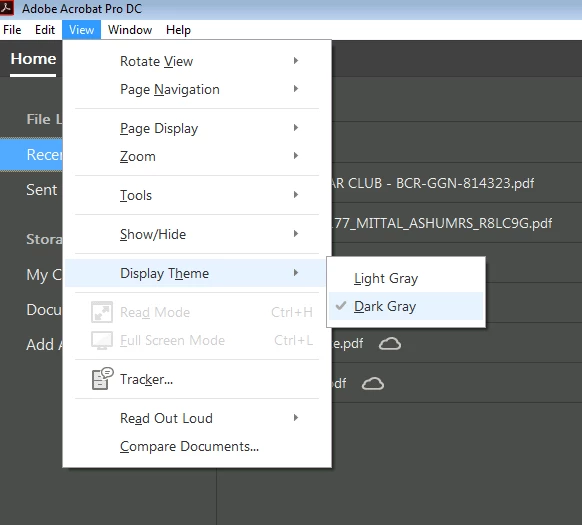
Next, go to View > Display Theme > Dark Gray and restart Acrobat.
More details here: What's new in Adobe Acrobat DC
Please try this out and let us know your feedback.
Thanks,
-ashu
Copy link to clipboard
Copied
Hey acrobatdcuser,
Acrobat DC has been designed like this with a brighter User Interface.
Please fill the Feature Request Form to wish for a darker UI so that your request could be passed on:
https://www.adobe.com/cfusion/mmform/index.cfm?name=wishform
Regards,
Anubha
Copy link to clipboard
Copied
It is not bright interface, it is vanished-out interface. Can't believe that beta-testers accept something like this.
Copy link to clipboard
Copied
This message pops up when I open a PDF document with the Acrobat DC program. Pick your color theme. Choose your preferred background color for Acrobat. You can change it back any time by selecting Display Theme from the View menu. Light theme or Dark theme. This is the exact message that pops up every time I open a PDF and it is very troublesome and unnecessary. Do you know how to disable this because it is very annoying. Thank you
Copy link to clipboard
Copied
Completely agree. The UI is way too bright and makes it very difficult to judge colours onscreen. It's almost impossible to read a document as there is little to no differentiation between a white page background and the outside of the page.
In fact, Acrobat DC seems to me to be a completely unnecessary update. It feels like a toy now.
Copy link to clipboard
Copied
The lack of constrast makes dificult to read and work with it. I revert to the previous version until this is fixed. Its like the ugly Windows 8.x and 10 UI design that is flat and ugly with lack of contrast. Same in Office 2013, Visual Studio, etc. This flat and "modern" UI wich is fashionable lately, its not usefull.
Copy link to clipboard
Copied
I did not mention that, but I could not agree more. There is NO contrast between my document and the user interface.
This is a case where seamless is a VERY bad thing. I'm a student/trainee. How am I supposed to focus on my study material when Adobe inserts its face onto every document? I'm almost tempted to go back to BlueBeam now...
I will submit a feature request and report it back here. If there's a way we can all second the motion, maybe they'll do it sooner.
Thanks guys,
Travis
Copy link to clipboard
Copied
Feature request has been submitted. No feature request confirmation reference was provided. This thread was linked to in the feature request.
(Again, I encourage others to request similarly, maybe they count requests:
https://www.adobe.com/cfusion/mmform/index.cfm?name=wishform
)
Now, whether or not to buy the pesky overly-bright version... What sucks is that subscribing doesn't make it any better, and Adobe would prefer subscriptions anyway... on with the trial.
Thanks guys!
Copy link to clipboard
Copied
Looking for a way to "manually force" the background color at least to change over here at StackOverflow... if anyone here knows where it is coded.
Note the old color (Adobe XI) was #565656. The new color is #F0F0F0. Wow -- the new one really is almost paper white!
Copy link to clipboard
Copied
I‌ HATE IT. I'm a long term Adobe user (multiple products) and HATE the new UI. It is f**king (in bold 72 pt font) terrible. It would be understandable if this was done to be consistent with CC but this is a huge step back. Did I mention how much I hate it?
Copy link to clipboard
Copied
this freakn sucks!
Copy link to clipboard
Copied
Way too bright...
Copy link to clipboard
Copied
I agree that the interface is way too bright. It's very hard to tell the difference between the white background of a document and the interface. In addition, the menu items (under File, Edit, etc.) are either 50% gray (selectable) or super light gray (not selectable) and barely visible (using Windows 7). The menu items are even lighter than the active and inactive toolbar buttons.
I'd like to go back to Acrobat Pro XI until they work this out but don't see any easy option to revert to the previous version in the Creative Cloud management application.
Copy link to clipboard
Copied
I don't understand the purpose of the redesigned Acrobat Pro. Is this an April Fool's joke? I hate it. It sucks. Looks like it was redesigned by the My Little Pony crew. It is too light, the pastel colors are awful, icons are too big, the menu items are grayed out, this must be a joke.
Copy link to clipboard
Copied
Yes! You nailed it: Acrobat "My Little Pony Edition."
But seriously, the grayed out menu items make no sense.
Copy link to clipboard
Copied
LOL!!! Couldn't agree more, it's just like f*&%ing iMovie ... couldn't they make a lite version for whoever they are designing for and leave the apps the way they were for their loyal customers of 20+ (almost 30?) years? Is it possible to go back to an old version when CC is constantly updating?
Copy link to clipboard
Copied
I would like to hear from the idiot who was responsible for this sorry excuse of a software program. Not the Engineers that just did what they were told, but the pencil dik, sorry embarrasment of a primate who ran this project. Come on here and man up, you lame excuse for a project manager that resulted in random people being motivated enough to troll a useless software program online .
,
Copy link to clipboard
Copied
Other people say they have switched back to Acrobat XI but I really hope that won't be the permanent solution. Maybe if we keep complaining they will finally add a dark theme option to Acrobat DC, just like they have with virtually all other Adobe products. That said, the way Adobe is handling feedback for Acrobat DC really sucks compared to the other Adobe products so I'm starting to think they won't listen to us.
Maybe if we were billionaires and started a campaign with a slogan like "Make America Acrobat great again!"...
Copy link to clipboard
Copied
Also, I noticed that it's almost impossible to see which bookmark in the Bookmarks Pane is currently selected because the icon fill color changes from grey to just slightly darker grey...
They should at least change it from grey to very dark grey or dark blue or even better, use a different icon for the selected bookmark so color blind people can tell the difference too.
Copy link to clipboard
Copied
If you search for Acrobat XI on adobe.com, then you have to click on "all search results" or something like that (because it will only show you DC). And then you can find it and re-install XI. Which is what I am doing right this second...
Copy link to clipboard
Copied
That's all fine and dandy. I WAS aware of all of this - and I HAD uninstalled DC and re-installed XI instead of DC. Already then, I was surprised about how they had managed to 'hide' it and make it much more difficult to install than it should be. I was even more surprised when, after installing XI, I still saw Acrobat DC listed in the desktop app as the installed app - DESPITE the fact that it actually WAS XI. This too I took as a sign on the wall. Finally, when I was asked to upgrade to 'DC' (and not XI), I concluded that they were sidelining XI. And so to me, the response of the customer rep (who, based on my interaction with him may, admittedly, not have had received the necessary instruction to answer that - or frarnkly, almost any other - question). I think, however, that if they don't handle the outcry in this thread adequately, they'll have an even bigger rebellion on their hand than Microsoft did after their long-running (and still ongoing - even with Win 10) UI/Metro debacle(s). Rather than 'learning' from us (surely they MUST have seen the stats of how many of us uninstalled DC after a week of intensive use - suggesting that we DID give it a try, but voted against it with our installers), they impose such decisions entirely heavy-handedly, top-down, without ever asking themselves the question what this does to their actual customer base. It keeps amazing me how places like Google (FAR from a perfect place) or especially the open source software movement really DO get this, whereas some of these first generation behemoths don't...
Copy link to clipboard
Copied
This theme isn't even approaching acceptable! How did this make it into production, was it QAd at all, are there any UX people (or artists/ professionals) at all at Adobe? I mean, I think we are all used to sub-par products from Adobe, but products that fill a niche and at least look good. Acrobat DC is unusable!
The drop down menus look like all options are disabled: White forms, white menus, light text and no highlighting!? Why?
Copy link to clipboard
Copied
I too fell into the DC hole. Oh great and long overdue update to Adobe Acrobat. Two days of fighting this horrible program and another couple of hours to de-install and and re-install XI pro. I mean this is the CORE of adobe publishing. how can you guys be allowed to create this bloated mess?
For the future:
Interface unusably bright, I just cant look at this thing.
Magnification and layout presets in .pdf files not honored. I hope my customers are not seeing this too?
Delay as the program scans the .pdf to read out loud for gods sake! Read out loud?
Pointless large bright buttons for my flailing three year old fingers.
Sorry I have run out because at this point I uninstalled and rolled back to XI.
Sorry Acrobat team. If this was a TV show it would be cancelled after the pilot.
Copy link to clipboard
Copied
I agree. I installed and de-installed DC twice (since, for some reason, you can't have both installed at the same time), mistakenly thinking that they might have improved it with an update. It takes two or three steps to do what I used to accomplish in one step, and some features are crippled (developmentally disabled?), such as the commenting tools. The Acrobat UI has become more Microsoft than an Office app!
Copy link to clipboard
Copied
When interface will be fixed? Can't work with it, it's too bright.