Adobe Acrobat Pro layout is different
Hi there
Thanks in advance for any support.
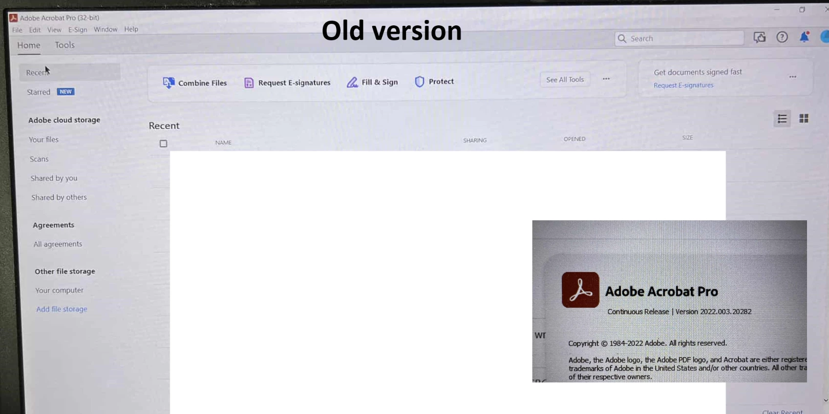
I had Adobe Acrobat Pro installed on my old work laptop last year, and it looked like the first attached image, called old version. It looks more like your traditional installed program with the menu bar.
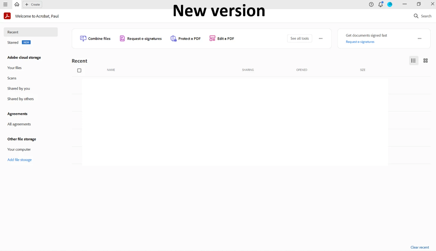
My IT department* just installed Adobe Acrobat Pro on my new laptop, and it looks like this, see image attached called new version. This gives more of an online vibe which I'm not keen on, and no menu bar.
Is this how it should be? Did Adobe redesign it? I preferred the old version. Maybe people familiar with the 'new version' can tell me if this is a good thing and I just need to get used to this drastic new layout. Am I missing any features from the old version?
Many thanks in advance for any help that can be affored to me.
Thank you.
Paul
*I'm asking this forum because I don't think my IT department knows much about Adobe Acrobat, only how to install the programme so they won't be able to answer my query.