
Is this an acceptable creative workaround for Textboxes?
I am remediating a document that needs to be 508 compliant in both Word and in PDF. To clarify, I'm not just using word as a tool to create a PDF final product, I have to have both a Word final product and a PDF final product. Here is my issue:
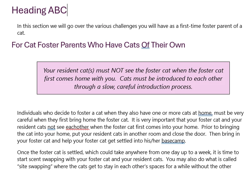
The document I was given to remediate had textboxes in it that were not in-line with text.
Here is how I am looking at remediating them:
I already took care of the easy part for word - moving them in-line with text and then putting them all at the beginning of their sections so that the screen reader reads the textbox first, then the rest of the content related content. I also changed the text so that it was no longer in a text box, and added a border around the text and a background color to mimic the original textboxes.
However, after reviewing them with the screenreader, I don't like it because it just sounds weird. The text boxes are key points that the author wanted to emphasize, and while it is clear to visual readers, I think that is getting lost as-is with the screen reader. So what I want to do, is add at the begining of each of these textboxes text that says "key point" but make it in really small font and matching the background color. I don't think that it is necessary for the text box to say "key point" for those who are visual because I think it is already very clear visually, I just want that text there for those who use screen readers. So this "invisible text" is another way of adding alt text. Here is an example screenshot.
Technically, you're not supposed to have "invisible text" but I was curious if in this instance, it would be ok. Does that work as a creative solution, or is it still a no-go?