Participant
November 21, 2024
Answered

Issue with fonts from MS Excel

  • November 21, 2024
  • 2 replies
  • 3450 views

I am having a problem with fonts not appearing as they should, specifically using MS Excel.  I have tried using


File->Print->Adobe PDF
File->Print->Microsoft Print to PDF
File->Save as Adobe PDF


Within the preferences of Distiller (or directly in Excel), I have it set to Embed all fonts, Embed Open Type Fonts, and Subset embedded fonts when...


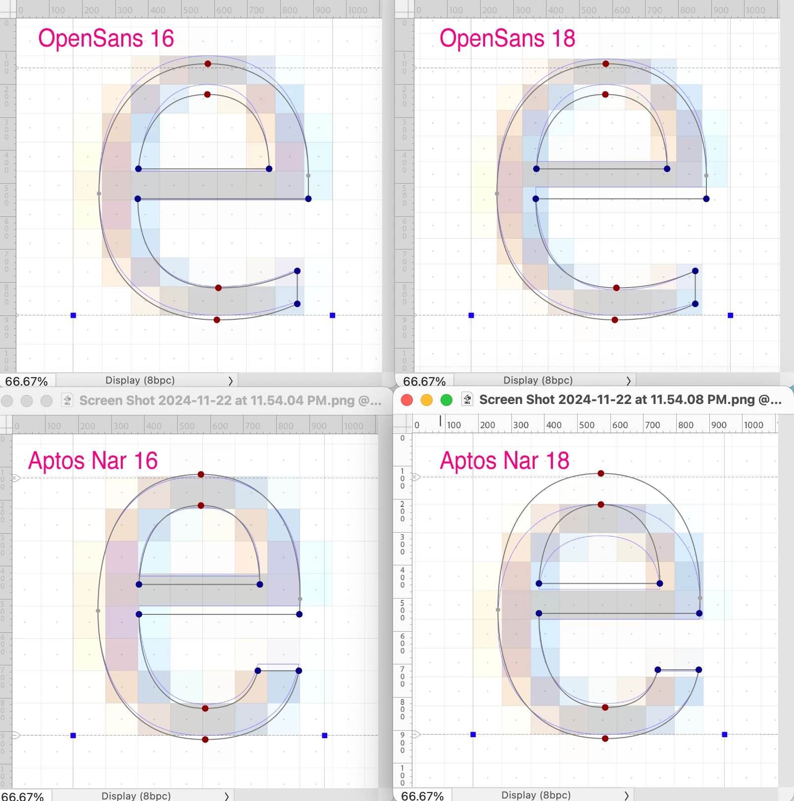
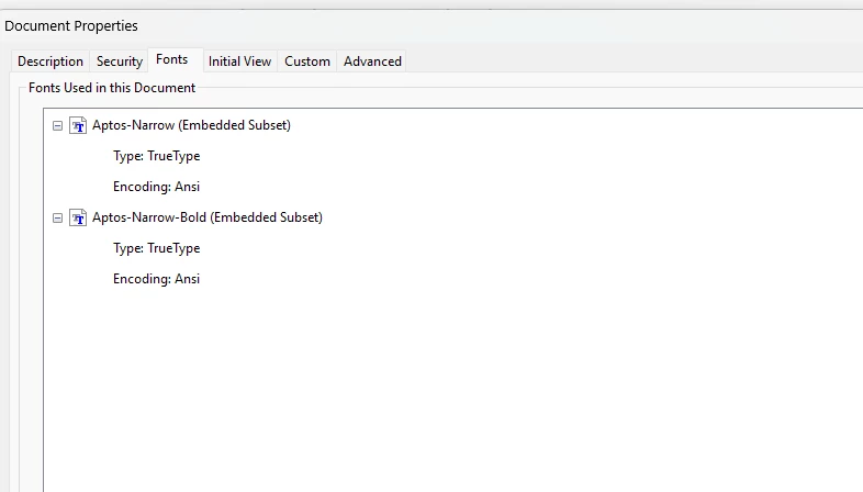
The results are always the same (see pic 1) despite the PDF properties indicating that the font has been embedded which is the Excel default Aptos Narrow.


I have dropped the fonts from "C:\Users\{USER}\AppData\Local\Microsoft\FontCache\4\CloudFonts" to the following locations:

C:\Program Files (x86)\Common Files\Adobe\Fonts
C:\Program Files (x86)\Adobe\Acrobat 2020\Resource\Font
C:\Program Files\Adobe\Adobe Creative Cloud\ACC\resources\fonts
C:\Program Files\Common Files\Adobe\Fonts

"C:\Windows\Fonts" (though not all of the fonts are properly showing up in that folder, separate issue)


and I also added "C:\Users\{USER}\AppData\Local\Microsoft\FontCache\4\CloudFonts" as a font folder within Acrobat Distiller itself.


Why o why does this look like a ransom letter with letters cut from different newspapers and magazines?

This topic has been closed for replies.
Correct answer Brad @ Roaring Mouse

Your file is technically fine and the font is properly embedded.

However: Aptos has notoriously bad TrueType hinting. It's horrendous. I found others complaining about this problem online.

To be clear, this has less to do with the actual font size you use, but how many pixels are available on the screen at any magnification you display it, which is why it changes depending on your zoom.

btw: You can also see this in Illustrator or InDesign if you zoom in and out.... it's not an Excel-centric issue.

A TrueType rasterizer is usually used to display fonts on the screen, and it will use the embedded hinting for the different sizes used. This hinting is programmed into the font by the designers, for better or for worse. Why it's being applied to only some characters and not others I'm not sure, although the TrueType specs mention that hinting is used on a case by case basis?  For other fonts, with better-designed hints, this might not be an issue. e.g. If you used Open Sans, you wouldn't be seeing this problem to this extreme, if at all.

Annnnywayy e.g. in this screenshot, I inspected the hinting in both Open Sans and Aptos Narrow at both 16 and 18 point. The REAL font outline is in Black; The hinting is the Blue outline. You can see how wildly different and shorter the letter "e" would be rendered in 18 pt Aptos.... even smaller than the 16 pt version. This is weird font design for sure. This difference is not in Open Sans.


As to why it shows in some programs and not others, it depends on what rasterizing tech is being used: e.g. a Win browser might use Cleartype rasterizer instead, which does it's own hinting, or a Mac with a Retina display which doesn't use hinting at all since those monitors are high enough resolution not to need it.


2 replies

Brad @ Roaring Mouse
Community Expert
Brad @ Roaring MouseCommunity ExpertCorrect answer
Community Expert
November 23, 2024

Your file is technically fine and the font is properly embedded.

However: Aptos has notoriously bad TrueType hinting. It's horrendous. I found others complaining about this problem online.

To be clear, this has less to do with the actual font size you use, but how many pixels are available on the screen at any magnification you display it, which is why it changes depending on your zoom.

btw: You can also see this in Illustrator or InDesign if you zoom in and out.... it's not an Excel-centric issue.

A TrueType rasterizer is usually used to display fonts on the screen, and it will use the embedded hinting for the different sizes used. This hinting is programmed into the font by the designers, for better or for worse. Why it's being applied to only some characters and not others I'm not sure, although the TrueType specs mention that hinting is used on a case by case basis?  For other fonts, with better-designed hints, this might not be an issue. e.g. If you used Open Sans, you wouldn't be seeing this problem to this extreme, if at all.

Annnnywayy e.g. in this screenshot, I inspected the hinting in both Open Sans and Aptos Narrow at both 16 and 18 point. The REAL font outline is in Black; The hinting is the Blue outline. You can see how wildly different and shorter the letter "e" would be rendered in 18 pt Aptos.... even smaller than the 16 pt version. This is weird font design for sure. This difference is not in Open Sans.


As to why it shows in some programs and not others, it depends on what rasterizing tech is being used: e.g. a Win browser might use Cleartype rasterizer instead, which does it's own hinting, or a Mac with a Retina display which doesn't use hinting at all since those monitors are high enough resolution not to need it.


Participant
November 23, 2024

Fascinatingly complex. Thanks to you and MikelKlink for helping me understand that it is just the specific font that has issues and that I'm not going crazy.  Since this appears just to be an on-screen rendinging issue, it is not as big of a deal because any hard-copy prints would not have the same issues so at least there's that.  It does drive me crazy so looks like I'll be changing the default font.  

MikelKlink
Participating Frequently
November 21, 2024

Can you share the Excel and PDF files in question for analysis?


Participant
November 21, 2024

I can (and did) create a different workbook that I can share that results in the same PDF output.

MikelKlink
Participating Frequently
November 22, 2024

Opening your PDF in Adobe Acrobat I don't see the effect you describe. In your screen shot the 'c' and 'e' characters look a bit compressed, something I cannot see here:

I may not have the best eyes, though, so you maybe can illustrate a problematic effect in your example file.