Répondu

Ce sujet a été fermé aux réponses.
It's a design change throughout Adobe's programs, not just Acrobat.
Poorly tested by the GUI design team; on Windows, the icon's black square melds into the default black background color of the Windows Task Bar. The Acrobat icon, especially, is nearly invisible on a high-resolution monitor. Just what users need: an invisible user interface!
This screen cap shows (from left to right), the new icons for Acrobat, InDesign, and Photoshop, and the previous icon for Photoshop on the far right.
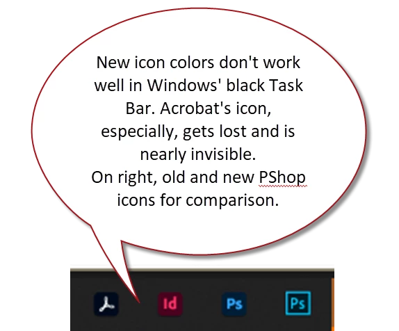
Good example of what NOT to do to a user interface!
Afficher les réponses précédentes
Enter your E-mail address. We'll send you an e-mail with instructions to reset your password.