- Home
- Adobe Fonts
- Discussions
- Nimbus Sans Condensed Bold not available
- Nimbus Sans Condensed Bold not available
Nimbus Sans Condensed Bold not available
Copy link to clipboard
Copied
I created a few brochures for print last year and the headline font was NimbusSansCondensed Bold. I recall (hopefully correctly) that I used typekit for the font. Is it retired - because it is not available anymore? I paid for typekit, used the font and now I have to go buy the font again elsewhere to make edits? Can someone clarify please
thanks in advance
Mokani
Copy link to clipboard
Copied
Hi Mokani,
Thank you for reaching out. I have checked at my end on windows and i am able to see the fonts. Please see the attached screenshot below:
Would you mind confirming if you have paid Typekit subscription or free? We would also suggest checking the same font on any other machine.
Let us know if that helps.
Thanks,
Harshika
Copy link to clipboard
Copied
Hi Harshika,
thank you for responding.
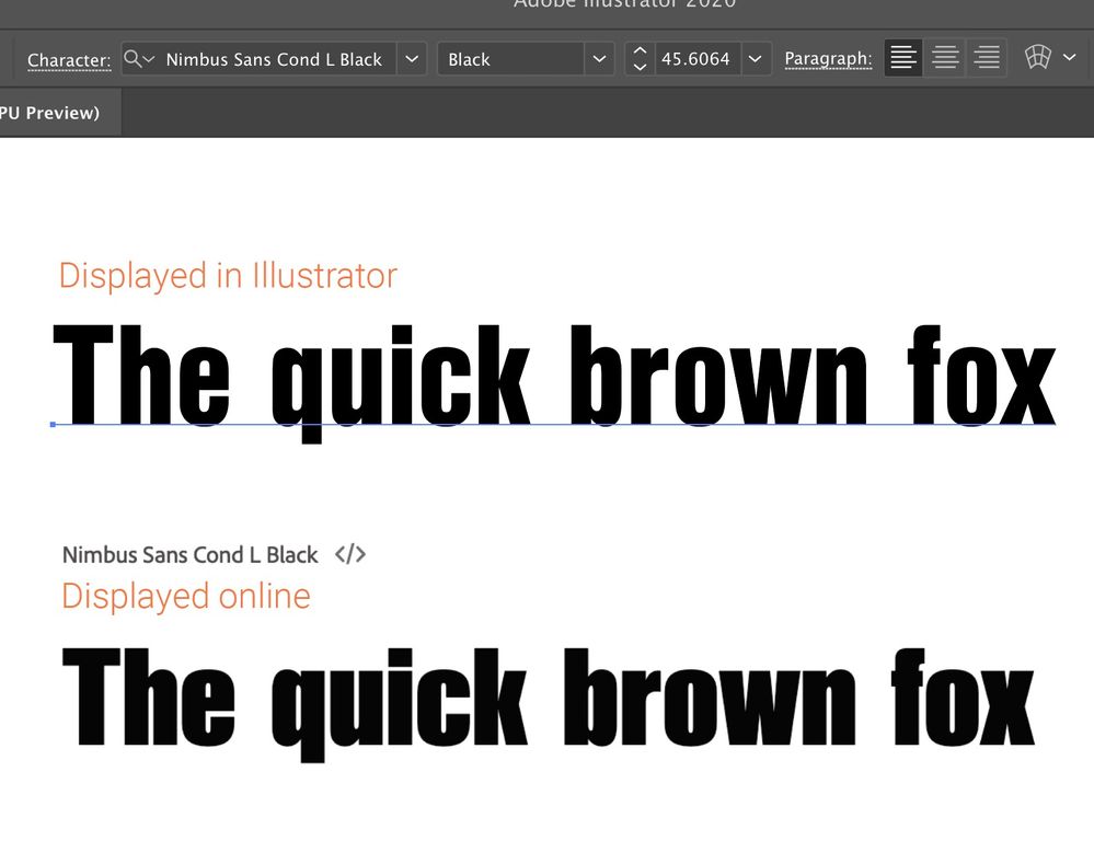
I have a subscription Creative Cloud All Apps, Annual plan, paid monthly (ongoing for many years). I use only one apple mac so the work was not generated elsewhere. The fonts in the screengrab above are also available to me but they are very different to the one I used last year. The line lenghts are much longer now. All my documents reflowed when I tried the fonts available on typekit this week. The only solution I could find in time for my deadline was to buy again buy from a supplier and I had to pay another £30 for a license (uk). Here is a screen grab to show the difference between Nimbus Sans Condensed Bold (top row) and Nimbus Sans Cond L (bottom row). They are really different except the names.
thanks for looking into this for me
Moira
Copy link to clipboard
Copied
Hi,
I am having the exact same problem. I've been using Nimbus Sans Cond Bold through typekit and realized it doesn't seem available anymore. Now the font on typekit (Nimbus Sans Cond L Bold) looks very different.
Copy link to clipboard
Copied

Copy link to clipboard
Copied
This might seem weird but trying using Nimbus Sans Condensed Black as a replacement - there's a chance that it may display as Bold (I'm saying that because it's actually happening with me). I know this isn't the proper solution but maybe it helps as a short term work around?
Copy link to clipboard
Copied
I'm having the same issue and switching weights doesn't help. It's just not the same font.
Copy link to clipboard
Copied
had to buy the font again elsewhere (at my own expense) otherwise I
couldn't have matched the headlines in my brochure which, was on a re-run
with a few amends. I wasted so much time and energy on this... and Adobe
just ignored my problem.
Best of luck
Love to hear if they help you
Moira
Copy link to clipboard
Copied
NimbusSansCond L and NimbusSansCon may have similar names, but they aren't the same fonts. At. All.
Copy link to clipboard
Copied
I am having the same issue. So annoying
Copy link to clipboard
Copied
I think one of the problems is the Nimbus Sans type family avaiable via Adobe Fonts is a limited selection of 15 fonts. Maybe the selection of styles has been shuffled up a bit.
The Nimbus Sans family from URW has a lot more styles. It's a visual "clone" of the Helvetica and Helvetica Neue typefaces, which have dozens of styles. The various "D," "T," "L," "P" and other letters after the Nimbus Sans name hint at the style of Helvetica being copied, be it the 1957 cut, the 1983 Neue cut, Helvetica Inserat, etc. I've seen some of these fonts included in sign making apps. The old Deneba Canvas app had a huge collection of URW fonts, including more than 80 Nimbus Sans font files (yet I don't think that was a complete selection of Nimbus Sans).
Monotype bought the URW type foundry in 2020. I don't know if that is a factor on why some styles of Nimbus Sans available via Adobe Fonts has changed since the Typekit days.
Copy link to clipboard
Copied
I just opened a project in Premiere that I needed to make adjustments to, and I'm having the same issue. The original font was NimbusSansCon Bold. The new one, NimbusSansCond L Bold isn't even close.
Why do you do this to your users, Adobe?
Copy link to clipboard
Copied
ignored by adobe ... Quite a few of us have been effected.
Find more inspiration, events, and resources on the new Adobe Community
Explore Now

