Copy link to clipboard
Copied
 1 Correct answer
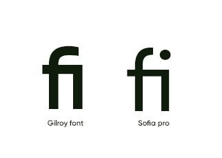
Those are called ligatures, and some fonts have those specially designed characters. It's not a problem at all, it's how the font was designed. Not all fonts have them, but some well designed fonts do.
Copy link to clipboard
Copied
Copy link to clipboard
Copied
Those are called ligatures, and some fonts have those specially designed characters. It's not a problem at all, it's how the font was designed. Not all fonts have them, but some well designed fonts do.
— Adobe Certified Expert & Instructor at Noble Desktop | Web Developer, Designer, InDesign Scriptor
Copy link to clipboard
Copied
Hi Dan,
how can you turn ligatures off?
Copy link to clipboard
Copied
There's no ligature setting in XD (advanced type controls would be nice). So the closet workaround I can think of would be to add a Character Spacing of 1 which will break them apart. Ideally that's done to just those 2 characters, because if you do it to all the chararacters you are adding a tiny amount of space across them all.
— Adobe Certified Expert & Instructor at Noble Desktop | Web Developer, Designer, InDesign Scriptor
Copy link to clipboard
Copied
Thanks for the reply. Advanced typesetting would indeed be nice...
I've switched from TT Norms to TT Norms Pro. This typeface doesn't have the ligatures.
Copy link to clipboard
Copied
That worked! Thanks : )
Copy link to clipboard
Copied
You can cheat it by adding a space and setting the type size to 0
Copy link to clipboard
Copied
Thanks! This is very helpful. Many of my clients don't like ligatures.
Get ready! An upgraded Adobe Community experience is coming in January.
Learn more
