- Home
- Adobe XD
- Discussions
- Re: Google Font and Adobe Font line-height Discrep...
- Re: Google Font and Adobe Font line-height Discrep...
Google Font and Adobe Font line-height Discrepancies
Copy link to clipboard
Copied
I'm a UI designer who works with a team of graphic designers and we have this problem:
When designing pages in XD that use Google Fonts (that my developers will use) there is an inconsistency in leading between Google Fonts directly from Google and Google Fonts that are loaded into Adobe Fonts. I tell our designers to deactivate Adobe Fonts when designing a page that needs to use free Google Fonts because it won't match up for the developers when coding. But it's been difficult to remind all the designers and production artists since they also work on print designs. So my question is, why the change in line-height/leading?
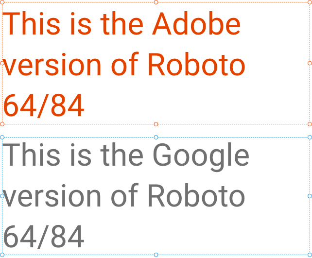
In my screenshot you can see on the left is Roboto Bold activated through Adobe, and on the right is my local copy of Google's version. The reason you can't see the last line of copy is due to the text box being too short for the Adobe version of the font.
I have come across this problem with other Google Fonts as well but can't remember off the top of my head.
Thanks in advance for looking into this!
-Diana
EDIT: Appears to be the baseline instead of leading. Please see comments.
Copy link to clipboard
Copied
I am checking with the team to see if this is a known issue. I will get back to you if the team needs more info.
Thanks,
Preran
Copy link to clipboard
Copied
Thanks, Preran! According to the closer look from Peter below, it appears it may be the baseline instead of leading. I've included more info in my comment to him below.
Copy link to clipboard
Copied
I overlayed the two text parts in Photoshop (one with 70% opacity) to find out how much it differs. But apart from the vertical position being a bit imprecise, and slightly different anti-aliasing of the rendered characters (due to system, tool, and browser differences), I don't see a difference in leading / line height ! The fact that the bounding box (DIV) is cutting off the third line, can have other causes, but line height isn't one of them...
Note: I intentionally offset the parts a tad horizontally, so it's easier to see the vertical differences.
Copy link to clipboard
Copied
I see what you are saying and its probably the baseline. It's a significant shift when turning one set of fonts on or off. It also seems to only apply to certain font sizes. In my original attachment, I cropped the screenshots to focus on the missing line of text but I've attached my original screenshots with a multiplied layer as a GIF and static image below. You will see in areas where Open Sans is used (main headline 'Mowing to Make a Difference" and the green subhead "Rodney Smith Jr. was a...") the fonts do not shift. Everywhere else, Roboto is being used. The DEK copy "A chance encounter..." is 30px regular, the citation is 16px italic, body copy 20px light, and call-out is 30px bold.
So, it's probably the baseline, but only for certain font-size and/or weights? Head-scratcher...
Copy link to clipboard
Copied
To help you out a little more, the baselines might differ a bit between tools (not fonts). So when the first baseline in the text frame starts at a few pixels lower, and the text frame is very tightly measured, then this overshoot might happen. Use a flexible height for the text frame in CSS, or at least some extra height, to accomodate such differences.
Copy link to clipboard
Copied
Judging by the slight but very clear 1 pixel differences in your example, it might have something to do with the rounding off of certain browsers. Font measures and line widths in web browsers are constantly being related and calculated between the intended size and the amount of device pixels. As Eric Meyer already described in this 10 years old article, such measures are being rounded off to integers. This might lead to any kind of slight visual difference in size, line height, et cetera.
Browsers also use different types of font anti-aliasing, which also often causes type to look a tad bolder or lighter than expected.
Stop scratching your head – these are the structural imperfections of the web we need to live with... 😉
Copy link to clipboard
Copied
I think we may not be on the same page, haha. This example is strictly within XD, not in browsers or prototype mode.
Copy link to clipboard
Copied
Diana, you're RIGHT !
I drifted onto the wrong page in the discussion, but I'm back on track, with a vengeance !
I created some text samples (at 64/84) with the Adobe and Google version of Roboto.
First I activated the Adobe CC Fonts version, deactivated it, and then installed the Google TrueType version.
These are the separate samples:
I shortened the lengths of the frames to show exactly the third line, not one pixel extra.
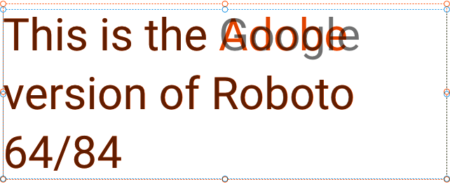
Then I created an overlay with the text aligned, to check once again any difference in leading:
No difference in leading – but the positioning of the frames is completely off !
You can also see that one pixel extra length, the Adobe version requires to show the third line.
When the frames are top-aligned, the difference is totally clear:
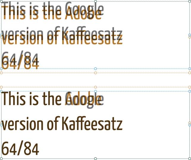
I also tested it with another Adobe and Google version of another font combo, the Kaffeesatz:
There's definitely something fishy in the baseline starting point of such fonts...
Copy link to clipboard
Copied
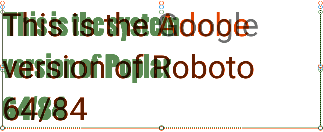
Out of curiosity, I added another OpenType system font to the comparison:
There are differences in character heights, of course. But the baseline starts again at a different height...
Copy link to clipboard
Copied
Hi Peter,
This is such an interesting discussion, and your insights are amazing, although my lack of experience with using Google fonts is a limitation in understanding the whole situation.
Do you thik I whoudl be logging a bug for this issue with the product team? I am not even sure if this is a workflow that the team supports, or intends to support in future.
Thanks,
Preran
Copy link to clipboard
Copied
Google Fonts have Roboto v2.137 from 2017, Adobe Fonts have Roboto v2.001047 from 2015 - this is the issue.
Copy link to clipboard
Copied
Wondering when this will be fixed... we're still experiencing this exact same issue using InDesign.
Copy link to clipboard
Copied
I started having this issue when I switched from a Windows to a Mac - which changed how I loaded my Google font families. The last line of all my copy was being cut off. I went into Adobe and deactivated the Google fonts loading through Creative Cloud. Instantly fixed the problem.
Copy link to clipboard
Copied
I discovered after long research, that Open Sans and possibly other Google and Adobe Fonts, use different versions in their respective online libraries, and in addition have changed the baseline font metrics from earlier versions, causing vertical alignment problems within text frames and table cells to be too low. This is most evident and problematic with vertical justification center.
Older versions of Open Sans (2012 – ???) align correctly based on the capital X-height of the font, with no additional spacing at the top of the font. Vertical center works as expected.
However, with newer versions of Open Sans, the font metric adds space at the top of the font, and it does not align correctly and adds space to the top of the font.
Text Frame Workaround:
This can be “corrected” by changing the baseline option in the Text Frame Options dialog (CMD-B or CTRL-B) to “Capital Height” which will align the text to the top of the text frame.
Table Cell Workaround:
a) change top or bottom inset spacing of the cell to compensate for text being to low and not respecting vertical center;
or
b) change the baseline shift in negative increments (-1 or 2pt for example) in the paragraph style settings.
It appears that Google and Adobe will be changing this most basic of font metrics, whenever they choose to, without regards to users that have created documents that rely on precise positioning of text. It is highly advised to save a copy of all downloaded fonts within each project folder if future document changes are necessary, and you find that the current version of your font is causing the above problems.
Find more inspiration, events, and resources on the new Adobe Community
Explore Now


