- Home
- Adobe XD
- Discussions
- Re: Is this fixed yet? I need to view my text at...
- Re: Is this fixed yet? I need to view my text at...
Copy link to clipboard
Copied
Hi All,
I'm new to Adobe XD and currently getting an understanding of it by creating a website prototype—I am generally clicking the "Desktop preview" Play button at the top right-hand corner to see how its looking, however, when I publish and view the link in a browser (Enlarging it with the full-screen arrows) it seems to be a lot more zoomed in then the desktop preview.
So my question is which one is the actual size? The desktop preview or the published version? Just checking so I can understand the final fonts sizes and layout etc.
Thanks!
Aaron
[Here is the list of all Adobe forums... https://forums.adobe.com/welcome]
[Comments is to ask about the operation of the Forum, not a specific program]
[Moved from the Comments forum to the specific Program forum... Mod]
 2 Correct answers
The published version in fullscreen is the size that you are designing at. On desktop in the preview window we scale the prototype to fit the available space.
It's probably easiest to check in XD by changing the zoom to 100% (Cmd/Ctrl + 1) and looking at the size.
No of course not, because it's too damn difficult to take all the variables into account which might influence whatever text size those dreaded users eventually see on their screens. Your designs should be intended to give your valued client and routined front-end developer a fairly good idea what you're striving for. But the end result is always a mix of system and browser inconsistencies, and user preferences. So keep margins in mind while desiging and don't expect pixel perfect executions of
...Copy link to clipboard
Copied
Hi Aaron,
Thanks for using Adobe XD and sharing the feedback. As per the description, you are unable to get the actual size of your prototype in fullscreen mode. I would request you to vote for this feature here: - View and share design prototypes at actual size – Adobe XD Feedback : Feature Requests & Bugs, you may also provide more information to the team in your comments.
Hope this helps, thanks.
Copy link to clipboard
Copied
Hi Atul,
Thanks for the feedback—I assume you mean full-screen preview mode not the published prototype fullscreen?
So is Stuart's comment is correct below?
Thanks.
Copy link to clipboard
Copied
The published version in fullscreen is the size that you are designing at. On desktop in the preview window we scale the prototype to fit the available space.
It's probably easiest to check in XD by changing the zoom to 100% (Cmd/Ctrl + 1) and looking at the size.
Copy link to clipboard
Copied
Thank you Stuart—Exactly what I was after!
Copy link to clipboard
Copied
Thank you for letting us know that your question was answered, and marking the answer as correct - appreciate it!
Copy link to clipboard
Copied
Hi Stuart,
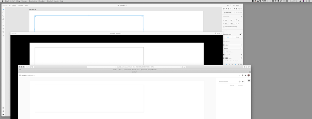
The prototype is not responsive according to the page, this is very bad in a presentation. In the attached image I show how the Marvel resolvable this in a very simple way, regardless of the screen size the prototype follows its actual size, this would make the Adobe XD perfect. To get around this I need to warn my client that he should view in full screen (F11) and in the format according to what I did.
Copy link to clipboard
Copied
The published version in fullscreen is the size that you are designing at. ...
This doesn't seem to be the case. Published version shows at a fraction of the actual size. The only way it shows at 100% is if the user/viewer presses Escape to exit full-screen mode, then manually selects 100%, then goes back into full-screen mode.
...On desktop in the preview window we scale the prototype to fit the available space.
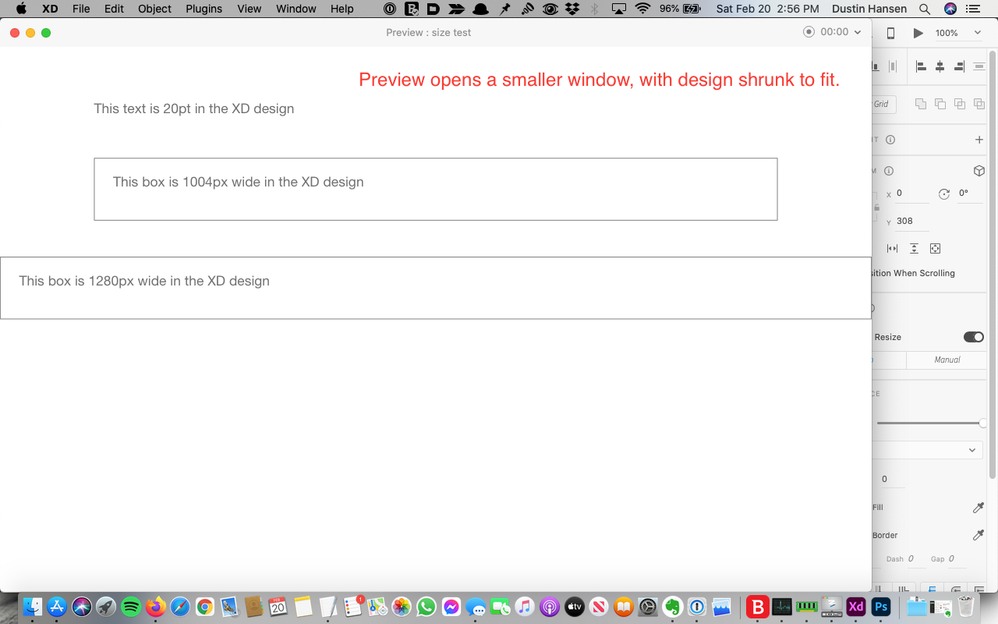
Two things here. 1) why??, and 2) this doesn't seem to be the case either. Even if I set it to 100%, once I press the Play (preview) button, it displays in a narrower window with the design shrunk:
If I make that window larger, the design scale stays the same - still shrunk, but now with black bars on either side:
Opening a screenshot of the preview window in Photoshop, you can easily confirm it's not at 100% scale:
Please fix.
thanks
Copy link to clipboard
Copied
Copy link to clipboard
Copied
Copy link to clipboard
Copied
Hey Adobe - why?? Why scale to fit available space? What are you thinking? Prototypes are built, mostly, to a specific size. It's paramount that this size carries forward to any client presentation. I really don't understand your logic here
Copy link to clipboard
Copied
Is this fixed yet?
I need to view my text at the size it was designed.
I designed my artboard at 1680 wide to match the width of my 2019 15" MacBook Pro. When I preview my file I still get bars. I check the browser width and its 1680, I check the zoom and its 100%.
Copy link to clipboard
Copied
No of course not, because it's too damn difficult to take all the variables into account which might influence whatever text size those dreaded users eventually see on their screens. Your designs should be intended to give your valued client and routined front-end developer a fairly good idea what you're striving for. But the end result is always a mix of system and browser inconsistencies, and user preferences. So keep margins in mind while desiging and don't expect pixel perfect executions of your designs.
Copy link to clipboard
Copied
Hi Peter,
My knowledge in development is brief and very superficial, you say it is very difficult so I believe. But, you already do incredibly complex things at Adobe and would this problem be very difficult? Attached is the print of Marvel's export configuration, with this feature the prototype ignores the screen size and displays the prototype in its actual size, as it was designed.
This problem creates two other problems, one for me and my client. The first, I need to export the screen in PNG and view it in the browser to analyze its consistency and actual size in action. The second problem is when presenting to my client, for him to view the prototype in real size I must request that it enables F11 and be on a screen compatible with the resolution from which I projected. In such a complete program it is somewhat frustrating to see that something so crucial is missing.
Copy link to clipboard
Copied
How nice of such software, to give the impression that you can rely on this setting ! Well, maybe you can – during a preview. But for the real thing it's just impossible to let all browsers or mobile devices render a web or app design exactly as the intended design.
E.g. you state "as it was designed" – on whose screen, at which resolution ?
Especially when users hit the Cmd or Ctrl + or - to zoom in or out on a webpage, the differences are staggering...
Designing without any fluidity and flexibility in mind (for positioning, scaling, text sizing) will only result in frustrations at both the designer's as well as the user's end.
But apart from all the user's influences and browser mis-alignments, could you be more precise at what point and what kind of preview you experience as being off-size ?
Copy link to clipboard
Copied
Just fix the app already - what's taking so long? This bug was raised two years ago. Your comments area all valid Peter, but no one is talking about that. We are simply saying fix the preview pane not to scale our designs - its simple. Its like designing for 16:9 ration and then intentionally getting my aspec ratio wrong so that you could see black bars around my design.
Copy link to clipboard
Copied
Hello Peter, me again. This is a project that is being developed, designed with a width of 1920px, but when sharing a presentation on Chrome it has these white bars on the sides. Colleague LucasCzuchraj said exactly the same, I left an attached image to clarify the problem (my prototype).
How to solve this problem? In the right corner when I click on the clipboard the XD shows me this option (XD problem), here I am saying that the window height is 1080px, you could easily work around this problem by placing the option "ignore window height" for example . This will allow my prototype to obey only the width and not the height, the width cannot be fixed either, projects with 1920px width opened in 1366px wide browsers cannot be resized, the sides must be cut.

Rolagem = Scrolling / Altura da janela = Window height
It seems that you do not use your programs or listen to your customers, we have been complaining about this problem for 2 years and it seems that you do not exercise or simply ignore it. Another very important thing, the scroll of the projects is very stuck in Chrome, regardless of the size of the project, it is horrible, it seems that the file is very heavy.
Copy link to clipboard
Copied
I hope the last paragraph of your post was addressed to the Adobe XD team members – not me personally 😉
As with the other suggestions I've made: for how it's working now, you need to regard your protype (designed at that size) to be a representation for that size. And that size is just an indication of how screens around this width will look. It's not responsive, it's not the real thing yet, it's just a mock-up, at best a prototype with some interactive capabilities. Anyone in your team or testing pool needs to be aware of that.
Furthermore, there are conflicting requests in this discussion already. Some users want the design to stay at the exactly designed size (which hopefully fits the reviewer's screen size), Adobe XD tries to scale it when it doesn't fit, while others want their design to be responsive, so it will move stuff from and to margins when viewers resize their browser or use a dufferent size mobile screen. So who gets it ?
Let's leave the testing of how the responsiveness truly works to the technical stage, when development has taken over and will try to let their frameworks fit the content nicely to each screen and device, according to your respective designs.
However, if you think Marvel serves you better at this, at this moment, then feel free to switch.
Copy link to clipboard
Copied
What's the point of having a preview function in a prototype design tool that doesn't represent the dimensions of the designed artwork? It took me a long time to realise that what I was seeing in the preview wasn't representative of any aspect of my design and was wondering why the developed websites were all far larger in element and type size than my artwork.
The width of the artwork makes no difference in the way the preview functions, it automatically shrinks the artwork in preview by around 25%. The example below has a content width of 1200px (represented by the box... you can see the width of that box on the right hand side) in the artwork but when previewed that same area of the artwork is only 900px in width. The artboard width is 1920px in width but if I reduce this the preview merely places black areas either side of the artwork, it doesn't scale it up to fill the available screen area. What's the bloody point!
Disgruntled Designer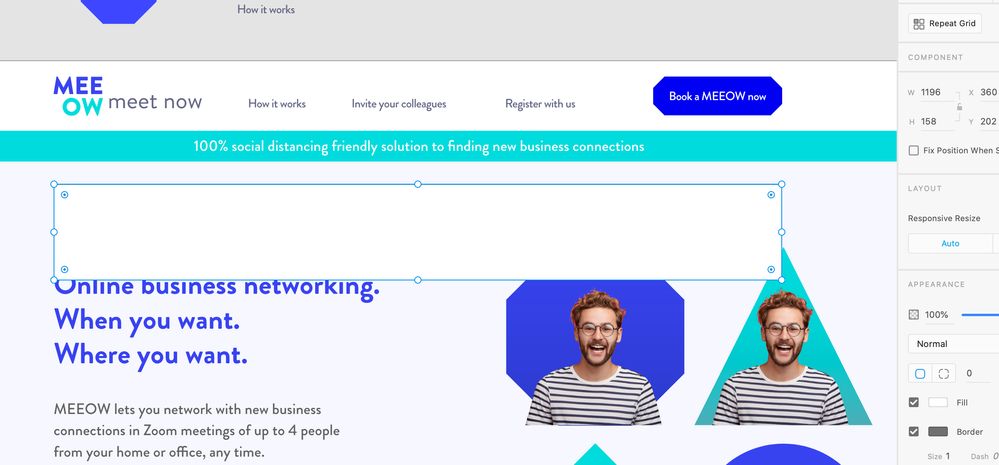

Copy link to clipboard
Copied
I can't reproduce your problem.
If I create a design at 1920 with a rectangle of 1200, view the artwork at 100% and compare it with the Preview in XD and the Preview URL online, all views are at the exact same and intended size, not scaled down.
Of course, to accommodate such a design, you need ample space in the size of your monitor, otherwise the width and/or height (viewport) will be scaled to fit the window on your screen.
Keep in mind: in all renditions you're previewing and judging a fixed design size in a viewport with a certain width and height – not its responsiveness within the preview window or panel as a whole.
Copy link to clipboard
Copied
Thanks for getting back to this Peter.
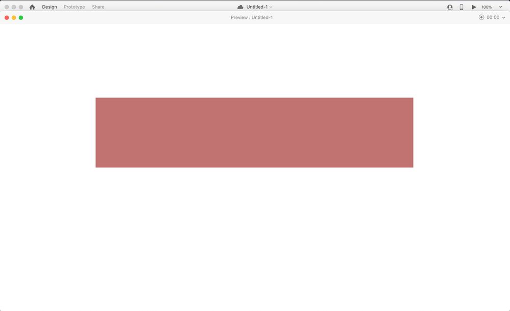
I'm not referring to a preview link viewed in a browser, I'm talking about the preview just in XD. I've taken 3 screen shots to show you what I'm seeing (I'm on a 15" Macbook Pro by the way and all screen shots are FULL SCREEN screen shots).
1. This is a 1920px wide artboard with a 1196px width box on it. This artwork is being viewed at 100% as you can see.
2. This is that same document in Preview in XD (not an uploaded link viewed in a browser). Remember, all these images are FULL SCREEN.
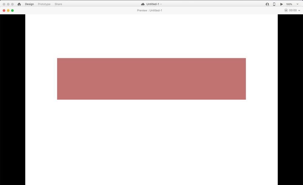
3. Just to illustrate that the size of the artboard makes no difference to the preview size here's the same box on a 1600px width artboard. The size of the artwork doesn't change, XD fills in the areas in black.
This is my issue, Preview is showing me what my site will look like on my own screen at only 75% size. As far as I'm aware this isn't the case when I'm using the live preview on a mobile sized artboard on my connected phone. I hope that's a true representation?
Copy link to clipboard
Copied
I also showed the initial XD preview in my image.
And your first image already shows the problem.
You can clearly see that at 100%, the rectangle of 1200 pixels reasonably fits the width of your screen (if you'd ignore the Properties panel on the right). But for previewing that whole artboard of a whopping 1920 pixels, it needs to be scaled down to fit the Preview window which fits the maximum size of your screen.
Although your 15" MacBook has many more (Retina) pixels, for many design tools (like XD) it adheres to the perceived resolution of 72 dpi. So when a browser complies with that same intention, a 1920 pixels wide website won't fit many laptop screens...
Copy link to clipboard
Copied
The reason that my earlier image shows an initial Preview at 100%, is that it was invoked on a 35" screen...
Copy link to clipboard
Copied
So why would it be that when I preview the document in XD and draw a screen shot marquee across the 1200px box it measures only 900px on screen? 1200px becomes 900px in preview? (i wish I could take a screen shot of me taking a screen shot)
Copy link to clipboard
Copied
Right, I've just done some more tests. Basically if my artboard is 1400px or below on width then the preview in XD is accurate. That seems like a terrible set up to me. Why can't the preview be actual size regardless of monitor size? Just like a website would be? Just crop the edges of the artwork in stead of shrinking it? or at least make it clear that it's going to shrink it to fit based on your screen size
-
- 1
- 2
Find more inspiration, events, and resources on the new Adobe Community
Explore Now


