- Home
- Adobe XD
- Discussions
- Re: why does a 16px font fit inside one row of my ...
- Re: why does a 16px font fit inside one row of my ...
Copy link to clipboard
Copied
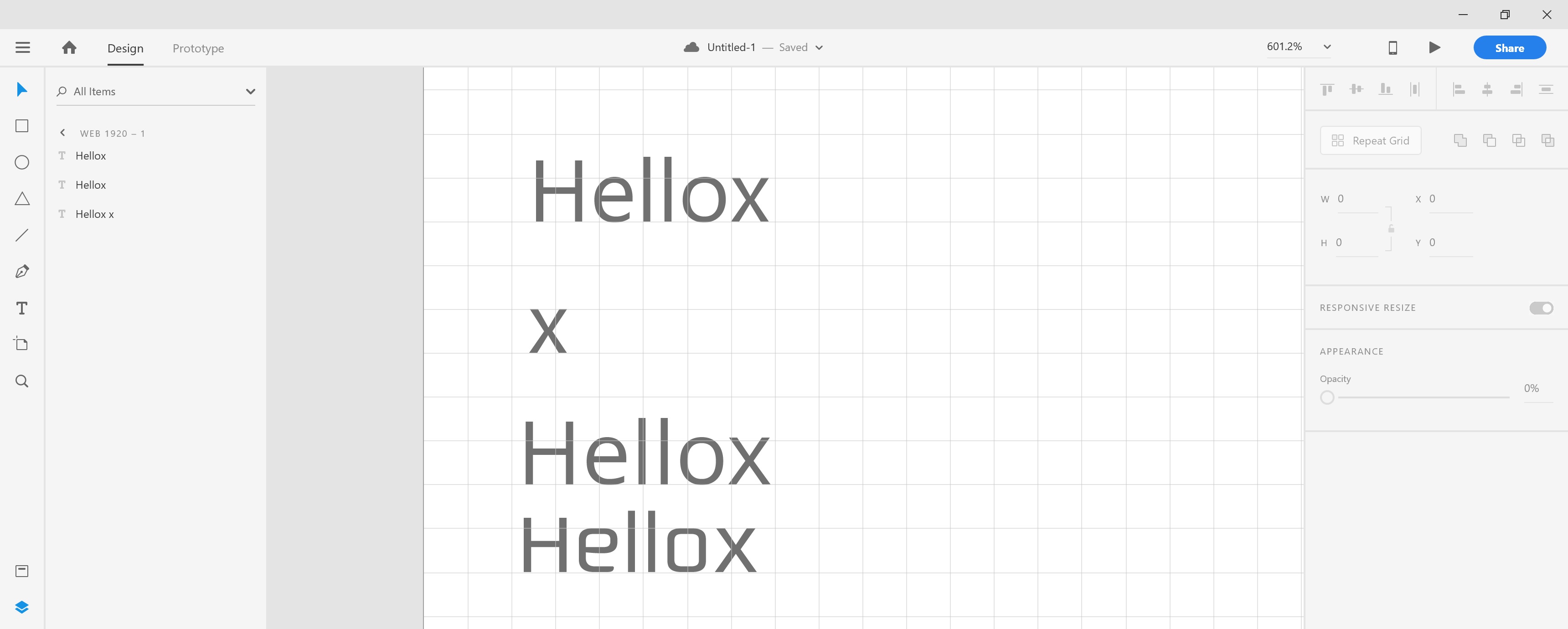
Shouldn't the x-height of my font fit inside of two of the 8px squares vertically? when I draw out a rectangle to have a height and width of 8px it fits perfectly. I'm trying to encompass the 8pt grid system in my design.
 1 Correct answer
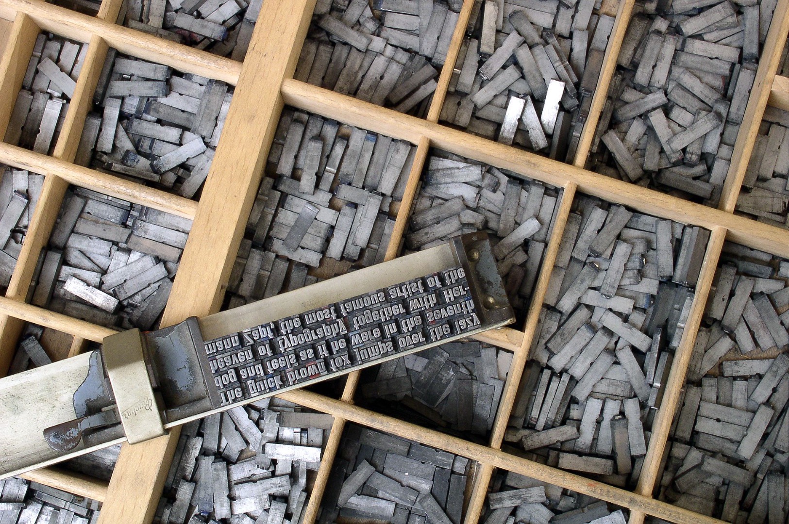
The pixel or point size of a font historically stands for the height of the wooden or metal-cast block, enclosing the height of all possible characters of that font. So the x-height is just loosely related to the font size, because it's up to the designer of the font how relatively larger or smaller the font will appear. Some fonts take up a lot of space with their x-height, some are designed to appear smaller.
So it's just a coincidence that the x-height in the font you picked has exactly half o
...Copy link to clipboard
Copied
That's a damn good question. Please show us some screenshots as well.
Working on MacOS or Windows?
(In General: Fonts have «blind/blank» space around letters – not pixel perfect.)
Copy link to clipboard
Copied
Here is an example with a few different fonts. Again I'm using an 8px grid and a 16px font. You did bring up another question I had though which is how to get rid of that invisible padding surrounding text that effects lining up elements precisely. Also I'm using windows 10

Copy link to clipboard
Copied
What is the font face that you are using? Have you tried other fonts?
Copy link to clipboard
Copied
Please take into account the following
Approximate Conversion from Points to Pixels
(and Ems and %)
Here's a chart that converts points to pixels (and ems and %). It's an approximation, which will depend on font, browser and OS, but it's a good starting point.
| Points | Pixels | Ems | Percent |
|---|---|---|---|
| 6pt | 8px | 0.5em | 50% |
| 7pt | 9px | 0.55em | 55% |
| 7.5pt | 10px | 0.625em | 62.5% |
| 8pt | 11px | 0.7em | 70% |
| 9pt | 12px | 0.75em | 75% |
| 10pt | 13px | 0.8em | 80% |
| 10.5pt | 14px | 0.875em | 87.5% |
| 11pt | 15px | 0.95em | 95% |
| 12pt | 16px | 1em | 100% |
| 13pt | 17px | 1.05em | 105% |
| 13.5pt | 18px | 1.125em | 112.5% |
| 14pt | 19px | 1.2em | 120% |
| 14.5pt | 20px | 1.25em | 125% |
| 15pt | 21px | 1.3em | 130% |
| 16pt | 22px | 1.4em | 140% |
| 17pt | 23px | 1.45em | 145% |
| 18pt | 24px | 1.5em | 150% |
| 20pt | 26px | 1.6em | 160% |
| 22pt | 29px | 1.8em | 180% |
| 24pt | 32px | 2em | 200% |
| 26pt | 35px | 2.2em | 220% |
| 27pt | 36px | 2.25em | 225% |
| 28pt | 37px | 2.3em | 230% |
| 29pt | 38px | 2.35em | 235% |
| 30pt | 40px | 2.45em | 245% |
| 32pt | 42px | 2.55em | 255% |
| 34pt | 45px | 2.75em | 275% |
| 36pt | 48px | 3em | 300% |
Copy link to clipboard
Copied
Yes but if I make a square that is 8px width and height it fits perfectly. So I believe the grid measurement is in pixels?
Copy link to clipboard
Copied
The pixel or point size of a font historically stands for the height of the wooden or metal-cast block, enclosing the height of all possible characters of that font. So the x-height is just loosely related to the font size, because it's up to the designer of the font how relatively larger or smaller the font will appear. Some fonts take up a lot of space with their x-height, some are designed to appear smaller.
So it's just a coincidence that the x-height in the font you picked has exactly half of the font's size.
Below, you can see how the x-height varies in three fonts (Helvetica, Times, Futura) within the exact same 72 pt size:

An example of a typeset block of text:

Copy link to clipboard
Copied
Exactly - there will be variations is x-height across all font face - even within some font families.
Copy link to clipboard
Copied
So how do people use something like googles material design? How do the fonts line up perfectly? Even though the baseline is lined up properly the top lines up perfectly as well to keep a vertical rhythm with spacing.


