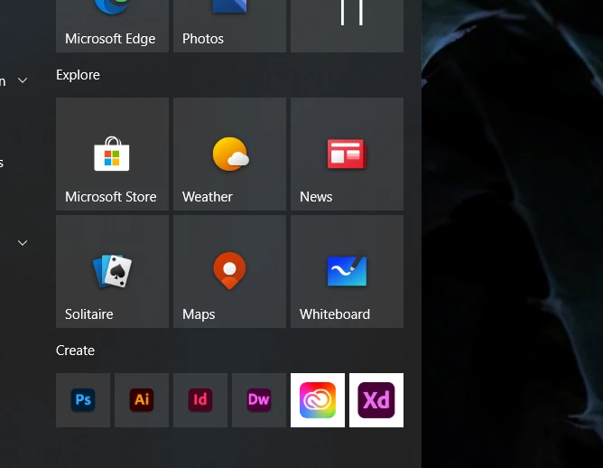
Why is the Adobe XD app icon different than other sets?
Is there a reason the Adobe XD, Fresco & Creative Cloud icons are different? They look different and not consistent with other Adobe icon sets. I'm pretty sure most if not all designers will find this annoying, can you please fix it? Maybe I'm just a bit OCD, but it's almost like a cruel joke to me. I understand that those are UWP apps, but they don't need to look out of place.

