- Startseite
- Animate
- Diskussionen
- Re: Banner not showing right on mobile and ipad
- Re: Banner not showing right on mobile and ipad
Banner not showing right on mobile and ipad
Link in Zwischenablage kopieren
Kopiert
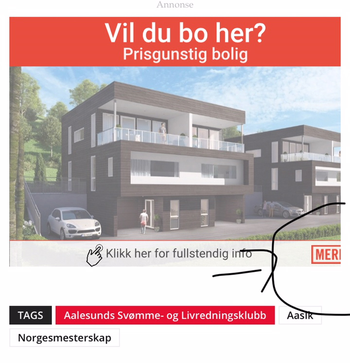
Hi I have this banner running on desktop, mobile and ipad. The banner is working fine on desktop and if I scale it the banner is responsive and scaling down when I change the size of the browser. However on mobile it cuts the banner so that it is not all shown. This also on a ipad but if I move the ipad in portrait the banner is showing it all. What can this be, can it be something with the banner or does it have to be the ad placement? 
Thanks
Lars Gravesen
Link in Zwischenablage kopieren
Kopiert
Screen shot is not enough info. Banner ads are iframes. Which ad serving platform? Did you view the source? What site did you see this behavior on? What version of Animate? Does your HTML file have this style in the body tag?
style="margin:0px;"
Link in Zwischenablage kopieren
Kopiert
You can try with
<meta name="viewport" content="width=device-width, initial-scale=1.0">
Weitere Inspirationen, Events und Ressourcen finden Sie in der neuen Adobe Community
Jetzt ansehen