Copy link to clipboard
Copied
How can I convert the following website to convert it from Flash to HTML5? Thanks.
Point by Point Myotherapy & Therapeutic Massage - Memphis, TN
 1 Correct answer
You would rebuild it in Adobe flash now called Adobe Animate using javascript instead of ActionScript 3.
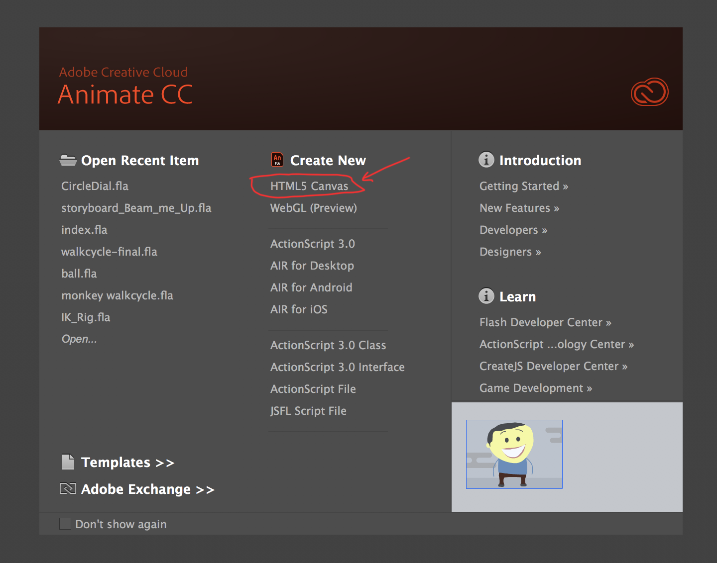
When you open Adobe Animate select HTML5 Canvas.

Also here is a tutorial on how to convert it Actionscript 3 to html5.
Animate CC | Convert ActionScript 3 Projects to HTML5/JavaScript - YouTube
Copy link to clipboard
Copied
You would rebuild it in Adobe flash now called Adobe Animate using javascript instead of ActionScript 3.
When you open Adobe Animate select HTML5 Canvas.

Also here is a tutorial on how to convert it Actionscript 3 to html5.
Animate CC | Convert ActionScript 3 Projects to HTML5/JavaScript - YouTube
Copy link to clipboard
Copied
My advice: Don't. Navigation buttons should not make click-clunk click-clunk click-clunk noises when rolled over, and even the green popover animations are pretty obnoxious. The whole thing could be replaced with some CSS. And that huge "Over 30 years experience yadda yadda" banner just chews up vertical screen space. It should only be on the Home or About screens. Constant peripheral animation has long been recognized as bad web design, because it distracts the eye.
Find more inspiration, events, and resources on the new Adobe Community
Explore Now