 Adobe Community
- Home
- Animate
- Discussions
- Re: How can I make my Animate CC's 'Canvas' output...
- Re: How can I make my Animate CC's 'Canvas' output...

Copy link to clipboard
Copied
I want my animation to fill the full screen and when the page is resizing it remains centered horizontally and vertically like an image or a video with background-size:cover. Any idea for the output javascript?


 1 Correct answer

CANVAS tag is same like VIDEO tag. Use CSS for CANVAS without checking Make Responsive. VIDEO 800x600 = CANVAS 800x600 = IMG 800x600
 3
Replies
3
3
Replies
3

Copy link to clipboard
Copied
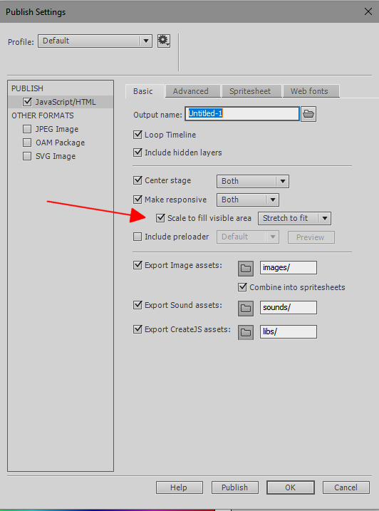
check the publish settings options you want:
Copy link to clipboard
Copied
!Thank you for your answer kglad but it doesn't help me because I don't want my animation to be responsive. I need that my canvas react exactly the same as a video or an image with background-size:cover. On mobile, the canvas is the same size but horizontally and vertically centered.
In CSS it would be this:
#animation_container { width: 100vw; height: 100vh;}
#canvas {
position: absolute;
top: 50%;
left: 50%;
transform: translate(-50%, -50%);
-webkit-transform: translate(-50%, -50%);
-ms-transform: translate(-50%, -50%);
min-height: 100%;
min-width: 100%;
}
But I have to generate it from Adobe Animate. So, for the moment, I have this script on the first frame of my animation but it doesn't work the way I need...
var page_body = document.getElementsByTagName("body")[0];
page_body.style.backgroundColor = "#00000";
page_body.style.overflow = "hidden";
page_body.style.position = "fixed";
var page_canvas = document.getElementsByTagName("canvas")[0];
stageWidth = page_canvas.width;
stageHeight = page_canvas.height;
var viewport = document.querySelector('meta[name=viewport]');
var viewportContent = 'width=device-width, initial-scale=1.0, minimum-scale=1.0, maximum-scale=1.0, user-scalable=0';
if (viewport === null) {
var head = document.getElementsByTagName('head')[0];
viewport = document.createElement('meta');
viewport.setAttribute('name', 'viewport');
head.appendChild(viewport);
}
viewport.setAttribute('content', viewportContent);
function onResize() {
var widthToHeight = stageWidth / stageHeight;
var newWidth = window.innerWidth;
var newHeight = window.innerHeight;
var newWidthToHeight = newWidth / newHeight;
//
if (newWidthToHeight > widthToHeight) {
newWidth = newHeight * widthToHeight;
page_canvas.style.height = newHeight + "px";
page_canvas.style.width = newWidth + "px";
} else {
newHeight = newWidth / widthToHeight;
page_canvas.style.height = newHeight + "px";
page_canvas.style.width = newWidth + "px";
}
scale = newWidthToHeight / widthToHeight;
stage.width = newWidth;
stage.height = newHeight;
page_canvas.style.marginTop = ((window.innerHeight - newHeight) / 2) + "px";
page_canvas.style.marginLeft = ((window.innerWidth - newWidth) / 2) + "px";
}
window.onresize = function () {
onResize();
}
onResize();
Copy link to clipboard
Copied
CANVAS tag is same like VIDEO tag. Use CSS for CANVAS without checking Make Responsive. VIDEO 800x600 = CANVAS 800x600 = IMG 800x600

 AdChoices