- Home
- Audition
- Discussions
- Change color of menu bars of programs.
- Change color of menu bars of programs.
Change color of menu bars of programs.
Copy link to clipboard
Copied
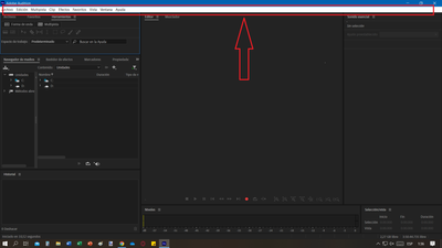
Hello! I have Adobe audition and I want to change the color of the menu bar to something darker but I can't (the white bar makes me look bad). I even switch windows to dark mode but the color of that bar is not changed. The high contrast mode allows you to change the colors of those buttons but it is not what I am looking for because with that mode everything looks very ugly.
Maybe the solution is installing a program or something but I tried everything and I couldn't. I ask the question because I always work at night and, oddly enough, that little white bar between the entire black screen makes my eyes super uncomfortable.
Copy link to clipboard
Copied
It used to be possible to alter this using Windows preferences, but apparently they removed the option, so you can't do it. And, there is no option in Audition to do it either, I'm afraid.
Copy link to clipboard
Copied
Hi,
as far as I know you only can change the Adobe Audition color and some of the Program Elements in the preferences. Hopefully there will be some Adjustments in the Future.
Henrik
Copy link to clipboard
Copied
There seems to be a few changes in Audition that are different or have even been removed. This UI decision to change the menus options to white and the dropdown contextual menus to an old Windows throwback is honestly so hideous and a strain on the eyes has to be a bug or overlooked mistake that hasn't been caught by the devs.
I say this because Audition appears to be the only app I use with a UI that took this color scheme approach with the white menu bar along with the white dropdown menu, too. In the screenshots I am providing, you'll see from Adobe SP, Adobe PS and Adobe Illustrator, none of them take this approach. With Substance Painter, you have both dark menu and dropdown. With the two apps they both have an off white top logo bar, a dark menu,and the dropdown menu is an off white.
Substance Painter has the best look in my opinion, but at least with the other two, the dark menu with the off white dropdown has a nice and constant flow. It doesn't look harsh. In fact, it actually does a great job of not bringing any attention away from our work. I hardly noticed that the dropdown was white. I couldn't remember because it still fits and doesn't look bad.
Adobe Audition's white bar completely breaks the flow of the design and is extremely harsh and distracting. It pulls my attention away from the work and the dropdown menu is just as others have mentioned, it hurts the eyes and is really ugly and out of place. I'm sorry to put it in such harsh terms but its the truth from my perspective.
It is so out of place, my first impression was that something was wrong; like the UI must not be loading correctly. Its why I googled it and ended up here. I thought maybe it was a bug or something messed up with my install.
If it seems as though I am being too harsh on my assignment; I'm honestly just trying to give constructive criticism that hopefully gets read and can be useful for the UI team to reconsider these changes because it is extremely distracting and hard to work effectively with the white logo bar, white menu AND also the white context dropdown menus.
The reason I'm addressing this is becxause it makes working in Audition for long hours tough but also because this is Adobe. We are all designer and creators subscribed and investing in a lot of money each month for a creative suite of important designing tools where our projects involve long and detailed hours of work. Consintration and a minimum amount of stress on our eyes is crucial to complete our work or meet deadlines.
Adobe is developed by people in the same industries we are. The developers here are extremely talented, and despite this small issue, I still love the products and the service here. It's really not as if this one overlooked issue detracts from the product line or how good it is. I feel like the team would be open to hearing my points because they are still trying to accommodate our needs.
My main point is this: It's appears to be a minor mistake that was simly overlooked but probably should have been caught by someone on the UI team or team leadership or head of quality control. I come to that conclusion because the UI isn't constant with rest of the product line.
I hope the Adobe team sees this and patches it with something more reasonable. I'm not asking for more custom features or anything fancy. Really, if you just bring it in line with the other UI apps, it would make many of us a lot happier because it of the negative effect on our productivity. At least for me it does, and I can't be the only one. If not, well I can still live with it because its only aesthetically unpleasent and not affecting core funtionality.
Kind Regards
A long time happy customer otherwise.
LB
Copy link to clipboard
Copied
Find more inspiration, events, and resources on the new Adobe Community
Explore Now
