

- Home
- Captivate
- Discussions
- Re: Blurry screen captures in responsive project
- Re: Blurry screen captures in responsive project
Blurry screen captures in responsive project

Copy link to clipboard
Copied
I have an elearning project that requires the use of screen captures to demonstrate a software process. Everything we produce must be mobile ready, which is why I need to use the responsive project. When published, my screen captures are clear if they are a background image. However, when I require using a screen capture as an object on stage (sometimes to overlay the existing screen cap or fading in screen captures to align with text on screen) it looks blurry or fuzzy when published. I'm viewing the published responsive project on a desktop. No scaling is occurring because the screen capture that is a background is nice and crisp. Is there a way to have a nice crisp jpeg or png in a responsive project?


 9
Replies
9
9
Replies
9
Copy link to clipboard
Copied
I don't understand, do you not use the Software sim feature, but get you screen captures with another app? Captivate works internally never with JPEG.
Which reponsive project workflow do you use: Fluid Boxes or Breakpoint Views?
Copy link to clipboard
Copied
I do sometimes use the software simulation when capturing a process, and because that automatically captures the jpeg as a background, it publishes clearly. Unfortunately, that technique does not always fit the bill. Sometimes I need to show a piece of a screen capture on a particular part of the screen or fade one on top of the other.
Captivate can publish a jpeg clearly if you import it and paste it as a background, but I cannot always do this because of the design/animation I'm creating. Is there a way to have a nice crisp jpeg or png in a responsive project?

Copy link to clipboard
Copied
You DO NOT need to go responsive just to have content on mobile devices. Thinking that being "mobile ready" means you MUST use responsive design is a common misconception and should be dispelled as often as possible. There are many situations where responsive would be a BAD idea, and your project is a case in point.
The fact that a lot of your content will rely on screenshots that are fixed graphics and would lose resolution if they were distorted or stretched is also another reason why responsive design would NOT be the best choice for your particular project. If you want captured graphics to remain crisp you need to leave them at exactly 100% of their captured size. Changing the size at all in Captivate will mean you lose resolution.
Building with responsive design will almost always add a lot of time to your project and mean you cannot create the same amount of content in a given time-frame. In short, it costs more project dollars to build responsive versus ordinary HTML5.
Copy link to clipboard
Copied
OP didn't answer my questions. Totally ahree with Rod, look at my blog post where I explain the differences between rescalable, Breakpoint views and Fluid Boxes/
Fluid Boxes Or Breakpoint Views? - Captivate blog
There are a lot more misunderstandings. Concurrent authoring tools claiming they can create reposive projects, but they mean rescalable projects or fluid projects which is not the same. Captivate marketig for CP2017 who seem to believe that everyone should only create responsive projects with Fluid Boxes, never speaking about the other possiilities.
Pesronally I would never create a software simulation as a responsive project, certainly not with screenshots.
Copy link to clipboard
Copied
I carefully chose the responsive project because of the high amount of interactive slides. I need to provide alternative layouts (optional items) and alternate text in many cases because some of my users will be taking the course on a phone. The number of screen captures is actually minimal.
My question remains: Is there a way to have a nice crisp jpeg or png in a responsive project? I understand it won't be crisp on a small device, but I should be able to achieve this when viewed on a desktop.
Copy link to clipboard
Copied
I am totally confused. Interactivity has nothing to do with responsiveness. A responsive project is a project that can be viewed on all devices: on desktop/laptop, on tablet, on smartphones. Interactivity has nothing to with that, nor accessibitily.
Both Rod and myself gave you the answer: it is pretty much impossible to have crisp bitmapt images on all screen resolutions. Especially since you are talking about software simulations: imagine how your images will look when a mobile device is switched from landscape to portrait mode? When I asked which workflow you were using: Fluid Boxes or Breakpoint Views, you didn't answer.
My suspicion is that you midunderstand the word 'responsive', reason why I sent you that link. If you rescale any bitmap image, you will always have quality loss.
Copy link to clipboard
Copied
Thanks for trying to help Lilybiri! Perhaps you've not attempted to use an interactive elearning activity on a smart phone. It can be very frustrating to users with medium to large fingers. Having alternative text when viewed on a smartphone is an industry best practice.
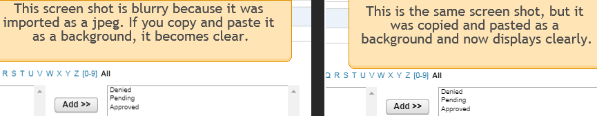
I am completely aware that you cannot scale a jpeg and expect a sharp image. What I do expect is that if you view it a the original size on a desktop, that is should be clear and sharp. In fact it is clear and sharp if it's a background image. Unfortunately when you have a jpeg on a layer vs. a background it display blurry or fuzzy.
I would love to hear from someone who works with responsive projects that has experienced this and has a fix.
thank you!
Copy link to clipboard
Copied
Fluid Boxes or Breakpoint Views????
Copy link to clipboard
Copied
I've tried both with the same result.

Find more inspiration, events, and resources on the new Adobe Community
Explore Now
 AdChoices