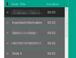
Fitting title in TOC?
I'm using Adobe Captivate 8. What should I do to get the entire title to fit into the TOC instead of resorting to a ....

Thanks
I'm using Adobe Captivate 8. What should I do to get the entire title to fit into the TOC instead of resorting to a ....

Thanks
If you remove the timings, you will have more room for the title. In addition, you can adjust the width of the table of contents. It's default is 250. I've actually bumped it up to 300 on a number of occasions. Finally, think about ways to shorten the title, for example using '&' instead of 'and', etc.
I think if you use a number of these approaches, you will find your titles fit much better.
The screenshot below shows where to adjust the width. This is a screenshot from Captivate 8 since that is what you asked about.
Hope this answers your question.
CHUCK

Already have an account? Login
Enter your E-mail address. We'll send you an e-mail with instructions to reset your password.