- Home
- Captivate
- Discussions
- Re: Line spaces changes when published
- Re: Line spaces changes when published
Line spaces changes when published
Copy link to clipboard
Copied
I am using smart shapes, specifically a rectangle. I have text within the rectangle, but when I preview or publish the line spaces changes and my words are now close or on the line of the rectangle making it hard to read. How do i prevent this? I am using Captivate 11.5.5.676.
Lisa
Copy link to clipboard
Copied
You are on a Mac. I'm sorry but I am a Windows user. This means I may not be able to help you.
Which font did you use? Is this a responsive or a non-responsive project? Did you set up a style for that shape, which includes the line spacing, font style, margins? Which Preview method did you use, especially if it is a non-responsive project? Which browser(s)?
It could help if you insert some screenshots.
Copy link to clipboard
Copied
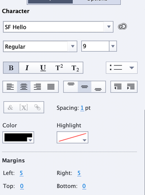
I used SF Hello, responsive project.
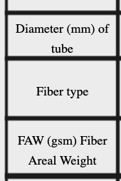
Browser is safari, but when I publish it, it looks the same. Here is before:
Here is after
I have other cells that are three lines and this causes it to go into the lines. I cannot post those contents, but this shows what it is doing.
Copy link to clipboard
Copied
Just to clarify something here:
- Are you trying to create what looks like a table in a responsive project?
- Are the lines shown in your screenshots created by borders on each of the rectangular Smart Shapes, or are the borders created by the settings for the Fluid Boxes into which the Smart Shapes are placed?
- Is the text actually added to each Smart Shape, or is the text added by another caption floating over the top of the Smart Shape?
I am asking these questions because with responsive courses there are lots of nuances to how things work and they don't usually work exactly the way you think they might.
Copy link to clipboard
Copied
Yes I am trying to make a table
They are borders of the rectangles.
The text is inside the rectangles, I am not using captions.
Basically I add a rectangle, double click on it, add the text. add another rectangle line it up, double click add the text. etc...
Copy link to clipboard
Copied
Have you enabled Uniform Text Scaling for your responsive project?
If you haven't seen this option, click your mouse in the scrap area outside the stage and then look in the Properties tab. There's a checkbox you can select. If your boxes are small you may need to reduce the setting there for Minimum Font Size down.
Even so, you are likely to find that trying to have a functional table layout in a responsive project is a futile exercise. Trying to get it to expand and contract for all different screen sizes is never going to work.
Copy link to clipboard
Copied
Thanks. I thought there may be a better soluton since I found that really old threaad. What I did was save it as another project with no table in the title. Took a screen shot of the table and replaced the table with a picture of the table. That seemed to work.
Copy link to clipboard
Copied
Using a picture of a table is a lot safer way to go in a responsive project because then the text is part of the bitmap and not going to move. But it also means your text won't be editable unless you edit the entire graphic.
Copy link to clipboard
Copied
I have no idea what you mean by 'SF Hello' project? Is it set up with Flujid Boxes, where did you get it?
Safari is not the best browser for testing Captivate output, did you try another browser like Chrome?
Alternative could be to NOT use fluid boes for the slide with the Table. In the most recent version it is possible to set up some slides without Fluid Boxes, only by using the Position Properties. That will give you some more control, but has the drawback that you don't allow Captivate to shrink width and height of boxes to reaarange the layout.
Decreasing the minimum font size to 10 or 8 pt (which I always recommend) will not prevent the resizing of the 'rectangles', only that it will take longer before the expand ison appears on smaller browser resolutions.
Get ready! An upgraded Adobe Community experience is coming in January.
Learn more

