- Home
- Captivate
- Discussions
- Re: Remove The Play button & White Screen that sho...
- Re: Remove The Play button & White Screen that sho...
Remove The Play button & White Screen that shows on mobile Adobe Captivate 2017
Copy link to clipboard
Copied
I would like to Remove The Play button & White Screen that shows on mobile devices with Adobe Captivate 2017. In desktop it's ok, because works autoplay, but on mobile not.
Copy link to clipboard
Copied
Some mobile devices and some mobile operating system version (e.g. iOS) do not allow autoplay. There may be code hacks to get around it. But the bottom line is that this is not really a Captivate issue.
If you want to read more about the interesting history of this issue:
Copy link to clipboard
Copied
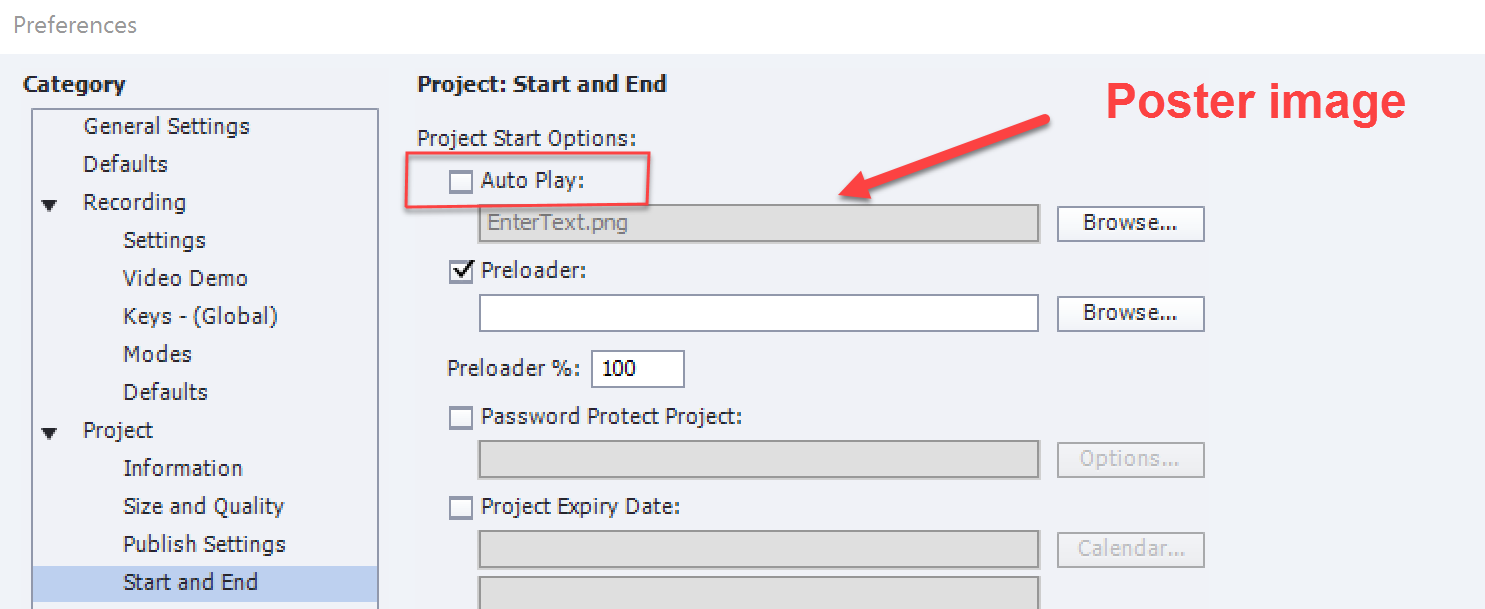
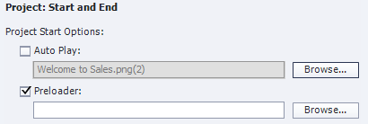
You cannot get rid of the Play button, but you can replace the white screen by a poster image:

Copy link to clipboard
Copied
Thanks Lilybiri, you have no idea how much new ideas this solution brings for my products. When I played around a bit with it I will share some stuff here.
Copy link to clipboard
Copied
Rod reply sums it up.
There are hacks to get around it, but in my experience, it then causes other issues, like audio not playing.
A more elegant solution is the change the button to a full screen button that has text that introduces the course.
Copy link to clipboard
Copied
Actually that's a great idea! I'm putting THAT one in my next book.
Copy link to clipboard
Copied
Hi! I saw your reply about a big white (video style) play button appearing on the screen (mine is not a mobile device). I have just come across the same thing, I think. Your solution was to change the button to one with text or make it full-screen and introduce the course. How would I do this?
AR
Harpers Ferry, WV
Copy link to clipboard
Copied
Did you read this blog post:
Get rid of White start screen with Black button (HTML output) - eLearning
Most embedded tutorials on my blog use that approach.
Copy link to clipboard
Copied
No, thanks for the link!!!
Copy link to clipboard
Copied
Maybe this will help somebody. You can actually replace the Play button's appearance with something of your own choice. Find the "Play_icon.png" file and change its appearance in Photoshop or similar program with something else (eg. START TEST). The file is located in the ...assets/htmlimages directory. Note! The dimensions of the icon must remain the same as original (96x96px)...
Copy link to clipboard
Copied
My approach is simiilar but sightly different. I replaced that icon by an invisible image. When I add a poster image I will have a clear indication where to click in the center of the poster image. That way it is easier to fit it in the design, and the interactivity is maintained.
Copy link to clipboard
Copied
Great idea! Thank for sharing...
Copy link to clipboard
Copied
I have found that this Play_icon.png is actually 116 px by 116 px rather than 96px by 96px
Copy link to clipboard
Copied
I have a question ... I've created a faux landing slide image (and hidden the original slide), and set this to appear at the start of the module.

However, when played (and I've only tested using the HTML5 in Browser preview option) the image is dulled like it hasn't loaded fully.

For comparison, the colours should look like this:

Any thoughts on what's causing this and/or whether there's a way to show the image properly?
Copy link to clipboard
Copied
I have the same experience, don't remember this to happen in CP9, will log a bug. Have a look at this movie: the Poster image is the same as the first slide. The difference is very celar, especially since I use a dark background:
I got feedback on my bug report. The dimming of the poster image is 'by design'. It is menat just to highlight the transparent play button provided automatically from Captivate.
Copy link to clipboard
Copied
Are the Preferences > Project > Start and End settings set to have a Fade In on the First Slide?
If so, deselect that option. It may be that the slide timeline is being paused just before the slide has completely reached 100% opacity.
Copy link to clipboard
Copied
Rod, you must have missed my answer. I never use Fade in. It is by desing: poster image is automatically dimmed to make the Play button visible (it is always black). No workaround at this moment, logged a feature request, never use that image for the play button.
Copy link to clipboard
Copied
It appears that setting is coming from ../assets/js/CPM.js file:
cp.autoplayImage.style.opacity=0.7
I have not tested, but would assume changing 0.7 to 1 would be 100% opaque as would be the case in a CSS opacity selector statement.
Having said that, the file is auto-generated (and minified) on publish and generally should not be modified unless you're comfortable with JavaScript. And, you would need to modify it every time you publish.
You may be able to override it in the CPLibraryAll.css file with !important flag and using it's HTML ID:
#autoplayImage {
opacity: 1 !important;
}
Copy link to clipboard
Copied
Thanks for that workflow. However, from what I was explained, it could be that the Play button is hidden in that case. That is nor a problem for me, because I have a workaround myself to avoid that (ugly) play button but could be a problem for the user in this thread especially if the background is dark (like the one in my movie).
Copy link to clipboard
Copied
Ah, thanks, Lieve. It would be nice to have more control over these elements in the future so we wouldn't have to do a jig every time we publish, or, in your case, create a workflow to avoid that ugly (hahaha) play button.
Copy link to clipboard
Copied
That works fine, thanks for the tip! I want to write a blog post about the workfflow for a poster image and hiding the (ugly) play button. I would like to include our tip, if you agree, but I will pay credit to you of course!
Have a look at this two short movies, published as rescalable HTML:
Copy link to clipboard
Copied
Absolutely, Lieve! You don't even need to credit me. Just happy if it can help someone in the future. Your blog posts have helped me out, tremendously, so thank you.
Copy link to clipboard
Copied
Thanks! You are becoming a great help on the forums, thanks for that. Will mention your name, I could not have found that myself being not much of a programmer. ![]()
Copy link to clipboard
Copied
Looks like the Captivate April 2018 update has forced this play button at the start of all courses now, both desktop and mobile. Has anyone found out how to get rid of this permanently yet?
I think i might be rolling back my version of Captivate.
Copy link to clipboard
Copied
Adobe has changed the default on Autoplay due to recent browser updates that have discontinued auto-playing media in web pages. Here is the post about that:
https://helpx.adobe.com/captivate/kb/captivate-responsive-courses-not-autoplay-browsers.html


