Colour difference dilemma
Copy link to clipboard
Copied
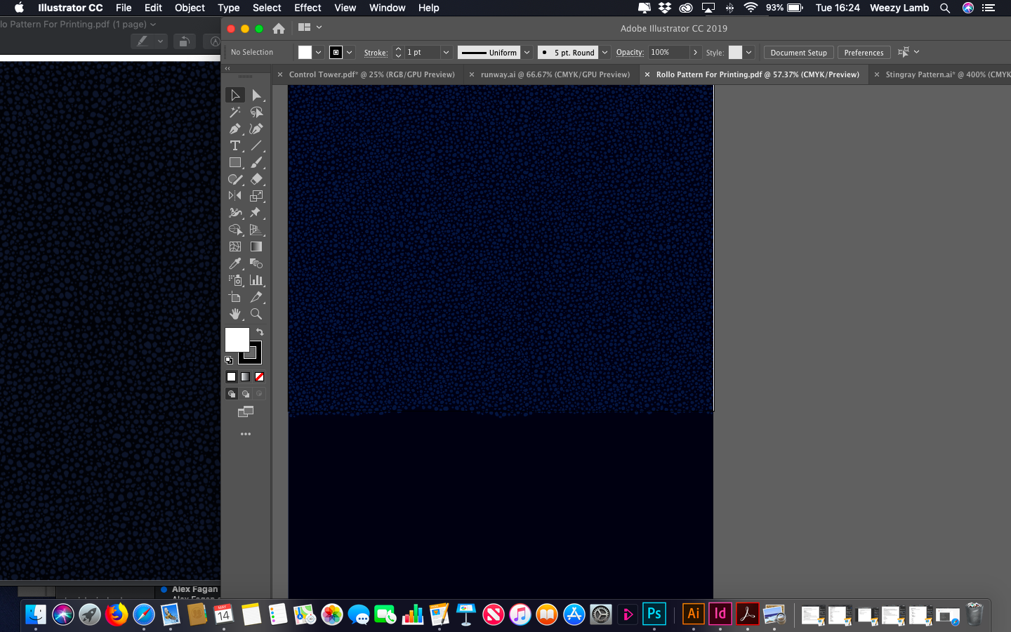
Hoping someone has a quick fix for me - On the left you see the PDF I have created opened with Preview, this is also the colour which the document prints in and matches the RGB/CMKY/Pantone colour codes correctly. On the right you see how I see the colours in Illustrator (Photoshop is the same) which is way off - I obviously need to be working with the correct output colours displaying and nothing I do seems to rectify this issue...
Thanks in advance!
PS - working on a MacBook Air
Copy link to clipboard
Copied
What you're showing here is missing color management. If you need colors to be reasonably accurate, you need to have a basic understanding of color management and color profiles.
It's not difficult. You just need to make sure that a) there is a color profile embedded in the file, b) it's an appropriate one for the intended use, and c) the color profile is correctly interpreted by the application.
In Photoshop and Illustrator you go to Color Settings, and under Policies make sure it's set to "Preserve Embedded Profiles". Then everything will be correctly handled.
If you want to see things correctly on screen, you also need a profile for that. A calibrator will make that for you.
Generic RGB/CMYK color codes are completely worthless, made by people who have absolutely no idea what they're doing. Numbers are relative to whatever color space is used! They mean nothing if color spaces aren't specified. RGB isn't a color space, but sRGB, Adobe RGB and ProPhoto RGB are. A set of numbers in one color space yields a completely different color in another - and a certain color has very different numbers in different color spaces.
The default working spaces for Photoshop and Illustrator are sRGB for RGB, and US Web Coated (SWOP) for CMYK. They don't have any particular significance, but there has to be some defaults, and these are it. So people who don't know anything about this, tend to just take these for granted, and "color codes" therefore tend to refer to sRGB and US Web Coated (SWOP).
---
The basic principle of color management is very simple. A source color space is converted/remapped into a destination color space. This recalculates the numbers in order to preserve appearance, using icc profiles to do the math. A profile is a description of a color space.
The source is usually the document, so you have a document profile, which is normally embedded in the file. The destination can be your monitor, having a monitor profile, or a printer, using a print profile that describes printer/paper/ink. All color management requires at least two profiles, one converted into the next in the pipeline.
Copy link to clipboard
Copied
Tried what you mentioned but still colors are different in illustrator and photoshop, and goes through the PDF and other programs.
kindly can you go item by item in the color setting manu to make sure I cover all the different options right.
thanks
Copy link to clipboard
Copied
The easy way to make sure color settings are the same across all Adobe softwares is to open Photoshop and set the color settings correctly in this one software and save those settings.
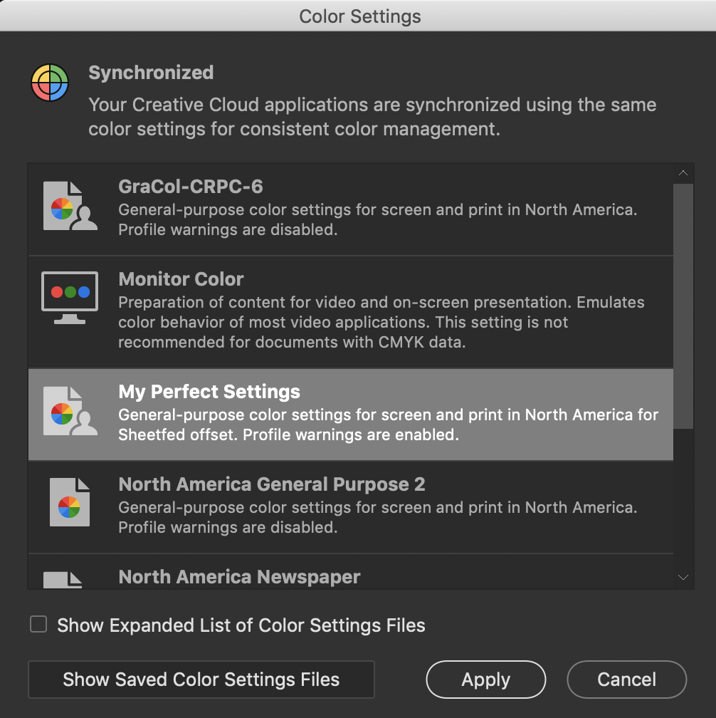
Then open Bridge and sync those settings in the color settings menu in that software.
Example:
Here are saved settings in Photoshop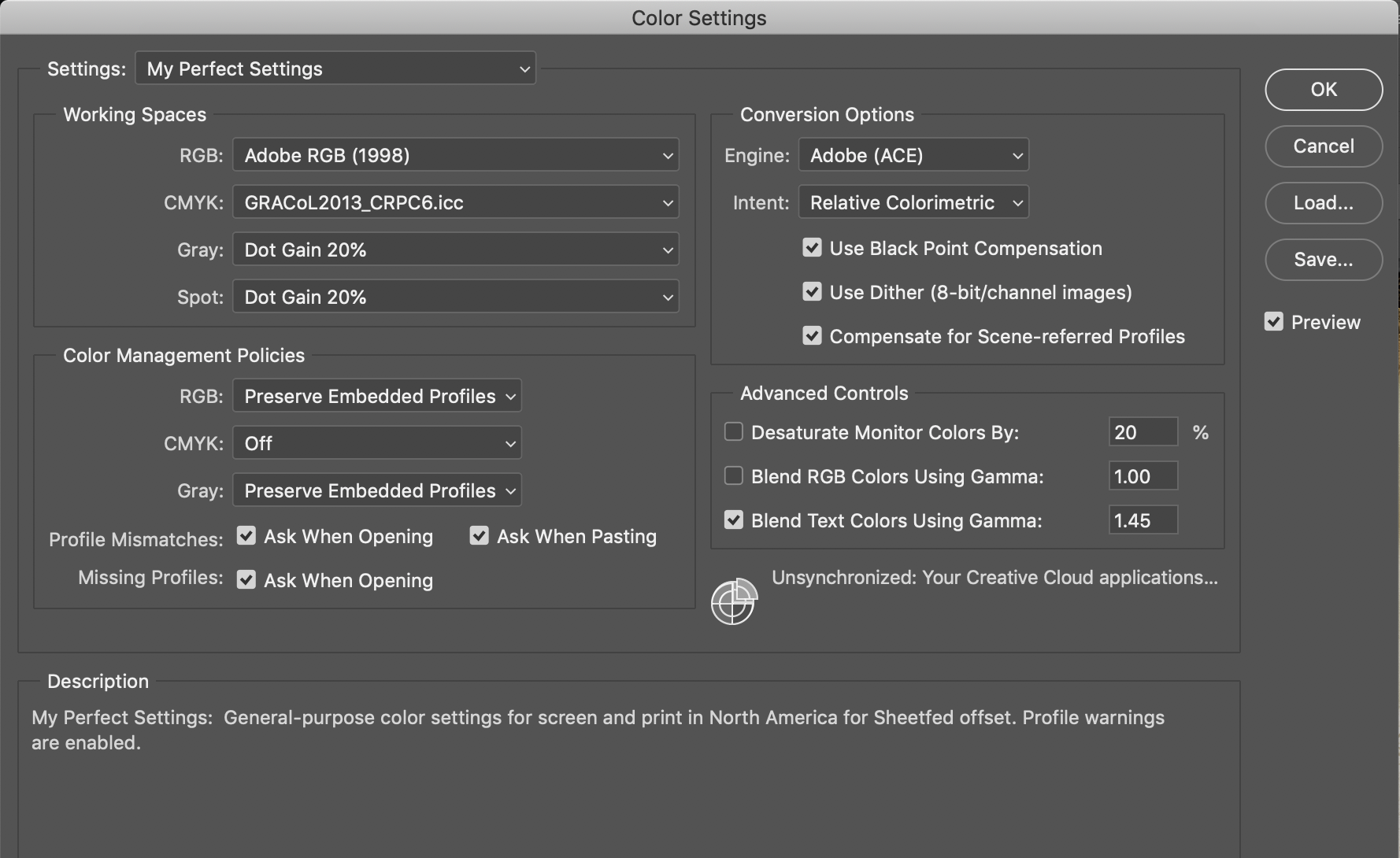
In Bridge / Edit /Color Settings, just click those settings and hit Apply
ICC programmer and developer, Photographer, artist and color management expert, Print standards and process expert.
Copy link to clipboard
Copied
same here !!
Copy link to clipboard
Copied
Also, if the mismatch is with an image from Photoshop placed in an Illustrator doc, make sure the image has an embedded profile by selecting it and checking the Links Info panel—the profile listed with Color Space should match the profile assigned to the place Photoshop file.
Copy link to clipboard
Copied
A Rob has mentioned that if the documents have embedded profiles, those profiles should be used in your workflows. All embedded profiles in your images should match. They should be viewed on the same device. If not then it may be the display profile causing the difference.
ICC programmer and developer, Photographer, artist and color management expert, Print standards and process expert.
Copy link to clipboard
Copied
kindly can you go item by item in the color setting manu to make sure I cover all the different options right.
Color Settings are your color management preferences for a new document setup—they don't necessarily affect existing documents (see my #18).
So for the Illustrator and Photoshop docs where you are seeing a color mismatch first check that both documents are in the same color mode—for Illustrator File>Document Color Mode..., and for Photoshop it’s Image>Mode. Also in Illustrator make sure the Color Type of fills and strokes is Process Color and not Spot Color. If the color modes match make sure the documents have the same assignment—Edit>Assign Profile... A document‘s profile assignment could be different than the Color Settings’ Working Space.
Copy link to clipboard
Copied
You mean the dark blue R1 G1 B5 in the left side
i don't see how any printed media could reproduce 1/1/5 as anything other than black to the naked eye
even the right side RGB 0/1/14
but whatever color you are trying troubleshoot, a solid fill may simplify
but to the visual mismatch on the screen
you must get your source profile and color settings in order
and nothing in color-managed Adobe apps will match until you:
- use (apply) the same correct source profile
- ensure your color settings are not changing your source document
at that point Adobe apps should use the embedded profile and make consistent color translations/conversions/corrections to the monitor profile
lastly, if you are using pantone spot colors in Adobe, i would expect room for error on the monitor between apps - it seems more of an art than a science to most users and not too many people know how Preview.app deals with pantone and spot colors in PDF, but if it's correct (what you want) that's a huge clue...
Copy link to clipboard
Copied
further, if your PDF is un-tagged (it does not contain an embedded ICC profile) - or objects within it have been mis-tagged or mis-converted
it will most likely not display correctly in Acrobat UNLESS Acrobat's working RGB/CMYK profile matches the document's correct color space
UNTAGGED DOCUMENTS: Acrobat will apply/assign/use its working RGB/CMYK profile for its conversion/translation/correction to the monitor space just like photoshop
i am not positive about all the Acrobat export presets, but that has been my experience
Copy link to clipboard
Copied
likewise, if your PDF is untagged - and you set up your printer to Convert to a print space ICC profile - you want to be aware of the same issue (the Source profile you are using for the conversion must be correctly assumed)
Copy link to clipboard
Copied
UNTAGGED DOCUMENTS: Acrobat will apply/assign/use its working RGB/CMYK profile for its conversion/translation/correction to the monitor space just like photoshop
The reason I brought up PDF/X is, those offset printing standards (X-1a, X-3, and X4) include an Output Intent profile, which is different than directly assigning a profile to a CMYK color object. In the OP's case, it could be the reason why OSX's Preview app isn't color managing the CMYK color as expected. It doesn't look like Preview will see a PDF/X Output Intent, but in general Preview does color manage and honor embedded profiles.
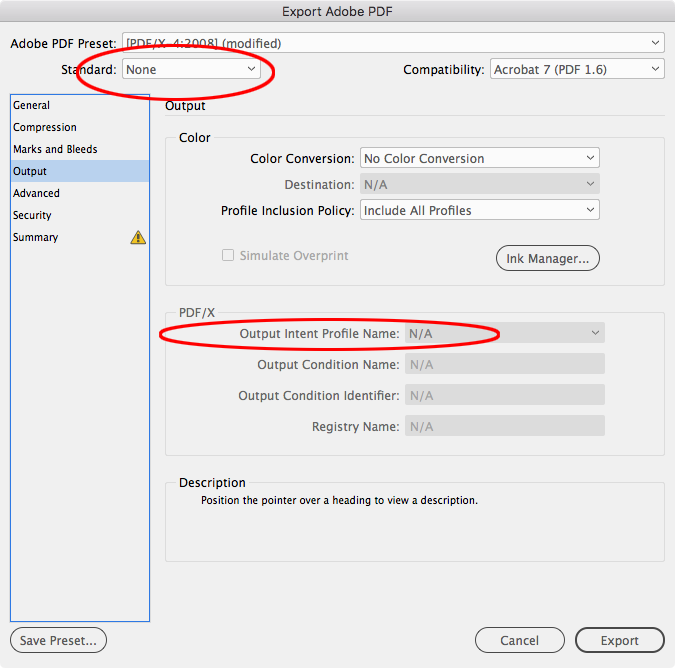
With PDF/X-4 it would be understandable to think that all color gets a profile embedded because the Export's Output tab looks like this (I’m using InDesign here):
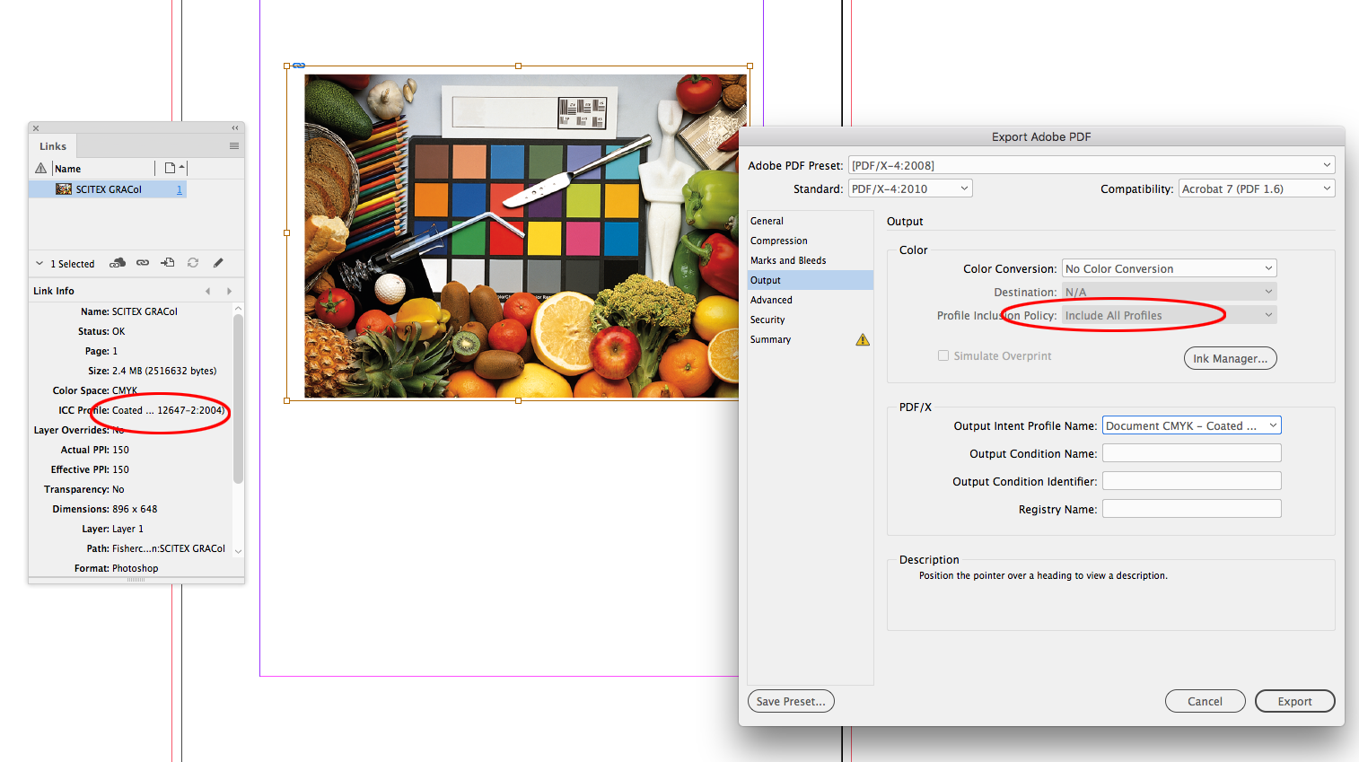
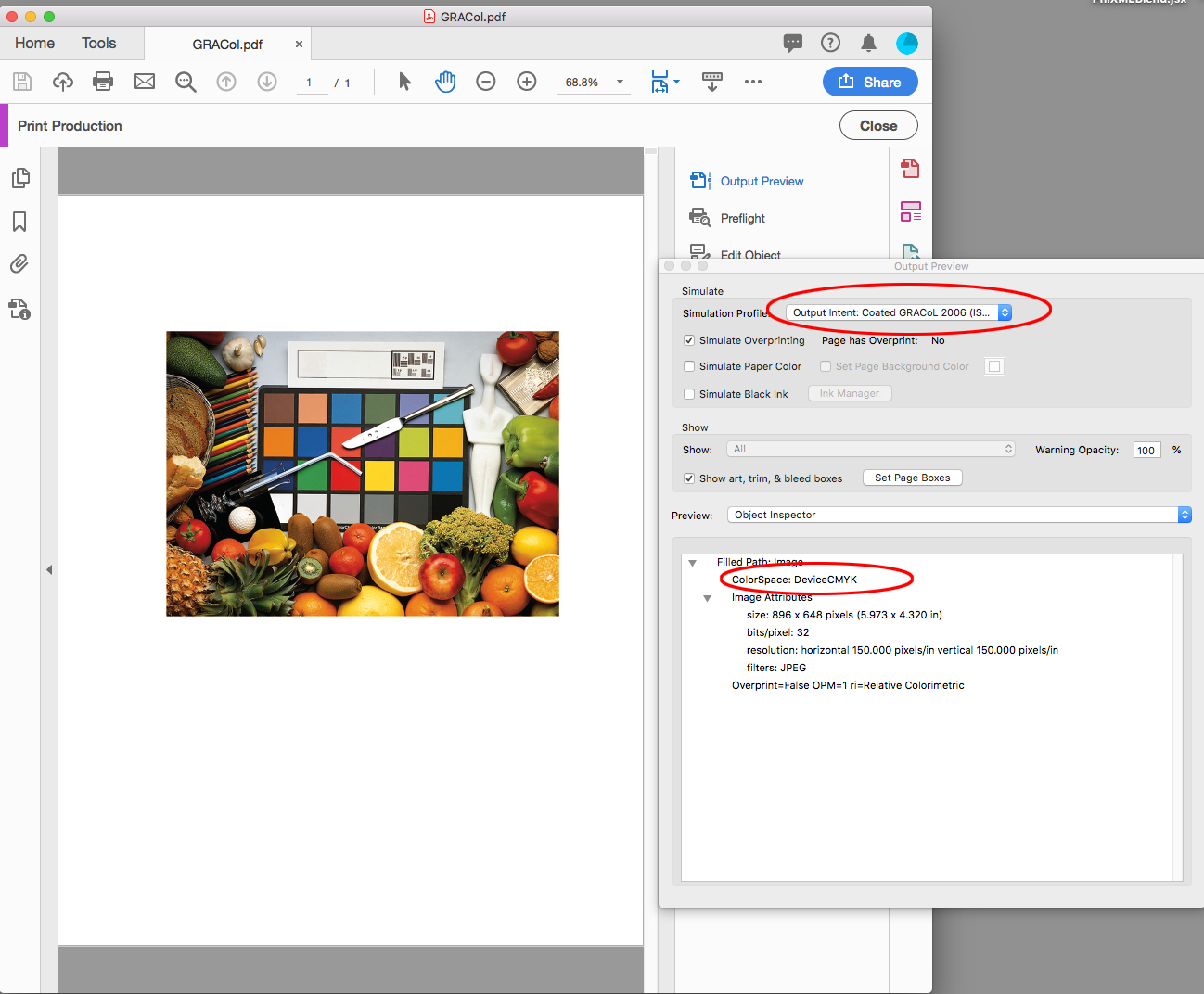
But if I use Acrobat‘s Output Preview>Object Inspector to check a document CMYK object (a CMYK object with a profile that matches the ID or AI document‘s assigned CMYK profile), I see that it is actually DeviceCMYK (no profile). The image did not get assigned the document‘s CMYK profile, because with PDF/X it is assumed that document CMYK needs no further color management. The PDF/X Standard leaves all document CMYK color as DeviceCMYK (it does tag CMYK objects with conflicting profiles).
With PDF/X, Acrobat defaults to using the Output Intent profile to preview DeviceCMYK—it doesn't necessarily use the current Color Management’s CMYK Working space, which could be different.
Copy link to clipboard
Copied
I really like that post, rob day
I don't know if I understand it all yet beyond 'profile on / profile off' (for monitor display purposes)
and for sending CMYK 'numbers' straight to the printer
but it is clear Acrobat color management takes a lot of practice and observation for most people to figure out...
Copy link to clipboard
Copied
I don't know if I understand it all yet beyond 'profile on / profile off' (for monitor display purposes)
and for sending CMYK 'numbers' straight to the printer
The PDF/X presets are designed for a separated offset press workflow. Once color has been converted to CMYK it normally shouldn't need an embedded profile for additional color managed conversions—a proper workflow shouldn't be converting to a random CMYK profile at the design stage, and then converting again to the correct destination CMYK profile somewhere downstream.
So the X Standards require an Output Intent Profile, which lets everyone know what the expected destination profile is, without actually embedding CMYK profiles. The profile isn't needed because the CMYK values should be correct and output to the plate separations unchanged.
If you set the Standard to None, there's no Output Intent profile included, and with Include All Profiles the Document CMYK objects will get a profile. The downside of None as the Standard is there could be additional, unwanted CMYK-to-CMYK conversions downstream because the correct CMYK destination not been communicated.
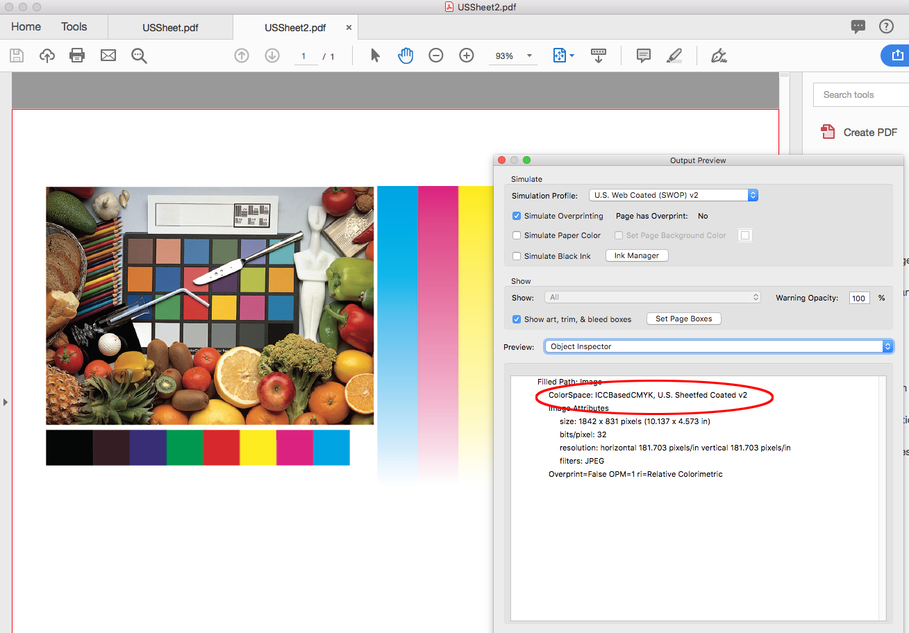
This PDF would preview the same in OSX Preview because the image is profiled
Copy link to clipboard
Copied
Thanks, by your:
>So the X Standards require an Output Intent Profile, which lets everyone know what the expected destination profile is
Output Intent Profile terminology has always confused me - compared to how Photoshop uses source and destination (which seems much more intuitive)
would your Output Intent Profile represent the document Source profile or a profile or standard based on the print space?
Copy link to clipboard
Copied
Hi gatorsoup
The Output Intent Profile identifies the expected printing process by naming a profile of that process.
as Rob wrote:
- - because with PDF/X it is assumed that document CMYK needs no further color management. The PDF/X Standard leaves all document CMYK color as DeviceCMYK (it does tag CMYK objects with conflicting profiles).
With PDF/X, Acrobat defaults to using the Output Intent profile to preview DeviceCMYK
Copy link to clipboard
Copied
https://forums.adobe.com/people/gator+soup wrote
Output Intent Profile terminology has always confused me - compared to how Photoshop uses source and destination (which seems much more intuitive)
would your Output Intent Profile represent the document Source profile or a profile or standard based on the print space?
If you are in a photographic workflow where the output is to a composite, RGB driven printer, or a screen, the conventional wisdom that all color should be profiled is true. In most cases a composite inkjet printer is going to make a final conversion of all color, including document CMYK, into the inkjet printer’s profile, which wouldn't be an offset press profile like US SWOP Coated.
But with offset printing CMYK-to-CMYK conversions at output can cause significant problems on press. Any specific CMYK builds that I made would change on a conversion, and not necessarily in a good way. Black only grays would convert to 4-color and risk color casts and registration problems on press. Primary colors like 100% cyan would likely get contaminated with K or Y percentages. Any CMYK images that I color corrected after the conversion would lose those corrections.
The PDF/X standards makes accidental CMYK-to-CMYK conversions at output very unlikely. To force the CMYK color into a different space the printer would have to knowingly intervene, and force a conversion by assigning the Output Intent as the source for the DeviceCMYK color while converting into some other space. That would be a risky move on the printer’s part because a knowledgeable client might call out the conversion—what happened to my 50% black type?—but the Output Intent Profile does make that an option.
Copy link to clipboard
Copied
Hi Rob
I appreciate the knowledge you're imparting here. Don't know if you can help with my quandary. I have an issue where I have 3 separate clients all using different custom PDF export settings and icc profiles. One has recently updated their settings (which I've added to job options) and I now cannot get InDesign to export the file - it simply fails to export. The client has now sent me icc profiles to use which they say will solve the problem but if I use them across my CC suite it will overwrite an existing profile from a previous client which we regularly use. I am frequently switching between projects for all of them and I can't see a way of switching between the icc profiles when in projects. Is that even something I can do? How do I create a consistent workspace for all three clients? Do two of them have to relent and we commit to one workspace? I don't understand why this has become such a major issue over the last year for all of them. If you could give me some insight into how I might be able to solve this that would be very much appreciated as I'd like to respond to the more recent client and be better informed myself.
Thanks in advance
Eddie
Copy link to clipboard
Copied
cyclopsdx wrote
but if I use them across my CC suite
There is absolutely no reason to do that. The whole concept of color management is that profiles follow the document, not the application.
Application color settings are defaults and policies for handling missing profiles. In a normal workflow, the document profile specifies the intent and overrides everything else.
But of course, you need to have the profiles installed on your system.
Copy link to clipboard
Copied
I have an issue where I have 3 separate clients all using different custom PDF export settings and icc profiles.
Do you need to export the same InDesign document repurposed for different client’s print conditions, or are you creating unique documents for each client?
Copy link to clipboard
Copied
No, all the documents are unique to the clients and are treated as separate projects. I sometimes find that I get a dialogue warning box telling me there are different colour profiles assigned when opening different documents and it becomes confusing and frustrating. A couple of years ago we would never encounter these issues so I can't see where I can create a consistency across the studio's workflow now. I juggling Japanese, American, European and individual corporate client profiles. It seems they're all creating different profiles and job options we have to use.
Copy link to clipboard
Copied
>>I sometimes find that I get a dialogue warning box telling me there are different colour profiles assigned when opening different documents and it becomes confusing and frustrating .. I juggling Japanese, American, European and individual corporate client profiles...
this is very simple in concept that should be crystal clear
I highly recommend you slug through my ASSIGN-CONVERT TUTORIAL Five simple steps to profile enlightenment
setting Color Management Policies to these is the first step because it takes (manual) control of the behavior and notices you of missing and mismatched profiles

Copy link to clipboard
Copied
cyclopsdx wrote
I sometimes find that I get a dialogue warning box telling me there are different colour profiles assigned when opening different documents and it becomes confusing and frustrating.
Another tutorial you should also view:
Photoshop CC's Color Settings & the Convert to Profile and Assign Profile command.
This new video covers everything you thought you wanted to know about the Photoshop Color Setting dialog. It also discusses the Convert to Profile Command and the Assign Profile Command. Photoshop CC 2017 is used in this video and it updates the video on this subject I Published on June 28, 2012.
High Rez: http://digitaldog.net/files/PhotoshopColorSettings.mp4
Low Rez (YouTube): https://www.youtube.com/watch?v=6JaHOGDK5OI
Copy link to clipboard
Copied
No, all the documents are unique to the clients and are treated as separate projects. I sometimes find that I get a dialogue warning box telling me there are different colour profiles assigned when opening different documents and it becomes confusing and frustrating.
The idea that the application's Color Settings handles the color management of existing documents is a common misconception— sync’ing your Color Settings via Bridge matches the CC applications Color Settings, but generally has no affect on existing documents.
The Color Settings are your color management preferences for documents you are about to create. Color Settings don't color manage existing documents unless those documents were created with a Color Management Policy set to Off, which in general should never be the case. The other Policiy options assign color profiles to the document when it is created, and it is the assigned profiles that handle the color management, and not the Color Settings’ Working Spaces.
I sometimes find that I get a dialogue warning box telling me there are different colour profiles assigned when opening different documents and it becomes confusing and frustrating.
So in your case all you need to do is save a companion Color Settings file that matches each client’s PDF job options, and make sure it is loaded before you create a new file for that client. In general you don't need to check the Ask When... boxes (the source of the annoying dialogs) because you are creating everything in house, and the existing documents should have been saved with the correct assignments and policies—you don't need to be warned of a conflict.
So if client A sends you a PDF .joboptions with the Output tab set like this:
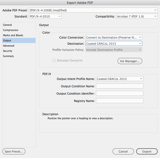
You'll want to save and load a Color Settings file with a matching CMYK Working Space profile like this before you create a new document for that client:
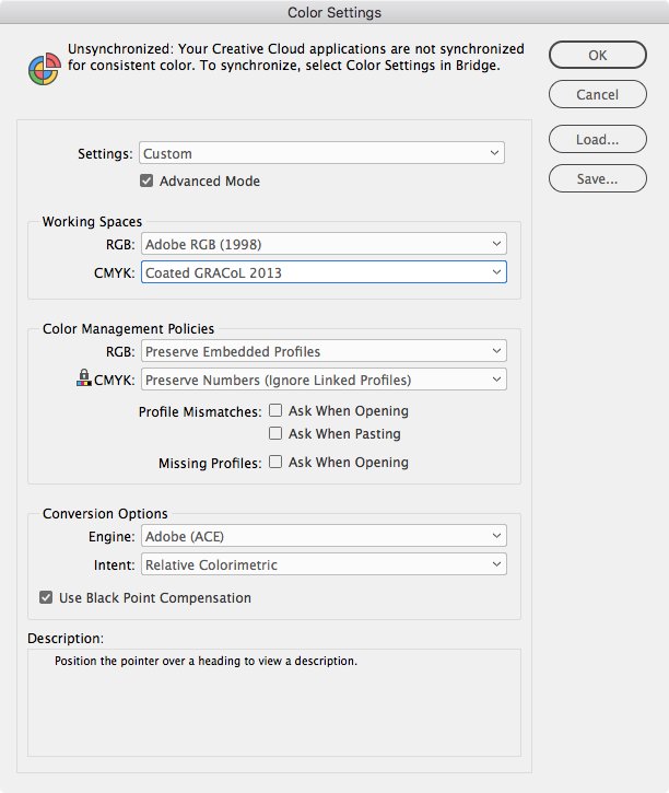
In this case because the Policies were set to Preserve..., the Working Space color profiles will be assigned and saved with the document. Anytime it is opened in the future, the assigned profiles and policies in place at creation will be used for color management—not the current Color Settings Working Spaces and Policies.
Copy link to clipboard
Copied
Thanks for all the info. A lot to read up on over the coming days. Still unsure why it's become such an issue with documents this past year. I've been successfully exporting pdfs for print for about 20 years and it's never been so convoluted.
Find more inspiration, events, and resources on the new Adobe Community
Explore Now


