

- Home
- Color Management
- Discussions
- Re: Monitor - Uncalibrated vs Calibrated - Does th...
- Re: Monitor - Uncalibrated vs Calibrated - Does th...

Copy link to clipboard
Copied
https://imgrpost.com/nosauce/?list=images&sort=date_asc&page=1
I'm new to Monitor Calibration and was wondering if I did things correctly and my calibrated monitor is displaying colors as intended. I was really disappointed with my new laptop when I noticed that everything looked really washed out, especially when viewing text with a light background. I'm happy that the calibration fixed this issue.
However...
1) There seems to be more banding when there's gradation/transition of a color
2) Windows and the Web is more colorful but the colors are darker,
3) people's skin in videos look oversaturated
I'm not sure if this is because what's meant to be expressed is being expressed more clearly or if there's something wrong with the calibration. Please note that this is a laptop display (can only control brightness) which is definitely lower quality vs a decent external monitor.
I took pictures of noticeable differences with my Pixel 1 phone camera:
https://imgrpost.com/nosauce/?list=images&sort=date_asc&page=1
- set 1 (pics 1-4): HP Website: https://store.hp.com/us/en/pdp/hp-spectre-x360-15-df0068nr
Okay, this can't be right. The color gradiation/transition in the background is very step-wise and noticeably less smooth when the display is calibrated. What's up with the rings? Is this banding? I mean the rings look ridiculous (calibrated). But is this correct? Clearly, this is not what the author intended for the end viewer. The only explanation I can think of is that the author anticipates most monitors to be crappy and uncalibrated and making these ridiculous rings is how to achieve a smooth gradation? My external monitor (VP2780-4K) is supposed to come well-calibrated the transition is much smoother. Although I can still see lines if I look close.
- set 2 (pics 5-6): Amazon background gradation, Windows taskbar icons, and FireFox browser:
I like how everything looks more distinguishable and really appreciate the clear texts. The horizontal area below the line and above the "Product description"... The transition/gradation definitely looks more blocky when the display is calibrated and smoother when its uncalibrated. The top portion of the FireFox Browser and the Windows Taskbar icon colors are darker when calibrated which sometimes make them more pronounced. But for some things the brighter colors of the uncalibrated view looks "right". What is it supposed to look like?
- set 3 (pics 7-8): Forum website: http://forum.notebookreview.com/threads/what-is-my-laptops-heatsink-made-out-of-copper-or-aluminum-c...
The calibrated view is a lot more colorful. I always thought the main writing areas were white, but it's definitely lavendar when it's calibrated. The Light greys look darker calibrated, and there's a much darker shading going on with the orange bar. Is my calibration messed up, or is that what it's supposed to look like?
- set 4 (pics 9-10): Windows Explorer
Things look more colorful calibrated, but everything looks a little darker.
- set 5 (pics 11-12): Folder images for Faststone Image Viewer
Uncalibrated looks better. It's smooth and the shading looks natural. Calibrated, you can see some lines going down and across the folders. The shading almost looks pixilated.
- set 6 (pics 13-14): Lamp shade in a Video Clip
MadVR setting is "this monitor is calibrated". It's not using 3DLUT. Again, the transition from the closer part of the bulb radiates more smoothly in the uncalibrated view. My lamp shades in-real-life looks like something in between the two. The calibrated view looks more distinct - bulb area vs non-bulb area - but the pixelation and jagged edges make things look a little unnatural.
- set 7 (pics 15-20): YouTub clip (background and person's face)
Again, smoother gradation in the uncalibrated background. This looks like banding. You can see concentric rings in the calibrated view. The shading on the person's face looks more real in the calibrated version, but there's also a blue tint.
- set 8 (pics 21-26): Examples of Skin color looking weird when calibrated (saturation?):
https://youtu.be/_xgemL_l4h0?t=24
https://youtu.be/dyWBMQvqkm4?t=21
People's skin colors in video clips (e.g. YouTube) is bizzare and unnatural - the flesh color looks pastel and the shades have a blue tone. Is this because video should be calibrated differently? (different gamma?)
Calibration information:
- i1Studio spectrometer using DisplayCAL (with black level drift compensation)
- Display: White LED backlit, LCD display - 0x0000AF06 AU Optronics, Model: 0x000030EB, AUO30EB, 12523
Gamut Coverage: 92.6% sRGB, 73.4% Adobe RGB 75.1% DCI P3
Gamut Volume 148.3% sRGB, 102.2%Adobe RGB, 105.0% DCI P3
Delta E*76: average 0.65, maximum 21.22, RMS 2.98
- Laptop: Spectre x360 - 15-df0068nr (Late 2018) - 8565U cpu, MX150 gpu
- FireFox color_management settings: profile loaded, v4 enabled, management mode = 1, rendering intent = 0
I want the red pill. I want things to look like they're supposed to look. Do they?


 1 Correct answer

Hi
This is a hard to solve issue without being in the room with the display to judge the appearance. It's impossible to tell you whether appearance is correct by looking at screenshots I'm afraid. However, that posterisation is definitely not right. We cant see what you're looking at when we look at youtube plainly, I will state though, that the skin tone does look rather saturated in the first clip. https://youtu.be/_xgemL_l4h0?t=24
IMO you should, ideally, at least as a starting point, be judg
... 10
Replies
10
10
Replies
10
Copy link to clipboard
Copied
Hi
This is a hard to solve issue without being in the room with the display to judge the appearance. It's impossible to tell you whether appearance is correct by looking at screenshots I'm afraid. However, that posterisation is definitely not right. We cant see what you're looking at when we look at youtube plainly, I will state though, that the skin tone does look rather saturated in the first clip. https://youtu.be/_xgemL_l4h0?t=24
IMO you should, ideally, at least as a starting point, be judging calibrated colour in Photoshop or at the least an application that uses colourmanagement. IF Firefox matches Photoshop, great if not it may be the settings or capabilities of Firefox.
Let me make some suggestions.
First dump the display profile you made and try again, something may have gone wrong. If you send a screenshot of the options (e.g. white point / luminance) available for calibration in your software we can perhaps suggest a starting point for you.
Posterisation is a term used to describe when smooth tones separate like the contours on a map. Its my preferred term for that issue because - what you are calling banding is a term usually reserved for when you see spurious straight lines across a print.
Anhyoo - posterisation can be a result of a calibration taking the screen's luminance and / or white point too far away from it's "native" condition.
You didn't tell us what settings you used as targets for the calibration?
When "profiling" or "calibrating" a screen it’s actually a 2 stage process where, first, a calibration table is loaded into the video card, then an ICC profile is made to characterise the calibrated display. This happens automatically. The ICC profile is used by apps like Photoshop but not by apps like the Windows image viewer and in some cases not for web content.
The calibration table can cause posterisation due to over correction - maybe that’s what's happened - I'd think that’s likely.
JUDGING CALIBRATED CONDITION
In my opinion, the only way to actually "know" that you have a correct calibrated appearance is by comparison of an image in Photoshop a good reference print. In collaboration with Pixl in Denmark, I developed a kit to aid with this: icc profile checking and verification, a simple kit from Pixl aps and colourmanagement.net | colour...
I hope this helps
if so, please do mark my reply as "helpful"
thanks
neil barstow, colourmanagement
Copy link to clipboard
Copied
Thank you for your explanations and suggestions!
I did a much longer calibration that took 5+ hours and things look better. I added white level drift compensation. The difference is unnoticeable vs the uncalibrated view but the posterization and saturation issues aren't there. I'd really like txt to appear more crisp on a white background. They look a little blurry compared to my external monitor as if the white is overpowering the black. Tinkering around with the brightness doesn't help. But I realize there may be nothing I can do about this; either because it's a laptop monitor or because Office programs may not be color managed. I went ahead and uploaded my DisplayCAL settings in case you have any suggestions:
https://imgrpost.com/album/I6co/?sort=date_asc&page=1
My laptop has two GPU’s: an integrated GPU (Intel) and a Dedicated GPU (NVidia). Most of the time it uses the iGPU. Do I need to do a different calibration for my dGPU? In which case, how would I do that? Force my computer to use dGPU for the DisplayCAL program itself?

Copy link to clipboard
Copied
First, don't expect too much from laptop displays. They are not in the same league as good desktop monitors; no matter what the manufacturers say. Most of them are TN panels at 6-bit native depth + dithering to compensate.
If you want the red pill, as you say, get an NEC or Eizo. They are expensive, but you get what you pay for.
I think Neil has a very good point above when he writes:
The calibration table can cause posterisation due to over correction - maybe that’s what's happened - I'd think that’s likely.
The thing is, these laptop panels have so many idiosyncrasies and irregularities that fully correcting it is a very tall order, and comes at a price. Banding and posterization is the first thing I'd expect.
A five hour calibration process is next to ridiculous. The more correction points, the more sharp twists and turns in the correction curves. I'd go for as few patches as possible.
Remember that all this is done in your video card, at 8-bit color depth. Then apply those corrections to a 6-bit+dithering panel, and you can see where it's headed. It accumulates and multiplies.
High-end monitors do all this in 16-bit depth internally. But in your case, you'd actually get better accuracy just profiling the display, and not calibrate it at all. That would sacrifice all your non-color managed software totally, but the color managed apps would benefit because the profile - which has much higher accuracy - would carry the whole load and do all the corrections necessary.
But in the end my advice is to get a good desktop unit.
Copy link to clipboard
Copied
Dag
I agree when you write:
"don't expect too much from laptop displays. They are not in the same league as good desktop monitors"
"If you want the red pill, as you say, get an NEC or Eizo. They are expensive, but you get what you pay for."
neil barstow, colourmanagement
Copy link to clipboard
Copied
D Fosse - A review of my external monitor (Viewsonic VP2780-4K) says...
"sRGB is the most accurate out of the box, followed by Native, which is the default mode. User Color pops up RGB sliders which allow for very accurate grayscale tracking...
The VP2780-4K comes with a factory-certified calibration supported by a complete data sheet that is unique to each sample. Our tests results matched ViewSonic’s almost exactly. You don’t need to calibrate if you use either the sRGB or Native modes. We attempted to calibrate the User mode and were rewarded with extremely accurate grayscale tracking, but then our luck ran out. We encountered gamma issues which in turn affected color saturations below 100 percent. The bottom line is that we were unable to exceed the accuracy offered by the preset picture modes. We don’t consider this a deal-breaker. The monitor is extremely precise as-delivered, and if you want greater accuracy, you can use a software LUT provided by CalMAN or the equivalent."
Does this mean to leave it on Native and just profile? Should I use Native or sRGB?
Copy link to clipboard
Copied
Calibrating monitors is a lot more technical and complicated than I thought. I think I need to do a lot more reading.
I realize laptop monitors aren't very good. But I still would like to try profiling it if it'll help because I really don't like the way things look. I realize this is harder than I thought. Am I likely to just do more harm by over-calibrating?
Either way, I think I need to just pin in it until I have more time.
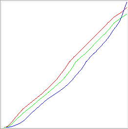
p.s. lol at the graph. Mine doesn't look as bad. But a lot worse than my external monitor.
Copy link to clipboard
Copied
Might want to also give this a try:
https://www.aardenburg-imaging.com/monitorchecker/
Copy link to clipboard
Copied
Hi Andrew
very helpful
did you have apart in formulating that image? it seems to be a good basic check for display performance.
neil barstow, colourmanagement
Copy link to clipboard
Copied
None at all.
Copy link to clipboard
Copied
Just as an illustration piece, I've kept a curve readout from a laptop calibration I once did. This wasn't even a particularly cheap laptop - it was definitely billed as "high-end" from the manufacturer. Note especially what happens near the white point. I think it speaks for itself:
Find more inspiration, events, and resources on the new Adobe Community
Explore Now
 AdChoices