

Visual representations of color spaces

Copy link to clipboard
Copied


I copied these diagrams from the program called Color Space ...
Can be downloaded from here: COULEUR.ORG
I think that it draws spectral locus on xyY by just plotting matching x, y and Y values for every interval of monochromatic lights on the spectrum ... just like we draw the locus line in XYZ by plotting matching tristimulus values X, Y and Z.
Because the underlying data for the most saturated colors human can see is CIE XYZ color matching functions, I think that we can draw the line of spectral locus in every model originated from CIE XYZ by just making necessary transformations to the XYZ tristimulus values for the intended model.
3D representation of the entire human gamut is more tricky, I think. I will ask about it, after getting your confirmation about the spectrum locus.


 11
Replies
11
11
Replies
11

Copy link to clipboard
Copied
Without further explanations these graphics are rather dubious, in my humble opinion.
http://docs-hoffmann.de/ciexyz29082000.pdf
On p.8 we can see, how XYZ is mapped onto the plane X+Y+Z=1 as coordinate system xy
by a perspective projection:
The original Y-axis is not orthogonal to the plane xy, therefore the quoted diagrams
are not correct. It's of course possible to construct a kind of substitution Y* orthogonally
to xy.
As long as we are talking about unrelated colors, like an arbitrary set of spectral light
sources with arbitrary radiant powers, the human gamut in XYZ is indeed a cone,
which has its vertex at X=Y=Z=0 and which intersects the plane X+Y+Z=1 by this
horseshoe curve (plus purple line for mixtures of extreme spectral red and blue).
About power:
http://en.wikipedia.org/wiki/Radiant_flux
"radiometric power", correctly: radiant power or radiant flux
The situation becomes different under certain circumstances where the unlimited cone is
replaced by a finite volume or by finite curves on this cone:
1) The radiant power of the spectral light sources is limited and equal, e.g. 1 Watt.
The curve on the cone shows the spectral loci. In Wyszecki&Stiles in chapter 3.3.3
in Fig. 4(3.3.3) exactly this situation is illustrated: we can see the cone, the horseshoe and
the spectral locus on the cone.
As already mentioned, this issue has been further evaluated by Jim Worthey ("amplitude
not left out" and illustrated by me and of course by himself (see references):
http://docs-hoffmann.de/jimcolor12062004.pdf
2) The volume of Optimal surface colors, concept by Roesch, as already explained.
Fig. 5(3.7) in W&S shows Y orthogonally over xy, which is not correct, but we understand
the meaning. This 'wet sack' has on top Y=100, which is the luminance of the illuminant.
3) A color space is a subset of a finite gamut volume in XYZ. There is always a white point and
nothing can become brighter than the white point. An RGB space is represented in XYZ by an
affine distorted cube. Mapping to xy delivers a triangle, but here we can see, what happens
if the "amplitude is not left out":
http://docs-hoffmann.de/ciegamut16012003.pdf
The sections Y=const. with the dark sides of the cube appear still as triangles, but the sections
with the bright sides by other polygons (p.12 for sRGB).
A threedimensional graphic would be possible, Y over xy.
Best regards --Gernot Hoffmann
Copy link to clipboard
Copied
http://docs-hoffmann.de/ciexyz29082000.pdf
On p.8 we can see, how XYZ is mapped onto the plane X+Y+Z=1 as coordinate system xy
by a perspective projection:The original Y-axis is not orthogonal to the plane xy, therefore the quoted diagrams
are not correct. It's of course possible to construct a kind of substitution Y* orthogonally
to xy.
I think that this line in these diagrams may be V(λ) in 3D space.
In place of plotting it over the spectrum axis in 2D, we plot it here over the chromaticity plane.
As the y-bar matching function is exactly same with the photopic luminous efficiency function ...
By plotting Y values over xy chromaticity diagram, I think that we indeed draw V(λ) function in 3D space, over the chromaticity plane.
Not sure, I may be wrong?
Thanks a lot for other points, but I need to think about them a little before asking additional questions 
Copy link to clipboard
Copied
I would like to ask some basic questions.
The following diagram is the Adobe RGB appearance in xyY (Color Think Pro):
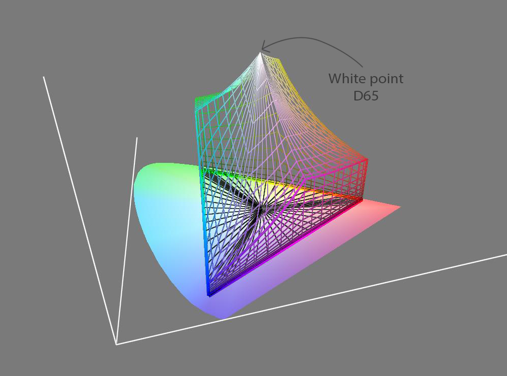
1. Does any white point conversion visually mean shifting the place of the top vertex in the graph ... and recalculating the other colors according to this shifting vertex?
2. Is the white point normal to equi-energy stimulus ... I mean an orthogonal line from the white point to the xy plane intersects the xy plane on the equi-energy point?
3. Is it possible to show the Planckian locus in xyY space?
Copy link to clipboard
Copied
Sorry for the delay, I've been travelling and pondering over your ColorThink diagram.
Here we see a diagram 3D-xyY according to Adobe:
http://dba.med.sc.edu/price/irf/Adobe_tg/models/ciexyz.html
Note that the base of this object is flat, not like a pyramide in the ColorThink diagram
(black lines).
Here we see my diagram xyY in 2D-xy with contours Y=const:
http://docs-hoffmann.de/ciegamut16012003.pdf
p.2 + p.12
Both representations are equivalent.
Now I'm trying to interprete the ColorThink graphics:
The appearance of an RGB color cube in XYZ, which is now called
XYZ-cube, is shown here:
http://docs-hoffmann.de/ciexyz29082000.pdf
p.5
Three base vectors R,G,B represent the three 'dark edges' of the XYZ-cube.
The other 9 edges are formed by linear combinations of the base vectors
like C=rR+gG+bB with special factors r,g,b, fixed 0 or 1 and in the range (0...1):
For instance
C=1R+(0...1)G is the edge from red to orange.
The XYZ-cube is an affine transformed regular cube. Straight edges of the
regular cube are mapped to straight edges of the XYZ-cube.
What we see in the ColorThink graphics is a 3D-color space which seems
to be a perspective transform of the XYZ-cube, 'erected' over the chromaticity
plane xy with Y as third coordinate. But this object does not have straight edges,
therefore it's not a perspectively mapped XYZ-cube, because perspective
mapping (like affine mapping) would have preserved straight edges. What is it?
3D-CIELab over xy? Sorry, I don't know how this object had been generated.
About the other questions:
A white point conversion is generated by varying the lengths of the base vectors
or the directions or both.
The base vectors appear in xy as 'primaries' (the nomenclature may vary).
If only the lengths of the base vectors are changed (and not their direction), then
the primaries in xy are the same.
The new white point in XYZ is achieved by Wn=Rn+Gn+Bn. If we apply previously
used factors r,g,b, the all colors are shifted automatically for the new white point.
A color with flat spectrum (in the relevant range) is called 'Equal Energy Stimulus'.
Such a spectrum does not exist for any natural or technical light. The color in XYZ
is the Equal Enery White point, which ist mapped to xy by a straight line through
this point and the point X=Y=Z=0, intersecting the plane X+Y+Z=1 in xe=ye=1/3.
The Planckian locus is a curve of chromaticities. It can be shown exactly and
by approximation for different 'correlated color temperatures' in xy:
http://docs-hoffmann.de/coltemp18102003.pdf
Obviously any arbitrary light source or illuminant doesn't have an assigned
white point in XYZ at Y=100 (Y is arbitrary). Therefore a diagramm Y over xy
wouldn't make any sense here, in my opinion. A good argument for the introduction
of the chromaticity diagram!
Now I hope, these explanations are more or less correct. I don't know how to edit
already posted contributions, therefore some errors might have been left.
Best regards --Gernot Hoffmann
Copy link to clipboard
Copied
Indeed, its bottom is flat in ColorThink as well.
It is my fault that ... the angle of the diagram is the reason why it is seen so deceptively.
For optimal colors ...
2) The volume of Optimal surface colors, concept by Roesch, as already explained.
Fig. 5(3.7) in W&S shows Y orthogonally over xy, which is not correct, but we understand
the meaning. This 'wet sack' has on top Y=100, which is the luminance of the illuminant.
Is the following page from the Bruce Lindbloom's site showing the gamuts of optimal colors?
Diagrams show the gamut (It is called as Lab Gamut by Bruce) in Lab, XYZ and xyY.
Copy link to clipboard
Copied
Thanks for the clarification - the bottom is flat, though it looks like a pyramide
(but the triangle doesn't fit AdobeRGB. The green primary should be more inside).
I'm not able to view Lindbloom's graphics because of a missing plug-in.
The human gamut in CIELab is a cone-like volume, unlimited on top. For color spaces
and for optimal object colors the volume is closed, with the white point on top.
Wyszecki & Stiles, Fig. 2(3.3.9).
The shape is not unique, it depends strongly on the illuminant.
This excellent publication shows many graphics:
Masakoa, Berns, Fairchild et al:
Number of discernible object colors is a conundrum
www.cis.rit.edu/fairchild/PDFs/PAP32.pdf
Best regards --Gernot Hoffmann
Copy link to clipboard
Copied
Thanks a lot for your time ...
Another very informative topic for me.
As a last question ... I have two gradients below, one of them drawn in sRGB and the another in ProPhoto RGB ... and their representation in xy chromaticity diagram.
They were drawn with same gradient tool settings and with the same RGB color code.
In ProPhoto, we apparently have magentas in the mid-reds as a result of curved hue lines.
I would like to ask that ... white point choice for a RGB space can lessen this shift a little bit?
I mean that ... when designing a RGB space, do those nonlinear hue lines have any effect on the choice of white point?
Can be a meaningless question

sRGB ProPhoto RGB


Copy link to clipboard
Copied
Please excuse me, your diagram for ProPhoto RGB isn't correct:
Especially we have the red primay at the rightmost tip of the horseshoe. The blue and green
primaries are mathematical constructs without any physical meaning, but this red is a spectral
color, though it cannot be reproduced by technical devices like monitors or printers.
It is even beyond the code range of CIELab in Photoshop, coordinate (a) ist clipped at 127.

Your test seems to prove, that the linear interpolation from white to red should create a considerable
magenta cast, because the trajectory hits the purple line of the sRGB triangle.
My suspicion was, that the effect were caused by gamut clipping by the monitor. Therefore I've
desaturated the monitor by 50%:

In my opinion the new gradient bar has a uniform hue, but everywhere a weak magenta tint.
One may ask: why desaturate as much as 50%? The answer is given on page 44 (top left) of
this doc:
http://docs-hoffmann.de/munsell15052009.pdf
sRGB has red for L=62 at appoximately a=60, b=70. pRGB red has to be desaturated toward
these limits. The graphic shows as well, that a pRGB red would be very far from the range of
practical colors as represented by the Munsell system.
Other considerations:
Lines of constant hue are not straight lines in CIE xyY. The constant hue curve for white to red
is bent toward the right side (somewhere shown in Hunt, Measuring Colour).
In CIELab it's a little better, but for blue we have a well-known desaster: Linear interpolation
between dark blue and gray in a plane L=const. generates halfways a magenta tint.
A white point shift (as suggested) cannot be the solution, IMHO, because these tints are local
phenomena. One could counteract by ICC-Profiles with correction tables or, more systematically,
by elaborated color appearance models, like CIECAM02.
Thanks for your always interesting questions.
Best regards --Gernot Hoffmann
Copy link to clipboard
Copied
One more, maybe more interesting than the previous one )
In the previous topic, you said that: "The colors in these diagrams are meant only symbolically. Some authors are refusing to colorize chromaticity diagrams at all."
I think that color diagrams shown in XYZ and xyY spaces are not so.
But, we have experimental data only for the colors which are on the spectral locus ... that is, we have only three columns of experimental data for X, Y, Z tristimulus values ... and all the CIE colorimetry is mainly depended upon these data and then processing of them mathematically. So, we don't have any experimental data for the colors if they are not on the spectral locus. When specifying these other colors (colors that are not on spectral locus) in XYZ and xyY diagrams, how are the "colors" of them decided?
Let me ask better my question with the help of a diagram.
I pasted the diagram of ProPhoto in xyY ... and I drawn an ellipse on it.
How is it decided that the colors in the black ellipse should be so, as shown in the diagram?
For example, can these colors not be more red than magenta? Can they not be decided so?
Maybe, my question can be expressed as ... how are the formulas of colorimetry matched with the real world colors?
Please don't spend so much time on this question, I feel that it is really very interesting 

Copy link to clipboard
Copied
A set of three numbers in xyY or XYZ defines a color.
How does it look? How can it be reproduced?
A good occasion to go back to the roots.
The CIE color system is essentially based on the work of Hermann Graßmann,
one of the greatest scientists in the 19th century [1].
Mostly his four laws are quoted [2], but it boils down to this [3]:
"The whole set of color stimuli constitutes a linear vector space,
named tristimulus space."
Colors behave like vectors in a three-dimensional space. A color is
characterized by three numbers. A fourth number would be redundant
(linearly dependent). A color is not characterized by just one spectrum. For
one color exists an arbitrary number of different spectra, called metamers.
The explanation of Graßmann's laws via spectra [4] is wrong.
Nobody knows what a color 'really' is. Acccording to the philosopher Kant,
we don't know what any object in the space 'really' is. We have just an
impression by our senses, eventually enhanced by instruments.
Colors are described by comparison with reference colors. For length and
weight we need references as well: the meter, the kilogramm.
Reference colors are (for instance) the three CIE primaries, spectral colors
with well defined wavelengths (it's not important, that the first experiments
were executed with a different set). Let's say R,G,B.
According to Graßmann one needs exactly three 'primaries'. This should
have ended a long dispute: three or four?, but it didn't.
Now we can use these spectral colors as base vectors of a coordinate system.
According to Kant, humans have an a-priori idea of space (without any proof),
where we can position objects. By intuition the axes are orthogonal.
Any other color can be described by a linear combination of the three primaries,
according to Graßmann exactly in a vector space. Color matching means:
find the three weights for the primaries to match a given (numerically unknown)
color.
Unfortunately, one needs for the matching of some colors negative weight factors,
which is possible by the concept of vector space, but somewhat disturbing for
real color mixing.
In RGB we can describe a new vector space by base vectors X,Y,Z, which form
a non-orthogonal coordinate system. All colors have non-negative coordinates X,Y,Z
and this construct has the funny feature, that luminance is identical with Y,
whereas the 'imaginary primaries' X and Z don't have luminance. Mathematically
this is not a problem.
The relation between the two spaces is given by a matrix Cxr and its Inverse:
X=(X,Y,Z)' (column vectors)
R=(R,G,B)'
X=Cxr R
R=Crx X =Cxr^-1 X
Conventionally we draw XYZ as a cartesian coordinate system (with orthogonal axes),
and R,G,B is the set of non-orthogonal base vectors – the arrangement has been swapped.
There is no natural law, which of the coordinate systems has to be shown as a cartesian.
XYZ is universal. Other RGB-systems with new primaries can be added, either as
working spaces like sRGB, aRGB or pRGB (ProPhotoRGB, which uses two non-physical
primaries, which doesn't surprise, because we got used to entirely non-physical primaries
X,Y,Z), or device RGB systems like monitor spaces. Each RGB system is related to XYZ
using a matrix, thus we can transform as well from one RGB-system to another.
Now it's possible to render a threedimensional visualization of a color space by appropriate
colors, for instance aRGB. But for a monitor these colors would be clipped almost at the
sRGB boundary.
Of course it's not possible to render pRGB correctly, because the blue and green primary
are outside the human gamut, and the red primary would be too dark. Therefore it's wise,
to use pRGB only for regions or real world colors.
There might be still an objection: the reference system contains only spectral colors.
How are the little saturated colors looking? This had been clarified by Graßmann: the vector
addition of any two colors is valid mathematically and by appearance.
These explanations may also help to end the dispute about the 'basic colors', especially
for painting. Many artists have invented their own system. The answer is simple: basic
colors are like primaries. Their location in the XYZ-space defines, which colors can be
created with positive weight factors or mixing ratios. By the way: one shouldn't worry here
about the difference between additive and subtractive color mixing.
One may have serious doubts, whether Graßmann's laws and the whole CIE colorimetry
is really valid, especially considering numerous optical illusions [5] and all these special
effects in color appearance, like Helmholtz-Kohlrausch and other nonlinearities.
It's perhaps surprising, that CIE colorimetry works so very well for image processing and
device calibration for monitors, printers and cameras.
Finally I would like to mention another scientist, which is not as popular as others,
probably because his work is mathematically difficult: Jozef B.Cohen [6].
His work has been continued by William Thornton, Michael Brill and James Worthey
(for a further search).
Best regards --Gernot Hoffmann
[1] Hermann Günther Graßmann (Grassmann)
http://en.wikipedia.org/wiki/Hermann_Grassmann
[2]
http://de.wikipedia.org/wiki/Gra%C3%9Fmannsche_Gesetze
[3] Claudio Oleari
http://www.slidefinder.net/o/oleari10/32197498/p3
(6th slide).
[4]
http://en.wikipedia.org/wiki/Grassmann%27s_law_%28optics%29
.
[5]
http://www.michaelbach.de/ot/index.html
[6]
Jozef B.Cohen
Visual Color and Color Mixture
http://books.google.de/books?id=W8QeI5di7t4C&pg=PR13&lpg=PR13&dq=cohen+color&source=bl&ots=aYGoI0I99...
Copy link to clipboard
Copied
Thank you so much ... I will reread your post later.
By the way, I have had some time for taking a glance at your last reference, "Visual Color and Color Mixture" by Cohen ...
It provides historical perspectives about some questions in my mind ... and it is available as a full text.
Thanks a lot for the link.

 AdChoices