- Home
- Creative Cloud Services
- Discussions
- Adobe Portfolio: Why is my portrait phone view pag...
- Adobe Portfolio: Why is my portrait phone view pag...
Copy link to clipboard
Copied
Hello, I'm not sure if I'll get a response, but does anybody have a workaround for the problem I'm having with Adobe Portfolio?
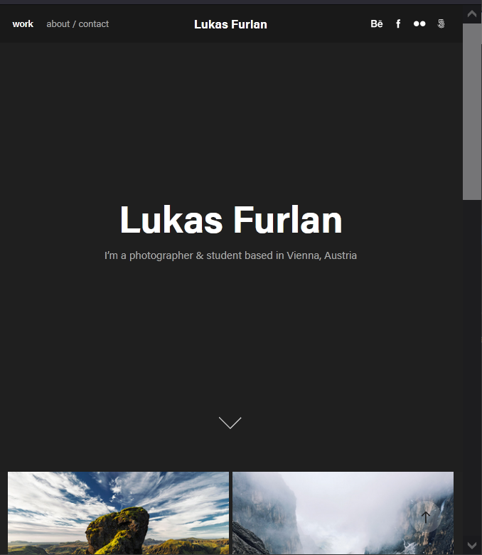
I've made my portfolio, and I'm very very happy with it. The only problem with it is, whenever I view it on my phone in portrait aspect, the opening title of my site is tiny - and I mean TINY.
I've tried all sorts of different workarounds to try and fix the problem, like increasing max-width, and increasing the font size of the title. It works great on every other preview option, except for portrait mobile. So much so that even when I turn my phone to landscape mode, the title is exactly how I want it.
But who looks at things on their phone in landscape orientation?
I know most of my traffic will primarily be via mobile users, so this is stressing me out a lil. There doesn't seem to be any way to make changes to each individual device preview. Otherwise, this would be a quick fix.
And another reason why it's annoying is the fact that the title is the only thing that seems to scale down. So it makes it so that my button and social links end up being bigger than the title. So that your eye is immediately drawn to the button or social icons instead of what I want it to be drawn to.
I'm hoping someone can help me find a solution. If it wasn't for this annoying issue, my portfolio would be 100% the way I want it.
I'm currently using the Lukas theme. I would switch to others to see if the issue remains, but I've spent soooo much time working on customising this theme that I'm reluctant to just up and switch to a different one when the problem may still remain.
Please help! Thanks 🙂
 1 Correct answer
Short answer: Smaller text is used to accommodate smaller viewports. There's not enough real estate for big text on small screens.
That's a design decision determined by your Theme's global styles. Different Themes have different styles & options. Currently there are 12 Themes to choose from. You may compare Themes and decide for yourself which Themes you like best. But all Themes are built to perform well on small, medium and large devices (aka responsive web design) out of the
...Copy link to clipboard
Copied
Sorry, No forum here... Try the several Portfolio links in https://community.adobe.com/t5/download-install-discussions/is-portfolio-still-being-developed/td-p/...
Copy link to clipboard
Copied
portfolio questions: https://help.myportfolio.com/hc/en-us/requests/new?ticket_form_id=177168
portfolio faq: https://help.myportfolio.com/hc/en-us
Copy link to clipboard
Copied
Short answer: Smaller text is used to accommodate smaller viewports. There's not enough real estate for big text on small screens.
That's a design decision determined by your Theme's global styles. Different Themes have different styles & options. Currently there are 12 Themes to choose from. You may compare Themes and decide for yourself which Themes you like best. But all Themes are built to perform well on small, medium and large devices (aka responsive web design) out of the box.
Compare Themes & Features
https://help.myportfolio.com/hc/articles/360035995733-Themes-features
https://help.myportfolio.com/hc/articles/360035496294-Comparing-themes
Copy link to clipboard
Copied
The Lukas Theme looks fine to me on small screen. Are you using a Masthead?
Copy link to clipboard
Copied
I am finding this hugely frustrating too. The UI design should not be this bad - especially coming from such a company. All my 'headings' within the theme are absolutely tiny on mobile size and the margins between content is far too large. I hate the fact there isn't any way to personlise the mobile view. The response below in regards to not having enough real estate for big text on small screens is rediculous - there is no excuse why the headings can't scale to an appropriate and legible size. People shouldn't have to just keep switching between themes to find one that works - they should all work and all be responsive and Adobe people keep claiming they are, but they aren't the minute you try to change the settings and customise your sizing of elements. Pretty poor considering how much people pay for the suite.
Copy link to clipboard
Copied
I got the EXCACT same problem. Going to switch to a different plattform soon (it is in process 🙂 ). But meanwhile: what is the solution now? switching themes? I cannot belive Adobe has such a big problem with this simple necassarity in 2024. they will loose customers (like me) if portfolio gets not updated on so many levels.
Copy link to clipboard
Copied
Portfolio links:
- FAQ & Knowledgebase - https://help.myportfolio.com/hc/
- Contact Portfolio Support - https://help.myportfolio.com/hc/requests/new?ticket_form_id=177168
Hope that helps.
Find more inspiration, events, and resources on the new Adobe Community
Explore Now


