


Copy link to clipboard
Copied
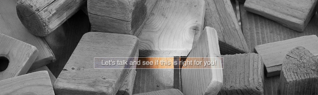
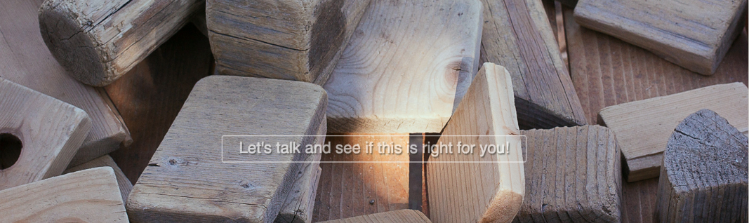
The banner image has a centered call to action (CTA) button. The CTA has a transparent background reveling the banner image. Using css I would like to change the banner image to black & white (BW). The area behind the CTA should remain in color and no affected by the banner img BW effect. Next, hovering on the CTA buttons removes the BW effect on the banner image. Can this be done with css?
http://photoshopace.com/snipets/banner-box-hover-v1.html
default banner state
banner in color on mouse hover CTA


 1 Correct answer

This is as close as I can get it. Seems to work in Firefox, Chrome - Safari has issues but it still works albeit not 100%. Don't know about anything else. It uses the clip: rect() css method, now superceeded by clip-path but that don't work in much at the moment. Is it worth the effort, no.
<!DOCTYPE html>
<html>
<head>
<meta charset="UTF-8" />
<title>Overlay Background</title>
<script src="http://code.jquery.com/jquery-1.10.2.min.js"></script>
<script>
$(document).ready(function(){
$('.overlay a').css('
...
 18
Replies
18
18
Replies
18

Copy link to clipboard
Copied
You need 2 banners -- 1 B&W, 1 full-color.
The call to action button is more problematic. You could possibly fudge it with a CSS gradient background sampled from colors in your full-color banner. See link below.
Ultimate CSS Gradient Generator - ColorZilla.com
Nancy
Copy link to clipboard
Copied
I am trying to avoid using the image swap technique because the positioning and alignment of the CTA becomes problematic when it needs to match precisely a specific area on the image. In a responsive environment this is very challenging to make it work.
Perhaps the html image map technique might work. Again, I don't think it will do well in a responsive environment.
Any other ideas?

Copy link to clipboard
Copied
To change a color image to black and white on hover, you could use the css greyscale filter -
https://www.html5rocks.com/en/tutorials/filters/understanding-css/
The main drawback of using a css filter is that it does not work in IE11 or below.
Copy link to clipboard
Copied
Polycontrast wrote
I am trying to avoid using the image swap technique...
You don't need image swaps for this. 2 background images will do what you need on hover. And no positioning is required. In fact, it's better to avoid positioning if at all possible. Not exactly what you asked for but it works on all devices,
<!doctype html>
<html>
<head>
<meta charset="utf-8">
<title>Bootstrap 3.3.7 Starter</title>
<meta name="viewport" content="width=device-width, initial-scale=1">
<meta http-equiv="X-UA-Compatible" content="IE=edge">
<!-- Latest compiled and minified Bootstrap CSS-->
<link rel="stylesheet" href="https://maxcdn.bootstrapcdn.com/bootstrap/3.3.7/css/bootstrap.min.css" integrity="sha384-BVYiiSIFeK1dGmJRAkycuHAHRg32OmUcww7on3RYdg4Va+PmSTsz/K68vbdEjh4u" crossorigin="anonymous">
<style>
.jumbotron {
background: center center;
background-image: url(http://lorempixel.com/g/1200/400/nature/6) ;
background-size: cover;
}
.jumbotron h1 {
/**fallback font-size for bad browsers**/
font-size: 20px;
/**responsive font-size for good browsers**/
font-size: 4.5vw;
color:white;
}
/**change to color image on hover**/
.jumbotron:hover { background-image: url(http://lorempixel.com/1200/400/nature/6);}
</style>
</head>
<body>
<div class="jumbotron text-center">
<h1>CALL TO ACTION TEXT GOES HERE</h1>
<a class="btn btn-lg btn-default" href="some_link.html">DETAILS</a>
</div>
<!--jQuery-->
<script src="https://code.jquery.com/jquery-1.12.2.min.js" integrity="sha256-lZFHibXzMHo3GGeehn1hudTAP3Sc0uKXBXAzHX1sjtk=" crossorigin="anonymous">
</script>
<!--Bootstrap-->
<script src="https://maxcdn.bootstrapcdn.com/bootstrap/3.3.7/js/bootstrap.min.js" integrity="sha384-Tc5IQib027qvyjSMfHjOMaLkfuWVxZxUPnCJA7l2mCWNIpG9mGCD8wGNIcPD7Txa" crossorigin="anonymous"></script>
</body>
</html>

Copy link to clipboard
Copied
There's nothing wrong with using positioning in a responsive site to do special effects when you understand how positioning works. If used correctly, positioned elements are just as responsive as anything else on the page and the code ends up hundreds, if not thousands, of lines shorter than tacking on frameworks and libraries to do something this simple.
This is what viewport units and positioning was created for.
Copy link to clipboard
Copied
I used vw units to make it responsive, it should work with any image size since the image is resized to 100% of the viewport width...
<!doctype html>
<html lang="en-us">
<head>
<meta charset="utf-8">
<meta http-equiv="X-UA-Compatible" content="IE=edge">
<meta name="viewport" content="width=device-width, initial-scale=1">
<title>Oh, that's better.</title>
<style>
*{
-moz-box-sizing:border-box;
-webkit-box-sizing:border-box;
box-sizing:border-box;
margin:0;
padding:0;
}
#banner {
width:100vw;
height:30vw;
background-image:url(images/not-hovered.png);
background-size:100vw;
}
#cta_button {
position:absolute;
top:15vw;
left:0;
right:0;
margin:0 auto;
border:2px solid white;
width:50vw;
color:white;
text-align:center;
padding:10px;
background-image:url(images/hovered.png);
background-repeat:no-repeat;
background-position:-25vw -15vw;
background-size:100vw;
cursor:pointer;
}
#cta_button:hover ~ #banner {
background-image:url(images/hovered.png);
}
#wrapper {
position:relative;
width:100vw;
}
</style>
</head>
<body>
<div id="wrapper">
<div id="cta_button">YOUR TEXT HERE</div>
<div id="banner"></div>
</div>
</body>
</html>
EDIT: Ooops, you need to have the "hovered" version of the image as the background of the CTA button. Updated the code above.
Copy link to clipboard
Copied
Thanks for all the suggestions and replays. After reviewing the suggestions I have this question. Is it possible to apply a BW filter to part of a div? Somehow programmatically mask part of the div from the filter effect?
Copy link to clipboard
Copied
There's nothing in CSS that would allow you to use the black and white filter in that way. I suppose it might be possible using javascript, but I don't know of anything that will do it off hand.
Copy link to clipboard
Copied
There is nothing in javascript that allows a css filter to be partially applied.
As is often stated in the forum, web design is not print design, and although you could apply a filter to a section of the image, it would involve 'cutting' the image into 2 seperate images, and then placing them so that they line up correctly. This may sound simple, (and used to be) but with sites now having to be viewable across multiple device viewport sizes, it is not something i would recommend without lots of testing.
Can you tell us why you wish the filter only to apply to a portion of the image?
Copy link to clipboard
Copied
Sorry Jon, the previous post was for the OP, but i mistakenly replied to your post. Sorry.
Copy link to clipboard
Copied
This is as close as I can get it. Seems to work in Firefox, Chrome - Safari has issues but it still works albeit not 100%. Don't know about anything else. It uses the clip: rect() css method, now superceeded by clip-path but that don't work in much at the moment. Is it worth the effort, no.
<!DOCTYPE html>
<html>
<head>
<meta charset="UTF-8" />
<title>Overlay Background</title>
<script src="http://code.jquery.com/jquery-1.10.2.min.js"></script>
<script>
$(document).ready(function(){
$('.overlay a').css('cursor' , 'pointer').mouseenter(function(){
$('.background_image').css({'-webkit-filter': 'none', 'filter': 'none'});
});
$('.overlay a').mouseout(function(){
$('.background_image').css({'-webkit-filter': 'grayscale(100%)', 'filter': 'grayscale(100%)'});
});
});
$(document).ready(function(){
var container_width = $(".container").css("width").replace(/[^-\d\.]/g, '');
var overlay_width = $(".overlay a").css("width").replace(/[^-\d\.]/g, '');
var y = container_width - overlay_width;
var y = y / 2;
var newwidth = + overlay_width + y;
if ($(window).width() > 481) {
$(".overlay").css('clip' , 'rect(185px,' + newwidth + 'px, 250px,' + y + 'px');
}
if ($(window).width() < 480) {
$(".overlay").css('clip' , 'rect(172px,' + newwidth + 'px, 250px,' + y + 'px');
}
});
$(document).ready(function(){
$(window).resize(function() {
var container_width = $(".container").css("width").replace(/[^-\d\.]/g, '');
var overlay_width = $(".overlay a").css("width").replace(/[^-\d\.]/g, '');
var y = container_width - overlay_width;
var y = y / 2;
var newwidth = + overlay_width + y;
if ($(window).width() > 481) {
$(".overlay").css('clip' , 'rect(185px,' + newwidth + 'px, 250px,' + y + 'px');
}
if ($(window).width() < 480) {
$(".overlay").css('clip' , 'rect(172px,' + newwidth + 'px, 250px,' + y + 'px');
}
});
});
</script>
<style>
* {
box-sizing: border-box;
}
.container {
position: relative;
height: 300px;
width: 85%;
margin: 0 auto;
max-width: 1200px;
}
@media screen and (max-width: 900px) {
.container {
width: 95%;
}
}
.background_image {
position: relative;
background-image: url(http://lorempixel.com/1200/400/nature/6/);
background-position: center center;
-webkit-filter: grayscale(1);
transition: opacity .3s ease-in-out;
-moz-transition: opacity .3s ease-in-out;
-webkit-transition: opacity .3s ease-in-out;
height: 300px;
}
.background_image:hover {
transition: opacity .3s ease-in-out;
-moz-transition: opacity .3s ease-in-out;
-webkit-transition: opacity .3s ease-in-out;
}
.overlay {
position: absolute;
z-index: 1000;
width: 100%;
height: 100%;
background-image: url(http://lorempixel.com/1200/400/nature/6/);
background-position: center center;
-webkit-filter: grayscale(0);
clip: rect(185px, auto ,250px, auto);
}
@media screen and (max-width: 480px) {
.overlay {
clip: rect(165px, 850px ,250px,250px);
}
}
.overlay span {
width: 100%;
position: absolute;
bottom: 50px;
}
.overlay a {
width: 50%;
margin: 0 auto;
display: block;
padding: 18px 0;
text-align: center;
font-family: helvetica, sans-serif;
font-size: 18px;
line-height: 25px;
color: #fff;
border: 1px solid #fff;
}
@media screen and (max-width: 900px) {
.overlay a {
width: 65%;
}
}
@media screen and (max-width: 480px) {
.overlay a {
width: 90%;
padding: 12px 20px;
}
}
</style>
</head>
<body>
<div class="container">
<div class="overlay">
<span><a>Let's talk and see if this is right for you</a></span>
</div>
<!-- end overlay -->
<div class="background_image"></div>
</div>
<!-- end container -->
</body>
</html>
Copy link to clipboard
Copied
O/K Os, +1 for you.
You have actually used a css property i have not played with. You may be interested in -
http://lab.iamvdo.me/css-svg-masks/
It does not work in any MS browsers, which maybe a problem for the OP.
only one question i will answer for myself on monday, (on ipad) when i get back home, is can it be done using calc() and @support.
Copy link to clipboard
Copied
pziecina wrote
It does not work in any MS browsers, which maybe a problem for the OP.
I had a feeling it might not play well in MS.
Not explored masks yet but obviously they are needed.
Something as simple as this shouldn't be complex to solve.
Copy link to clipboard
Copied
osgood_ wrote
Not explored masks yet but obviously they are needed.
If it was not for this discussion, I would probably never have even looked at them. A lot of the newer css one must have a use for, so until someone demonstrates a requirement people will tend to ignore them.
div vs html5 elements, float vs flexbox and design grids (eg bootstrap layout) vs css grid layouts, are examples.
Copy link to clipboard
Copied
pziecina wrote
osgood_ wrote
Not explored masks yet but obviously they are needed.
If it was not for this discussion, I would probably never have even looked at them. A lot of the newer css one must have a use for, so until someone demonstrates a requirement people will tend to ignore them.
div vs html5 elements, float vs flexbox and design grids (eg bootstrap layout) vs css grid layouts, are examples.
There's a lot out there just waiting to be discovered or that which can be used 'safely' for mainstream solutions. Probably a lot I won't ever get to use. Still its good to try and keep in touch for whatver time I have left in this field.
Copy link to clipboard
Copied
Thank you to all that contributed to this discussion. Glad to see that Dreamweaver has strong community members. The solution incorporates javasscript which is not my strength but is fine. The important point is that this complex hover effect can be achieved and can be used creatively in a web page layout.
Copy link to clipboard
Copied
I'm going to put my reputation on the line here, but depending on which browsers and devices it is important for the OP to support, and why the partial filter effect is required. It should be possible to cut the image in two, then use css grid or flexbox layouts to align the images without any problems.
Copy link to clipboard
Copied
Oh, no offense taken.
Like I mentioned, I wasn't sure if it could be done with .js and I knew the second part of your post was for the OP.
Find more inspiration, events, and resources on the new Adobe Community
Explore Now
 AdChoices