• Global community
    • Language:
      • Deutsch
      • English
      • Español
      • Français
      • Português
  • 日本語コミュニティ
    Dedicated community for Japanese speakers
  • 한국 커뮤니티
    Dedicated community for Korean speakers
Exit
0

CSS responsive table override

Contributor ,
Jun 29, 2022 Jun 29, 2022

Copy link to clipboard

Copied

I found this amazing CSS code class for a responsive table. I love it. The problem is that the media query for the mobile screen overrides other table classes I created. I tried to name the table something else, to avoid the problem. I named it ".table-lead-sheets". The first section workd perfectly, there is no override. The second section with the media query overrides the other table classes. Please advise on any suggestions.  I have the code below. It is a great asset, if I could only figure out that one bug.

 
/* 
Generic Styling, for Desktops/Laptops 
*/
.table-lead-sheets { 
  width: 60%; 
  border-collapse: collapse; 
font: normal 1.8em;
    font-family: Baskerville, "Palatino Linotype", Palatino, "Century Schoolbook L", "Times New Roman", serif;
margin-left: auto; 
  margin-right: auto;
max-width: 600px;
padding-left: 20px;
}
/* Zebra striping */
tr:nth-of-type(odd) { 
  background: #eee; 
}
th { 
  background: #333; 
  color: white; 
  font-weight: bold; 
}
td, th { 
  padding: 6px; 
  border: 1px solid #ccc; 
  text-align: center; 
}
 
 
@media 
only screen and (max-width: 760px)
 {
 
/* Force table to not be like tables anymore */
.table-lead-sheets, thead, tbody, th, td, tr { 
display: block; 
}
 
/* Hide table headers (but not display: none;, for accessibility) */
thead tr { 
position: absolute;
top: -9999px;
left: -9999px;
}
 
tr { border: 1px solid #ccc; }
 
td { 
/* Behave  like a "row" */
border: none;
border-bottom: 1px solid #eee; 
position: relative;
padding-left: 50%; 
}
 
td:before { 
/* Now like a table header */
position: absolute;
/* Top/left values mimic padding */
top: 6px;
left: 6px;
width: 45%; 
padding-right: 10px; 
white-space: nowrap;
}
/*
Label the data
*/
td:nth-of-type(1):before { content: "Model"; }
td:nth-of-type(2):before { content: "Weight"; }
td:nth-of-type(3):before { content: "Size"; }
td:nth-of-type(4):before { content: "Thickness"; }
}


Views

322

Translate

Translate

Report

Report
Community guidelines
Be kind and respectful, give credit to the original source of content, and search for duplicates before posting. Learn more
community guidelines
LEGEND ,
Jun 29, 2022 Jun 29, 2022

Copy link to clipboard

Copied

You would need to insert the table class infront of the td, th, tr. That would then target ONLY the td, th and tr in a table with the class name .table-lead-sheets - see if that helps.


.table-lead-sheets tr:nth-of-type(odd) { 

  background: #eee; 
}
.table-lead-sheets th { 
  background: #333; 
  color: white; 
  font-weight: bold; 
}
.table-lead-sheets td, .table-lead-sheets th { 
  padding: 6px; 
  border: 1px solid #ccc; 
  text-align: center; 
}
 
 
if you just use:
 
td {
blah: blah;
}
 
th {
blah: blah;
}
 
tr {
blah: blah;
}
 
that targets ALL the td and th elements in ALL tables

Votes

Translate

Translate

Report

Report
Community guidelines
Be kind and respectful, give credit to the original source of content, and search for duplicates before posting. Learn more
community guidelines
Contributor ,
Jun 29, 2022 Jun 29, 2022

Copy link to clipboard

Copied

Thanks, that worked well. The answers I saw in stackoverflow were confiusing, and did not work. One issue with your solution was that the hidden headers were suddenly exposed. I was able to hide them by leaving one of the tr tags alone and not naming it. Strange. I hope that doesn't cause any future inheritance problems. The other table looked fine though. CSS is not always logical. 

 
@media 
only screen and (max-width: 760px)
 {
 
/* Force table to not be like tables anymore */
.table-lead-sheets,.table-lead-sheets thead, .table-lead-sheets tbody, .table-lead-sheets th, .table-lead-sheets td, .table-lead-sheets tr { 
display: block; 
}
 
/* Hide table headers (but not display: none;, for accessibility) */
.table-lead-sheets thead  tr { 
position: absolute;
top: -9999px;
left: -9999px;
}
 
.table-lead-sheets tr { border: 1px solid #ccc; }
 
.table-lead-sheets td { 
/* Behave  like a "row" */
border: none;
border-bottom: 1px solid #eee; 
position: relative;
padding-left: 50%; 
}
 
.table-lead-sheets td:before { 
/* Now like a table header */
position: absolute;
/* Top/left values mimic padding */
top: 6px;
left: 6px;
width: 45%; 
padding-right: 10px; 
white-space: nowrap;
}
 
/*
Label the data*/
 
.table-lead-sheets td:nth-of-type(1):before { content: "Model"; }
.table-lead-sheets td:nth-of-type(2):before { content: "Weight"; }
.table-lead-sheets td:nth-of-type(3):before { content: "Size"; }
.table-lead-sheets td:nth-of-type(4):before { content: "Thickness"; }
 
}


Votes

Translate

Translate

Report

Report
Community guidelines
Be kind and respectful, give credit to the original source of content, and search for duplicates before posting. Learn more
community guidelines
Community Expert ,
Jun 29, 2022 Jun 29, 2022

Copy link to clipboard

Copied

If you must use tables to present spreadsheets or charts, don't use absolute positioning hacks.


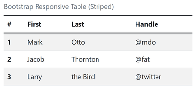
On the off chance you're using Bootstrap, use responsive & striped classes.  No added CSS required.


image.png


<table class="table caption-top responsive-table table-striped">
  <caption>Bootstrap Responsive Table (Striped)</caption>
  <thead>
    <tr>
      <th scope="col">#</th>
      <th scope="col">First</th>
      <th scope="col">Last</th>
      <th scope="col">Handle</th>
    </tr>
  </thead>
  <tbody>
    <tr>
      <th scope="row">1</th>
      <td>Mark</td>
      <td>Otto</td>
      <td>@mdo</td>
    </tr>
    <tr>
      <th scope="row">2</th>
      <td>Jacob</td>
      <td>Thornton</td>
      <td>@fat</td>
    </tr>
    <tr>
      <th scope="row">3</th>
      <td>Larry</td>
      <td>the Bird</td>
      <td>@twitter</td>
    </tr>
  </tbody>
</table>


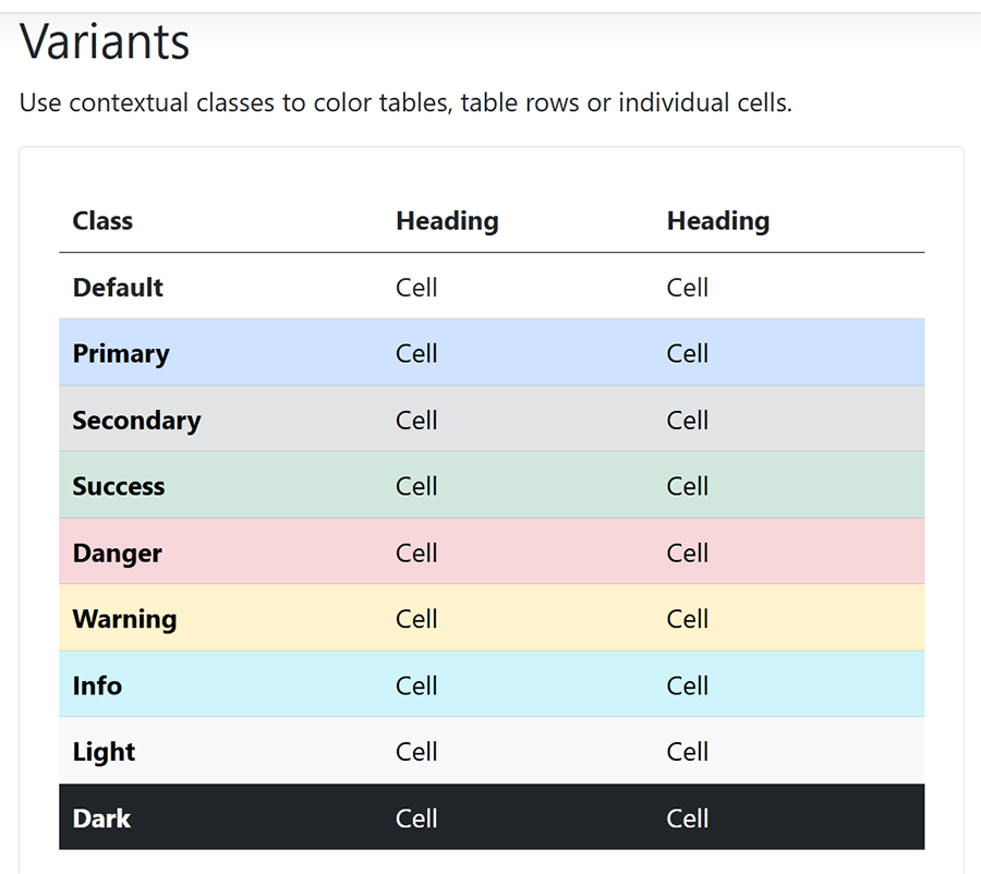
Optionally, you can change bg-colors with contextual classes.

image.png

https://getbootstrap.com/docs/5.0/content/tables/#responsive-tables


Nancy O'Shea— Product User, Community Expert & Moderator
Alt-Web Design & Publishing ~ Web : Print : Graphics : Media

Votes

Translate

Translate

Report

Report
Community guidelines
Be kind and respectful, give credit to the original source of content, and search for duplicates before posting. Learn more
community guidelines
LEGEND ,
Jun 29, 2022 Jun 29, 2022

Copy link to clipboard

Copied

quote

@Nancy OShea wrote:

If you must use tables to present spreadsheets or charts, don't use absolute positioning hacks.


The OP is obviously using a solution which labels the information vertically on small screens, not just deploying a simple table. Whether or not the solution is a good one or not is debatable. I try and avoid using tables like the plague and if and when its a necessity I don't know if I would have the desire to jump through hoops to make them fully responsible, maybe, quite possibly yes if I was doing me job properly, its not something I need to consider these days.

Votes

Translate

Translate

Report

Report
Community guidelines
Be kind and respectful, give credit to the original source of content, and search for duplicates before posting. Learn more
community guidelines
Contributor ,
Jun 29, 2022 Jun 29, 2022

Copy link to clipboard

Copied

Why is absoulte positioning bad? 

Thanks for the bootstrap table code, it looks interesting. I have also been experimenting with bootstap 3 column grids. 

Votes

Translate

Translate

Report

Report
Community guidelines
Be kind and respectful, give credit to the original source of content, and search for duplicates before posting. Learn more
community guidelines
LEGEND ,
Jun 29, 2022 Jun 29, 2022

Copy link to clipboard

Copied

LATEST
quote

Why is absoulte positioning bad? 


By @default0vaokg78cv42


Its NOT in the context that you are using it. A lot of responsive table solutions make use of absolute positioning to good effect.

Votes

Translate

Translate

Report

Report
Community guidelines
Be kind and respectful, give credit to the original source of content, and search for duplicates before posting. Learn more
community guidelines
Contributor ,
Jun 29, 2022 Jun 29, 2022

Copy link to clipboard

Copied

Thanks, Nancy, for the bootstrap table code, it looks interesting. I have also been experimenting with bootstap 3 column grids. 


Likes


Votes

Translate

Translate

Report

Report
Community guidelines
Be kind and respectful, give credit to the original source of content, and search for duplicates before posting. Learn more
community guidelines