- Home
- Dreamweaver
- Discussions
- Re: DW 19: Design View does not render pictures wi...
- Re: DW 19: Design View does not render pictures wi...
Copy link to clipboard
Copied
I have the following HTML sourcecode:
<img src="example.jpg" width="400" height="600" alt="" />
The image is rendered correctly in the design view.
Now I apply CSS to it:
img { width: 30em; height: auto; }
Result:
The value "30em" is rendered correctly, the value "auto" is ignored.
The rendered height of the picture is 600px.
How can I solve the task please?
In a browser the CSS works.
Thank you.
 1 Correct answer
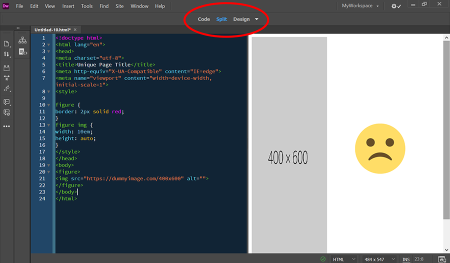
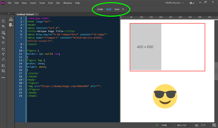
Design view is a throwback to the old Macromedia days and is NOT capable of interpreting advanced CSS level 2 and level 3 specs. That's why Live view was created. Use them both or not, your choice.
See screenshots below.
Design view:
Same code in Live view:
I can give you lots of other examples where CSS rendering is hideous or ignored in Design view.
Copy link to clipboard
Copied
Just remove the width and height from the image tag, as below. The width/height are not needed as you are defining the width and height using css:
<img href="example.jpg" alt="" />
Copy link to clipboard
Copied
Removing the width and height attributes has no effect for the described problem.
Can someone reproduce my problem?
Copy link to clipboard
Copied
Resize images to required size & optimize them for the web beforehand with Photoshop or similar raster image editor.
CSS
.img-fluid {
max-width:100%;
height: auto;
display:block;
vertical-align: baseline;
}
HTML:
<img class="img-fluid" src="https://dummyimage.com/600x400" alt="placeholder">
Copy link to clipboard
Copied
Thanks for the suggestion.
It is no option for me, because I need the width in the unit "em". And display: block does not fit my needs too.
Can you reproduce, that the value "auto" for "height" is ignored in the design view?
Copy link to clipboard
Copied
Forget about Design view. The only thing that matters is how it looks in real browsers.
What's the URL to your problem page please?
As a working example, copy & paste this into a new, blank document. Save and preview in browser.
<!doctype html>
<html lang="en">
<head>
<meta charset="utf-8">
<title>Unique Page Title</title>
<meta http-equiv="X-UA-Compatible" content="IE=edge">
<meta name="viewport" content="width=device-width, initial-scale=1">
<style>
body {
background: #555;
width: 80%;
color: #EAEAEA;
margin: 0 auto;
}
.img-fluid {
max-width: 100%;
height: auto;
vertical-align: baseline;
}

.img-full-size {
width: 100%;
height: auto;
vertical-align: baseline;
}
</style>
</head>
<body>
<nav>NAVIGATION GOES HERE</nav>
<header>
<h1>My Awesome Website</h1>
<h2>Some Pithy Slogan...</h2>
</header>
<hr>
<main>
<h3>Image Fluid (no distortion)</h3>
<img class="img-fluid" src="https://dummyimage.com/600x400" alt="placeholder">

<h3>Image Full-size (distorted)</h3>
<img class="img-full-size" src="https://dummyimage.com/600x400" alt="placeholder">
<p>Lorem ipsum dolor sit amet, consectetur adipisicing elit. Nemo optio porro velit, accusamus, consequuntur architecto! Explicabo ipsa cupiditate provident. Illum, aut, commodi? Voluptates</p>
</main>
<hr>
<footer> Footer goes here... </footer>
</body>
</html>
Copy link to clipboard
Copied
The design view is for me the main feature why I use DW.
When you don't use it and when it is not important for you I respect that of course.
I need a solution for Design View and the ignored value "height".
The code of my minimal test case:
<!doctype html>
<html>
<head>
<meta charset="utf-8">
<title>Unique Page Title</title>
<style>img { width: 10em; height: auto; }</style>
</head>
<body>
<figure><img src="https://dummyimage.com/400x600" alt=""></figure>
<p>Lorem ipsum dolor sit amet, consectetur adipiscing elit. Fusce vehicula orci vitae felis congue porta.</p>
</body>
</html>
Copy link to clipboard
Copied
Design view is NOT a browser. Switch to Live view if you want a more accurate display.
But I don't think that's your problem.
AUTO does not change the height of your image. Your image is what it is natively (600px).
Try another approach. In this example, the parent container is 10em wide, the image inside it is 100% both ways.
<!doctype html>
<html lang="en">
<head>
<meta charset="utf-8">
<title>Unique Page Title</title>
<meta http-equiv="X-UA-Compatible" content="IE=edge">
<meta name="viewport" content="width=device-width, initial-scale=1">
<style>
figure {
width: 10em;
border: 2px solid red;
}
figure img {
width: 100%;
height: 100%
}
</style>
</head>
<body>
<figure>
<img src="https://dummyimage.com/400x600" alt="">
</figure>
</body>
</html>
Copy link to clipboard
Copied
Nancy, I know that Design View ist NOT a browser.
Independent of that the intended functionality of the design view is, that CSS is interpreted in the Design View.
At the moment nobody likes to confirm, that "height: auto" is ignored in the Design View. It's OK. But it would be helpful for the discussion, when someone could confirm that.
Thanks for your suggestion, I really appreciate, that you like to help me.
But I do not want to set a width to figure, but to img.
Your wrote "AUTO does not change the height of your image."
That is not true.
When you use my complete code of the last posting in a browser, you get an automatically calculated height. Depending on 1em. That is the intended function of the value "auto".
I do not say anymore, that that does not work in Design View.
You say, that I my understanding of the value is not correct.
Copy link to clipboard
Copied
Design view is a throwback to the old Macromedia days and is NOT capable of interpreting advanced CSS level 2 and level 3 specs. That's why Live view was created. Use them both or not, your choice.
See screenshots below.
Design view:
Same code in Live view:
I can give you lots of other examples where CSS rendering is hideous or ignored in Design view.
Copy link to clipboard
Copied
@Nancy OShea
Thanks for confirming, that "auto" is not interpreted.
OK, so I guess I will have to get used to using Live View sooner or later. For example, I'm bothered by the overlay of options to insert class or id.
I prefer the absence of GUI elements when editing and assigning markup - like in Design View.
Copy link to clipboard
Copied
I prefer the absence of GUI elements when editing and assigning markup - like in Design View.
===========
Use them both interchangeably. Use Design for quick editing, Live to check styles. But regardless of what you do in DW, previewing in real browsers and mobile devices is still the best way to check your work. I keep my browser open continuously and hit the F5 key to refresh after saving.
I work different.
I separate editing/markup and design. Therefore, when I edit/markup, I need "quick editing" practically exclusively. This is why I think Adobe's decision to abandon Design View is a bad one. My bad luck.
When I design, I don't edit. And for that, like you, I use the browser to check if my CSS works the way I wanted it to.
The reason for this thread was the value "auto". Now, unfortunately, I have to live with huge images in Design View. This is very annoying. My bad luck.
Copy link to clipboard
Copied
At the moment nobody likes to confirm, that "height: auto" is ignored in the Design View. It's OK. But it would be helpful for the discussion, when someone could confirm that.
I think that you have already confirmed that "height: auto" is ignored in Design View. As Nancy has stated, design view stems from a pre-CSS era and as such CSS may not be interpreted as it should while in Design View.
This brings me to ask why you would want the image to be relegated to fixed dimensions. This does not fit into the realm of responsive design where a layout adjusts to the available realestate.
Copy link to clipboard
Copied
You have misunderstood my initial posting.
There is explicitly a relative CSS value for the width.
Copy link to clipboard
Copied
There is explicitly a relative CSS value for the width.
img { width: 30em; height: auto; } It's probably another of my senior moments.
Copy link to clipboard
Copied
Not a problem at all dear Ben. I appreciate your advices a lot.
Find more inspiration, events, and resources on the new Adobe Community
Explore Now


