


Copy link to clipboard
Copied
Hi,
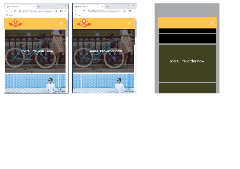
When the hamburger menu is clicked, the dropdown menu appears behind the photo.
How can I present it like the third picture?
Link
Hosun Kang


 1 Correct answer

Hosun wrote
Hi,
When the hamburger menu is clicked, the dropdown menu appears behind the photo.
How can I present it like the third picture?
Link
Hosun Kang
Remove class="logo" from the image src tag, its never needed.
<img class="logo" src="images/logo.png" alt="Roar Bikes logo">
For the mobile nav positioning you have to do a bit of re-organising at @media screen and (max-width: 500px) { }
Add to the 500px media query:
header {
flex-direction: column;
padding: 0;
}
.logo {
width: 100%;
padding
...
 8
Replies
8
8
Replies
8
Copy link to clipboard
Copied
Inside you media query for smaller screens add something like this:
.site-nav {
z-index: 99999;
}
Copy link to clipboard
Copied
in your file styles.css
/*Mobile View*/
@media screen and (max-width: 500px) {
h1 {
font-size: 25px;
}
.site-nav {
width: 100%;
right: 0;
change to
/*Mobile View*/
@media screen and (max-width: 500px) {
h1 {
font-size: 25px;
}
.site-nav {
width: 100%;
right: 0;
z-index: 99999;
So the menu will appear on top of the image ... Is that what you wanted? z-index controls the stacking order of positioned elements ...
Copy link to clipboard
Copied
Hi,
Thank you very much for your reply.
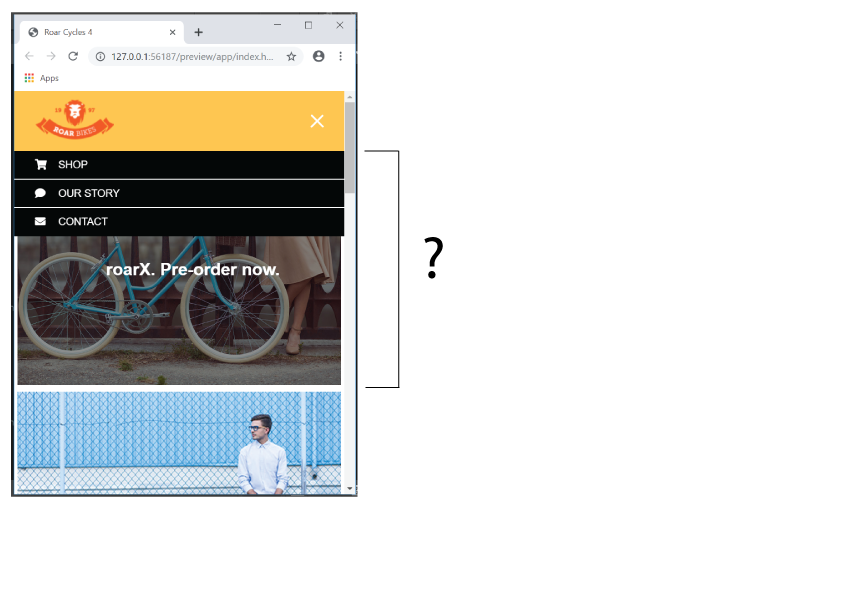
The remaining issue is the photo is partly hidden by the dropdown menu.
With the hamburger menu is clicked, I want to place the photo just below the dropdown menu.
I just guess something should be done with jQuery.
Hosun Kang

Copy link to clipboard
Copied
Z-index won't work on anythinig that is not positioned.
.site-nav {
width: 100%;
right: 0;
position: absolute;
top: 5.5em;
display: none;
background-color: black;
padding: -4px 0px 0px 0px;
z-index: 100;
}
Copy link to clipboard
Copied
Hi,
Thank you very much for your reply.
Your solution and Paul-M's solution are on the line and give the same result.
The remaining issue is the photo is partly hidden by the dropdown menu.
With the hamburger menu is clicked, I want to place the photo just below the dropdown menu.
I just guess something should be done with jQuery.
Hosun Kang

Copy link to clipboard
Copied
Maybe Bootstrap would work better than what you have now.

Copy & paste this code into a new, blank document and test it in various devices.
<!doctype html>
<html lang="en">
<head>
<meta charset="utf-8">
<meta http-equiv="X-UA-Compatible" content="IE=edge">
<meta name="viewport" content="width=device-width, initial-scale=1">
<title>Bootstrap 4.3 Starter</title>
<link rel="stylesheet" href="https://stackpath.bootstrapcdn.com/bootstrap/4.3.1/css/bootstrap.min.css" integrity="sha384-ggOyR0iXCbMQv3Xipma34MD+dH/1fQ784/j6cY/iJTQUOhcWr7x9JvoRxT2MZw1T" crossorigin="anonymous">
<style>
.navbar { /**font size grows 1px for every 100px of viewport width**/
font-size: calc(26px + 1.5vw); }
.bg-warning { background-color: orange !important; }
</style>
</head>
<body>
<nav id="topNav" class="navbar navbar-top navbar-expand-lg navbar-light bg-warning"> <a class="navbar-brand mx-auto" href="https://example.com">
<!--Your logo goes here-->
<img class="shadow-sm rounded-circle" src="https://dummyimage.com/250x110" alt="logo/brand"> </a>
<button class="navbar-toggler" type="button" data-toggle="collapse" data-target=".navbar-collapse"> <span class="navbar-toggler-icon"></span></button>
<div class="navbar-collapse collapse">
<ul class="navbar-nav ml-auto">
<li class="nav-item"><a class="nav-link" href="#">About</a></li>
<li class="nav-item"><a class="nav-link" href="#">Contact</a></li>
<li class="nav-item"><a class="nav-link" href="#">Services</a> </li>
</ul>
</div>
</nav>
<div class="jumbotron jumbotron-fluid text-center">
<h1 class="display-4">Bootstrap with Dreamweaver</h1>
<p class="lead">Easily build your page using the Bootstrap components from the Insert panel.</p>
<hr class="my-4">
<p>This is a simple hero unit, a simple jumbotron-style component for calling extra attention to featured content or information.</p>
<p class="lead"> <a class="btn btn-dark btn-lg" href="#" role="button">Learn more</a> </p>
</div>
<div class="container-fluid">
<div class="row">
<div class="col-sm-6 col-lg-3">
<h3>Text is good for search engines & humans</h3>
<img class="img-fluid" src="https://dummyimage.com/900x600" alt="placeholder">
</div>
<div class="col-sm-6 col-lg-3">
<h3>Text is good for search engines & humans</h3>
<img class="img-fluid" src="https://dummyimage.com/900x600" alt="placeholder">
</div>
<div class="col-sm-6 col-lg-3">
<h3>Text is good for search engines & humans</h3>
<img class="img-fluid" src="https://dummyimage.com/900x600" alt="placeholder">
</div>
<div class="col-sm-6 col-lg-3">
<h3>Text is good for search engines & humans</h3>
<img class="img-fluid" src="https://dummyimage.com/900x600" alt="placeholder">
</div>
</div>
<hr>
<div class="row">
<footer>Footer goes here</footer>
</div>
</div>
<!--first jQuery then popper then Bootstrap js-->
<script src="https://ajax.googleapis.com/ajax/libs/jquery/3.4.0/jquery.min.js"></script>
<script src="https://cdnjs.cloudflare.com/ajax/libs/popper.js/1.14.7/umd/popper.min.js"></script>
<script src="https://maxcdn.bootstrapcdn.com/bootstrap/4.3.1/js/bootstrap.min.js"></script>
</body>
</html>

Copy link to clipboard
Copied
Although I would normally recommend using Bootstrap, something that I would do, in this case, where you are spending a lot of time learning while creating, I would suggest not to use Bootstrap. It is the first time that I have checked a website in PageSpeed Insights where the values have been in the 90's. This is partially due to the lean code and partially because you are serving HTTP/2 - an Nginx box?. All in all, well done.
Even so, I have a few remarks, namely
- use a mobile first approach
- add a favicon
- add a language attribute
- optimise and serve scaled images
- use vanilla JS instead of jQuery
- add a viewport tag (<meta name="viewport" content="width=device-width, initial-scale=1, shrink-to-fit=no">)
To answer your question regarding the navigation bar, the problems are because of the misuse of position: absolute. This removes the element from the natural document flow.
Copy link to clipboard
Copied
Hosun wrote
Hi,
When the hamburger menu is clicked, the dropdown menu appears behind the photo.
How can I present it like the third picture?
Link
Hosun Kang

Remove class="logo" from the image src tag, its never needed.
<img class="logo" src="images/logo.png" alt="Roar Bikes logo">
For the mobile nav positioning you have to do a bit of re-organising at @media screen and (max-width: 500px) { }
Add to the 500px media query:
header {
flex-direction: column;
padding: 0;
}
.logo {
width: 100%;
padding: 10px 30px;
}
Also change your .site-nav css to as below for the 500px media query;
.site-nav {
width: 100%;
position: static;
display: none;
background-color: black;
padding: 0px 0px 0px 0px;/*alignment*/
}
position: static; re-connects the element to the natural flow of the html and pushes what is below it, the image, down when the hamburger menu is clicked. position: absolute; removes the element from the natural html flow therefore it is un-connected to the other elements around it, which is suitable for your dtp view.
Add margin-top: 30px; to your .hamburger-icon css for the 500px media query:
.hamburger-icon {
padding: 0.65em 0.35em;
position: absolute;
right: 1em;
cursor: pointer;
margin-top: 30px;
}
Find more inspiration, events, and resources on the new Adobe Community
Explore Now
 AdChoices