• Global community
    • Language:
      • Deutsch
      • English
      • Español
      • Français
      • Português
  • 日本語コミュニティ
    Dedicated community for Japanese speakers
  • 한국 커뮤니티
    Dedicated community for Korean speakers
Exit
Locked
0

How do I position an iframe in a bootstrap 5 Grid-layout?

Community Beginner ,
Aug 07, 2023 Aug 07, 2023

Copy link to clipboard

Copied

Dear all,


Currently I'm working on a (try-out) page with videos. I have two videos next to each other in an iframe, but I cannot position them properly. I want them evenly divided on the screen, not right next to each other, leaving the right side of the screen emtpy. I've searched the internet for solution and tried several, but nothing worked out properly. 

What properties can I add to the iframes besides margin:auto and display:block to center them horizontally in their column? They are responsive.

Here's a screen-image of the page:
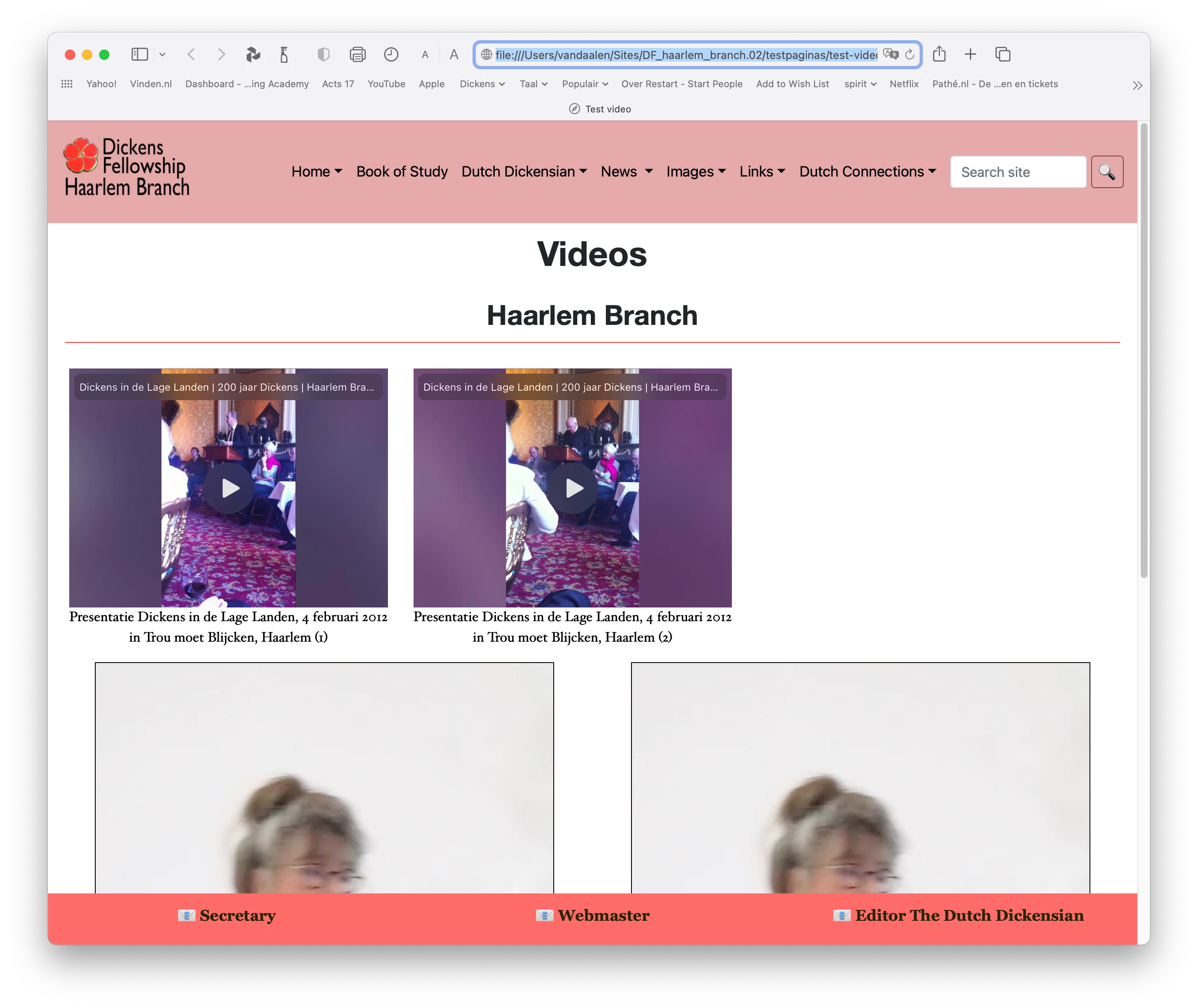
Screen test-page video.png

Here's the css-code:

iframe {
	margin: auto;
	display: block;
}
video {
	width: 90%;
	height: auto;
	display: block;
	margin-right: auto;
	margin-left: auto;
	border: thin solid hsla(0,0%,0%,1.00);

And the html:

<div class="row main">
				<div class="row">
						<div class="col-md-6 justify-center">
								<div class="embed-responsive embed-responsive-4by3"><iframe class="embed-responsive-item" src="https://www.youtube.com/embed/EBcL7xK7JUQ"></iframe>
								</div>
							<figcaption>
								<p>Presentatie Dickens in de Lage Landen, 4 februari 2012<br>
in Trou moet Blijcken, Haarlem (1)</p>
				</figcaption>
						</div>
						<div class="col-md-6 justify-items-center">
<div class="embed-responsive embed-responsive-4by3"><iframe class="embed-responsive-item" src="https://www.youtube.com/embed/tLB6ryTsQos"></iframe>
							</div>
						<figcaption>
								<p>Presentatie Dickens in de Lage Landen, 4 februari 2012<br>
in Trou moet Blijcken, Haarlem (2)</p>
				</figcaption>
			</div>
					</div>
				<div class="row">
						<div class="col-md-6">
<video class="embed-responsive-4by3" title="Vertelster" controls="controls" >
		<source src="../10.mp4" type="video/mp4">
</video>
<figcaption>
		<p>Dit is het bijschrift</p>
	</figcaption><br>
</div>
						<div class="col-md-6">
<video controls class="embed-responsive-item">
		<source src="../10.mp4" type="video/mp4">
</video>
<figcaption>
								<p>Dit is het bijschrift</p>
				</figcaption><br>
						</div>
			</div>
					</div>


Views

4.5K

Translate

Translate

Report

Report
Community guidelines
Be kind and respectful, give credit to the original source of content, and search for duplicates before posting. Learn more
community guidelines

correct answers 1 Correct answer

LEGEND , Aug 08, 2023 Aug 08, 2023
quote
quote
quote

Dear Osgood,

I've applied your code-snippets and the big advantage is the YT-video's aren't so small anymore. Yet they still are not evenly divided over the page, they are justified to the left, leaving a gap at the right side. What properties or class do I havo to add to "iframe' (op perhaps the row-column?) to get the desired result?


By @edinav24550678


It's difficult to know what you are doing or not, can you post the complete pages code plus any custom css you are using other than the default B

...

Votes

Translate

Translate
Community Expert ,
Aug 07, 2023 Aug 07, 2023

Copy link to clipboard

Copied

what adobe app (or service)?

Votes

Translate

Translate

Report

Report
Community guidelines
Be kind and respectful, give credit to the original source of content, and search for duplicates before posting. Learn more
community guidelines
Community Beginner ,
Aug 07, 2023 Aug 07, 2023

Copy link to clipboard

Copied

Sorry, should have looked better! it's Dreamweaver CC.

Votes

Translate

Translate

Report

Report
Community guidelines
Be kind and respectful, give credit to the original source of content, and search for duplicates before posting. Learn more
community guidelines
Community Expert ,
Aug 07, 2023 Aug 07, 2023

Copy link to clipboard

Copied

in the future, to find the best place to post your message, use the list here, https://community.adobe.com/

p.s. i don't think the adobe website, and forums in particular, are easy to navigate, so don't spend a lot of time searching that forum list. do your best and we'll move the post if it helps you get responses.


<"moved from using the community">

Votes

Translate

Translate

Report

Report
Community guidelines
Be kind and respectful, give credit to the original source of content, and search for duplicates before posting. Learn more
community guidelines
Community Expert ,
Aug 07, 2023 Aug 07, 2023

Copy link to clipboard

Copied

Use the built-in Bootstrap video embed classes to maintain responsive aspect ratio.


Below is an example with YouTube videos in <iframes>.

<!doctype html>
<html lang="en">
<head>
<title>Bootstrap Responsive Video Examples</title>
<meta charset="utf-8">
<meta name="viewport" content="width=device-width, initial-scale=1">
<!--Bootstrap CSS-->
<link rel="stylesheet" href="https://maxcdn.bootstrapcdn.com/bootstrap/4.3.1/css/bootstrap.min.css">
</head>
<body>
<div class="container">
<div class="row">
<div class="jumbotron mx-auto">
<h2>Bootstrap 4 in Dreamweaver</h2>
<p>Responsive video deomonstration.  This uses YouTube in <iframe> but any MP4 video will work. </p>
</div>
</div>
<div class="row">
<div class="col-lg-6">
<h2>Aspect ratio 1:1</h2>
<div class="embed-responsive embed-responsive-1by1">
<iframe class="embed-responsive-item" src="https://www.youtube.com/embed/tgbNymZ7vqY"></iframe>
</div>
</div>
<div class="col-lg-6">
<h2>Aspect ratio 4:3</h2>
<div class="embed-responsive embed-responsive-4by3">
<iframe class="embed-responsive-item" src="https://www.youtube.com/embed/tgbNymZ7vqY"></iframe>
</div>
</div>
</div>
<hr>
<div class="row">
<div class="col-lg-6">
<h2>Aspect ratio 16:9</h2>
<div class="embed-responsive embed-responsive-16by9">
<iframe class="embed-responsive-item" src="https://www.youtube.com/embed/tgbNymZ7vqY"></iframe>
</div>
</div>
<div class="col-lg-6">
<h2>Aspect ratio 21:9</h2>
<div class="embed-responsive embed-responsive-21by9">
<iframe class="embed-responsive-item" src="https://www.youtube.com/embed/tgbNymZ7vqY"></iframe>
</div>
</div>
</div>
<hr>
<div class="row">
<footer>Footer goes here.... </footer>
</div>
</div>

<!--First jQuery then Popper then Bootstrap JS--> 
<script src="https://code.jquery.com/jquery-3.2.1.min.js" integrity="sha256-hwg4gsxgFZhOsEEamdOYGBf13FyQuiTwlAQgxVSNgt4=" crossorigin="anonymous"></script> 
<script src="https://cdnjs.cloudflare.com/ajax/libs/popper.js/1.14.7/umd/popper.min.js"></script> 
<script src="https://maxcdn.bootstrapcdn.com/bootstrap/4.3.1/js/bootstrap.min.js"></script>
</body>
</html>


Hope that helps.  Post back if have any questions.


Nancy O'Shea— Product User, Community Expert & Moderator

Votes

Translate

Translate

Report

Report
Community guidelines
Be kind and respectful, give credit to the original source of content, and search for duplicates before posting. Learn more
community guidelines
Community Beginner ,
Aug 08, 2023 Aug 08, 2023

Copy link to clipboard

Copied

I made a new html-page with your code, looks like it comes from W3 Schools-site (they use the same video). But I see no solution for positioning the iframes evenly.

Votes

Translate

Translate

Report

Report
Community guidelines
Be kind and respectful, give credit to the original source of content, and search for duplicates before posting. Learn more
community guidelines
LEGEND ,
Aug 08, 2023 Aug 08, 2023

Copy link to clipboard

Copied

quote

I made a new html-page with your code, looks like it comes from W3 Schools-site (they use the same video). But I see no solution for positioning the iframes evenly.


By @edinav24550678


Who are you responding to, Nancy or myself, _osgood? Did you see the code l recently posted? I don't recall posting any code which references the website you mention so maybe it's not me you're responding to.

Votes

Translate

Translate

Report

Report
Community guidelines
Be kind and respectful, give credit to the original source of content, and search for duplicates before posting. Learn more
community guidelines
Community Beginner ,
Aug 08, 2023 Aug 08, 2023

Copy link to clipboard

Copied

No, I was replying to Nancy.

Votes

Translate

Translate

Report

Report
Community guidelines
Be kind and respectful, give credit to the original source of content, and search for duplicates before posting. Learn more
community guidelines
Community Expert ,
Aug 07, 2023 Aug 07, 2023

Copy link to clipboard

Copied

To clarify an important point, Bootstrap 5 uses different classes from versions 3 & 4. 

https://getbootstrap.com/docs/5.0/helpers/ratio/


So if you're actually using Bootstrap version 5,  use the .ratio classes instead of .embed-responsive classes.

<div class="ratio ratio-16x9">
<h3>Aspect Ratio 16:9</h3>
<iframe src="https://www.youtube.com/embed/zpOULjyy-n8?rel=0" title="YouTube video" allowfullscreen></iframe> </div>


It's important your code classes match the version of Bootstrap you're referencing or it doesn't work right.


Nancy O'Shea— Product User, Community Expert & Moderator

Votes

Translate

Translate

Report

Report
Community guidelines
Be kind and respectful, give credit to the original source of content, and search for duplicates before posting. Learn more
community guidelines
LEGEND ,
Aug 07, 2023 Aug 07, 2023

Copy link to clipboard

Copied

quote

To clarify an important point, Bootstrap 5 uses different classes from versions 3 & 4. 

https://getbootstrap.com/docs/5.0/helpers/ratio/


So if you're actually using Bootstrap version 5,  use the .ratio classes instead of .embed-responsive classes.


It's important your code classes match the version of Bootstrap you're referencing or it doesn't work right.


By @Nancy OShea


I'm not even sure the videos themselves need to be responsive they currently look very small to me but I guess v5 is being used as it says that in the post title:


'How do I position an iframe in a bootstrap 5 Grid-layout?'


Anyway the relevant question about the videos themselves being distributed evenly across the browser window horizontally, rather than side by side to the left, well the code posted by the OP works for me, so maybe something else is on the OPs page which is causing the issue.

Votes

Translate

Translate

Report

Report
Community guidelines
Be kind and respectful, give credit to the original source of content, and search for duplicates before posting. Learn more
community guidelines
Community Expert ,
Aug 07, 2023 Aug 07, 2023

Copy link to clipboard

Copied

The topic as written is ambiguous.

I don't know if the OP means Bootstrap version 5, grid layout

Or Bootstrap, 5-grid layout. 


Not knowing which version they're using puts us at a disadvantage.  We may never know for sure as most people who post questions here don't respond unless they need more help.


Nancy O'Shea— Product User, Community Expert & Moderator

Votes

Translate

Translate

Report

Report
Community guidelines
Be kind and respectful, give credit to the original source of content, and search for duplicates before posting. Learn more
community guidelines
LEGEND ,
Aug 08, 2023 Aug 08, 2023

Copy link to clipboard

Copied

quote

We may never know for sure as most people who post questions here don't respond unless they need more help.


By @Nancy OShea


Maybe, as an aside note which moderator deleted my response showing a couple of code examples which would have resolved the OPs question?


The question here was......'how do l distribute the videos evenly across the width of the browser window'. With all due respect yourself and Ben seem to be providing a completely different answer to the one asked. Not that they are unwelcome of course but the fix for the OP was simple and that post has for some curious reason been deleted.............hummmm.


Votes

Translate

Translate

Report

Report
Community guidelines
Be kind and respectful, give credit to the original source of content, and search for duplicates before posting. Learn more
community guidelines
Community Beginner ,
Aug 08, 2023 Aug 08, 2023

Copy link to clipboard

Copied

Dear Nancy,


I mean Bootstrap version 5, with a grid layout.  Proves to show you can never be clear enough.

Currently I have to decide what adivcie to follow.


Regards,

Edina

Votes

Translate

Translate

Report

Report
Community guidelines
Be kind and respectful, give credit to the original source of content, and search for duplicates before posting. Learn more
community guidelines
Community Beginner ,
Aug 08, 2023 Aug 08, 2023

Copy link to clipboard

Copied

I mean advice of course. it's a 12-grid layout.

Votes

Translate

Translate

Report

Report
Community guidelines
Be kind and respectful, give credit to the original source of content, and search for duplicates before posting. Learn more
community guidelines
Community Beginner ,
Aug 08, 2023 Aug 08, 2023

Copy link to clipboard

Copied

Dear Osgood,


The videos are small indeed but they have to be viewed on a smartphone as well.

Votes

Translate

Translate

Report

Report
Community guidelines
Be kind and respectful, give credit to the original source of content, and search for duplicates before posting. Learn more
community guidelines
LEGEND ,
Aug 08, 2023 Aug 08, 2023

Copy link to clipboard

Copied


@edinav24550678 wrote:

Dear Osgood,


The videos are small indeed but they have to be viewed on a smartphone as well.


That's the idea of responsive videos, they adapt to the size of a users screen. I couldn't tell from your code if the videos were responsive or not as they weren't big enough to make any difference on desktop or tablet. As for smartphone, personally l wouldnt offer videos on that size device.
 
As an aside note your original code did work for me, the 2 videos were displayed evenly across the browser window width, centered in their respective columns. Is there something else on your page that could be stoping that happening, also which browser are you testing in. Most browsers these days show the results the same,  rendering has improved over the years but there are still some occasion where they show a layout differently.
 
I did post what l believe was a solution to your problem, with some minor improvememts but it looks like one of the moderators who look after the forum posts decided to delete the post for some strange reason. It could have been 'kglad', thats where my money is as they were actively involved in moving  posts around at the time and may have accidentally deleted it by mistake.

Votes

Translate

Translate

Report

Report
Community guidelines
Be kind and respectful, give credit to the original source of content, and search for duplicates before posting. Learn more
community guidelines
Community Beginner ,
Aug 08, 2023 Aug 08, 2023

Copy link to clipboard

Copied

Dear Osgood,

The entire code of the whole page can be found in the attached pdf-file, maybe you can find the mistake that is stopping the 2 upper videos from displaying evenly across the window width. By the way, I do think the videos are indeed too small, but I don't know how to fix this wihtout giving them a fixed hight or width, which will delete responsiveness.

I use Chrome, Safari , Firefox and sometimes Opera to test html-pages. Thus far I detected no difference between them with the test-video page.

Your deleted post can still be found in my e-mail.

Regards,

Edina

Votes

Translate

Translate

Report

Report
Community guidelines
Be kind and respectful, give credit to the original source of content, and search for duplicates before posting. Learn more
community guidelines
LEGEND ,
Aug 08, 2023 Aug 08, 2023

Copy link to clipboard

Copied

quote

Dear Osgood,

The entire code of the whole page can be found in the attached pdf-file, maybe you can find the mistake that is stopping the 2 upper videos from displaying evenly across the window width. By the way, I do think the videos are indeed too small, but I don't know how to fix this wihtout giving them a fixed hight or width, which will delete responsiveness.

I use Chrome, Safari , Firefox and sometimes Opera to test html-pages. Thus far I detected no difference between them with the test-video page.

Your deleted post can still be found in my e-mail.

Regards,

Edina


By @edinav24550678


See if the below code snippet works for you, it uses Bootstrap 4.4.1 same version as you are using. Its ONLY the video section, but I think its how you want it to be laid out?


<!DOCTYPE html>
<html lang="en">
<head>
<meta charset="UTF-8">
<meta name="viewport" content="width=device-width, initial-scale=1.0">
<title>Test Video</title>
<link href="https://cdn.jsdelivr.net/npm/bootstrap@4.4.1/dist/css/bootstrap.min.css" rel="stylesheet">
<style>
.container-fluid {
width: 90%;
}
video {
width: 100%;
border: 1px solid #000;
}
</style>
</head>
<body>

<div class="container-fluid m-auto">

<div class="row">

<div class="col-md-6">
<figure>
<div class="embed-responsive embed-responsive-4by3">
<iframe class="embed-responsive-item" src="https://www.youtube.com/embed/EBcL7xK7JUQ"></iframe>
</div>
<figcaption>
<p class="text-center">Presentatie Dickens in de Lage Landen, 4 februari 2012 in Trou moet Blijcken, Haarlem (1)</p>
</figcaption>
</figure>
</div>
<!-- end col-md-6 -->


<div class="col-md-6">
<figure>
<div class="embed-responsive embed-responsive-4by3">
<iframe class="embed-responsive-item" src="https://www.youtube.com/embed/tLB6ryTsQos"></iframe>
</div>
<figcaption>
<p  class="text-center">Presentatie Dickens in de Lage Landen, 4 februari 2012 in Trou moet Blijcken, Haarlem (2)</p>
</figcaption>
</figure>
</div>
<!-- end col-md-6 -->

<div class="col-md-6 text-center">
<figure>
<video class="embed-responsive-4by3" title="Vertelster" controls="controls">
<source src="../10.mp4" type="video/mp4">
</video>
<figcaption>
<p  class="text-center">Dit is het bijschrift</p>
</figcaption>
</figure>
</div>
<!-- end col-md-6 -->


<div class="col-md-6 text-center">
<figure>
<video class="embed-responsive-4by3" title="Vertelster" controls="controls">
<source src="../10.mp4" type="video/mp4">
</video>
<figcaption>
<p  class="text-center">Dit is het bijschrift</p>
</figcaption>
</figure>
</div>
<!-- end col-md-6 -->


</div>
<!-- end row -->

</div>
<!-- end container-fluid -->


</body>
</html>


Votes

Translate

Translate

Report

Report
Community guidelines
Be kind and respectful, give credit to the original source of content, and search for duplicates before posting. Learn more
community guidelines
Community Beginner ,
Aug 08, 2023 Aug 08, 2023

Copy link to clipboard

Copied

Dear Osgood,

I've applied your code-snippets and the big advantage is the YT-video's aren't so small anymore. Yet they still are not evenly divided over the page, they are justified to the left, leaving a gap at the right side. What properties or class do I havo to add to "iframe' (op perhaps the row-column?) to get the desired result?

Scherm­afbeelding 2023-08-08 om 16.36.39.png

Votes

Translate

Translate

Report

Report
Community guidelines
Be kind and respectful, give credit to the original source of content, and search for duplicates before posting. Learn more
community guidelines
LEGEND ,
Aug 08, 2023 Aug 08, 2023

Copy link to clipboard

Copied

quote

Dear Osgood,

I've applied your code-snippets and the big advantage is the YT-video's aren't so small anymore. Yet they still are not evenly divided over the page, they are justified to the left, leaving a gap at the right side. What properties or class do I havo to add to "iframe' (op perhaps the row-column?) to get the desired result?


By @edinav24550678


It's difficult to know what you are doing or not, can you post the complete pages code plus any custom css you are using other than the default Bootstrap 4 css, preferably in a new thread as this one is getting a bit lengthy now and hard to follow or better still upload the page/css to your remote server and provide a link to the page. Once l have the whole code at my disposal l will be able better to see first hand what's wrong.

Votes

Translate

Translate

Report

Report
Community guidelines
Be kind and respectful, give credit to the original source of content, and search for duplicates before posting. Learn more
community guidelines
Community Beginner ,
Aug 08, 2023 Aug 08, 2023

Copy link to clipboard

Copied

quote
quote

Dear Osgood,

I've applied your code-snippets and the big advantage is the YT-video's aren't so small anymore. Yet they still are not evenly divided over the page, they are justified to the left, leaving a gap at the right side. What properties or class do I havo to add to "iframe' (op perhaps the row-column?) to get the desired result?


By @edinav24550678


It's difficult to know what you are doing or not, can you post the complete pages code plus any custom css you are using other than the default Bootstrap 4 css, preferably in a new thread as this one is getting a bit lengthy now and hard to follow or better still upload the page/css to your remote server and provide a link to the page. Once l have the whole code at my disposal l will be able better to see first hand what's wrong.


By @osgood_


I hope that the pdf-files of my html-page and my custom stylehsheet attached here will be enough information for you.

I cannot yet upload the page to a remote server.

Votes

Translate

Translate

Report

Report
Community guidelines
Be kind and respectful, give credit to the original source of content, and search for duplicates before posting. Learn more
community guidelines
LEGEND ,
Aug 08, 2023 Aug 08, 2023

Copy link to clipboard

Copied

quote
quote
quote

Dear Osgood,

I've applied your code-snippets and the big advantage is the YT-video's aren't so small anymore. Yet they still are not evenly divided over the page, they are justified to the left, leaving a gap at the right side. What properties or class do I havo to add to "iframe' (op perhaps the row-column?) to get the desired result?


By @edinav24550678


It's difficult to know what you are doing or not, can you post the complete pages code plus any custom css you are using other than the default Bootstrap 4 css, preferably in a new thread as this one is getting a bit lengthy now and hard to follow or better still upload the page/css to your remote server and provide a link to the page. Once l have the whole code at my disposal l will be able better to see first hand what's wrong.


By @osgood_


I hope that the pdf-files of my html-page and my custom stylehsheet attached here will be enough information for you.

I cannot yet upload the page to a remote server.


By @edinav24550678


No pdfs aren't any good as they are static and meaningless. It's best to post the actual code here or link to the page on a remote server, if possible. That way we can see immediately the layout and even make adjustments using the browser tools. In my experience responders here won't download a pdf file and then attempt to grab the code its just way to much hassle.


As you can't yet upload to a remote then try posting the code, all of it, with all of your custom css if you are using any. Don't worry about the Bootstrap css and js as that is already linked or if it's not we can link to a cdn to get that.


Try creating another thread if you post as this one is way to long now and finding responses is getting difficult.

Votes

Translate

Translate

Report

Report
Community guidelines
Be kind and respectful, give credit to the original source of content, and search for duplicates before posting. Learn more
community guidelines
Community Expert ,
Aug 07, 2023 Aug 07, 2023

Copy link to clipboard

Copied

You are better off having the video play in a modal. That way you are ensured that not two videos are playing at the same time. Copy the following code and paste it in a new document to see the result.


<!doctype html>
<html lang="en-AU">

<head>
    <meta charset="UTF-8">
    <meta name="viewport" content="width=device-width, initial-scale=1, shrink-to-fit=no">
    <title>Untitled Document</title>

    <link href="https://cdn.jsdelivr.net/npm/bootstrap@5.3.1/dist/css/bootstrap.min.css" rel="stylesheet" integrity="sha384-4bw+/aepP/YC94hEpVNVgiZdgIC5+VKNBQNGCHeKRQN+PtmoHDEXuppvnDJzQIu9" crossorigin="anonymous">
    <style>
        .video-item {
            display: block;
            position: relative;
        }

        .video-item .btn {
            display: block;
            position: absolute;
            top: 50%;
            left: 50%;
            margin-left: -40px;
            margin-top: -30px;
            z-index: 840;
            outline: 0 !important;
        }

        svg.btn-youtube {
            fill: var(--bs-danger);
            fill-opacity: 0.85;
            color: var(--bs-light);
            width: 55px;
            height: 40px;
        }

        svg.btn-youtube:hover {
            fill: var(--bs-primary);
            fill-opacity: 1;
        }

        svg .image {
            fill: currentColor;
        }
    </style>
</head>

<body>
    <svg xmlns="http://www.w3.org/2000/svg" xmlns:xlink="http://www.w3.org/1999/xlink" style="display: none;">
        <defs>
            <symbol id="icon-video" viewBox="0 0 1024 721">
                <title>YouTube Play Button</title>
                <path class="button" d="M1023.6,361.5c0,24.5,0.9,49-0.2,73.5c-1.7,36.6-4.7,73.1-7.3,109.6c-2,28.9-8.5,56.9-19.3,83.8 c-18.2,45.4-52.8,70.6-100,78.3c-23.1,3.8-46.7,4.9-70.1,6.1c-41.1,2.1-82.2,3.5-123.3,5c-22.1,0.8-44.3,1.1-66.4,1.5 c-42.3,0.6-84.6,1.5-126.9,1.3c-46.1-0.1-92.3-1-138.4-1.9c-36.6-0.7-73.2-1.6-109.9-3c-30.8-1.2-61.6-2.4-92.2-5 c-19-1.6-38.1-4.6-56.6-9.3c-43-11.1-71.6-38.4-86-80.7c-8.9-26-14.7-52.5-16.6-79.9c-2.5-35.4-5.8-70.7-6.7-106.1 C2.5,389.7,2.8,344.9,3.3,300c0.5-48,4-95.8,10.1-143.4c3.3-25.8,10.5-50.9,22.3-74.2c18.4-36.2,48.9-57,87.9-65 c17.2-3.5,34.9-4.9,52.5-5.9c38.2-2.2,76.5-3.9,114.7-5.2c32.9-1.2,65.9-1.7,98.9-2.3c25.6-0.5,51.3-0.8,76.9-1 c24.3-0.2,48.6-0.5,73-0.5c30.3,0.1,60.6,0.5,90.9,1c28.6,0.5,57.3,1,85.9,2c44.6,1.7,89.2,3.5,133.7,5.9 c21.2,1.1,42.7,2.1,63.2,8.2c44.1,13.2,73,41.9,87.5,85.7c8.8,26.7,14.1,54,15.9,82c2.2,34.2,5,68.4,6.5,102.7 C1024.5,313.8,1023.7,337.6,1023.6,361.5C1023.6,361.5,1023.6,361.5,1023.6,361.5z M408.2,494c92.1-47.8,183.5-95.1,275.9-143 c-92.5-48.3-183.9-96-275.9-144C408.2,303,408.2,397.9,408.2,494z">
                </path>
                <path class="image" d="M408.2,494c0-96.1,0-191,0-287c92,48,183.4,95.7,275.9,144C591.6,398.9,500.3,446.3,408.2,494z" fill="white"></path>
            </symbol>
        </defs>
    </svg>
    <div class="container">
        <div class="row row-cols-2">
            <div class="col">
                <div class="card bg-transparent shadow">
                    <div class="video-item">
                        <img class="card-img-top" alt="The Grumpy Bloke" src="https://i.ytimg.com/vi/N_dq3SBz2ls/maxresdefault.jpg">
                        <button type="button" class="btn p-0" data-bs-toggle="modal" data-bs-target="#mdlVideo" data-bs-video="N_dq3SBz2ls" aria-label="Play Video">
                            <svg class="btn-youtube">
                                <use xlink:href="#icon-video"></use>
                            </svg>
                            <span class="visually-hidden">2. The Grumpy Bloke</span>
                        </button>
                    </div>
                </div>
            </div>
        </div>
    </div>
    <!-- MODAL FOR VIDEO -->
    <div class="modal fade" id="mdlVideo" tabindex="-1" aria-labelledby="exampleModalLabel" aria-hidden="true" is="dmx-bs5-modal">
        <div class="modal-dialog modal-xl">
            <div class="modal-content">
                <div class="modal-body">
                    <div class="ratio ratio-16x9">
                        <iframe title="YouTube video" allowfullscreen=""></iframe>
                    </div>
                </div>
            </div>
        </div>
    </div>
    <script>
        var videoModal = document.getElementById('mdlVideo')
            videoModal.addEventListener('show.bs.modal', function (event) {
            // Button that triggered the modal
            var button = event.relatedTarget
            // Extract info from data-bs-* attributes
            var video = button.getAttribute('data-bs-video')
            // Update the modal's content.
            var modalBodyIframe = videoModal.querySelector('.modal-body iframe')
    
            modalBodyIframe.src='https://www.youtube.com/embed/' + video + '?rel=0'
        })
    	// Stop the video playing when modal is closed
        videoModal.addEventListener('hidden.bs.modal', function (event) {
            videoModal.querySelector('.modal-body iframe').src=''
        })
    </script>
    <script src="https://cdn.jsdelivr.net/npm/bootstrap@5.3.1/dist/js/bootstrap.bundle.min.js" integrity="sha384-HwwvtgBNo3bZJJLYd8oVXjrBZt8cqVSpeBNS5n7C8IVInixGAoxmnlMuBnhbgrkm" crossorigin="anonymous"></script>
</body>

</html>


To add another video, simply add the following code snippet


            <div class="col">
                <div class="card bg-transparent shadow">
                    <div class="video-item">
                        <img class="card-img-top" alt="The Grumpy Bloke" src="https://i.ytimg.com/vi/N_dq3SBz2ls/maxresdefault.jpg">
                        <button type="button" class="btn p-0" data-bs-toggle="modal" data-bs-target="#mdlVideo" data-bs-video="N_dq3SBz2ls" aria-label="Play Video">
                            <svg class="btn-youtube">
                                <use xlink:href="#icon-video"></use>
                            </svg>
                            <span class="visually-hidden">2. The Grumpy Bloke</span>
                        </button>
                    </div>
                </div>
            </div>


To change the video, all that is required is to change the video ID, in this case it is the `N_dq3SBz2ls`


I have produced a tutorial which uses a different IDE

https://youtu.be/lqZqOapCxiQ

(Wappler hoofdkwartier is in Enschede)


OT: Vrouwen WK 2023 - finale: Ned - Aus (mijn voorspelling)


Wappler, the only real Dreamweaver alternative.

Votes

Translate

Translate

Report

Report
Community guidelines
Be kind and respectful, give credit to the original source of content, and search for duplicates before posting. Learn more
community guidelines
LEGEND ,
Aug 08, 2023 Aug 08, 2023

Copy link to clipboard

Copied

quote

You are better off having the video play in a modal. That way you are ensured that not two videos are playing at the same time. Copy the following code and paste it in a new document to see the result.


By @BenPleysier


Seems reasonable but it could have been done with way less code using a vanilla javascript component, the only real good use l've personally found to date for using a  component is handing it off to a less experienced developer where they would only need to change a couple of attributes in a custom tag.

Votes

Translate

Translate

Report

Report
Community guidelines
Be kind and respectful, give credit to the original source of content, and search for duplicates before posting. Learn more
community guidelines
Community Expert ,
Aug 08, 2023 Aug 08, 2023

Copy link to clipboard

Copied

That is exactly what I have done as you can see here: wappler-youtube-player - npm (npmjs.com)

Wappler, the only real Dreamweaver alternative.

Votes

Translate

Translate

Report

Report
Community guidelines
Be kind and respectful, give credit to the original source of content, and search for duplicates before posting. Learn more
community guidelines