- Home
- Dreamweaver
- Discussions
- Re: How to insert 2 columns and 2 rows inside a ex...
- Re: How to insert 2 columns and 2 rows inside a ex...
Copy link to clipboard
Copied
Hello
How to do this and what is the best way as there can be multiple ways of doing this?
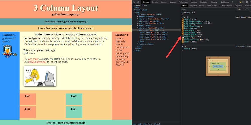
I am using grid in the basic webpage and I want to insert 4 boxes inside a existing row.
I what to have 2 columns and 2 rows, fixed height & width in a 2 x 2 grid.
The page resizes for cell, tablet and desktop ok.
Here is a link to the page: http://davidswebsite.com/test/basic_layout1.html
 1 Correct answer
Hello
I did the following using Flex and Grid. I changed from a 2x2 pattern to in this case 4 across. When I resize the screen it will collapse to 1 column. No width is defined. The content will determine that. If I remove the following the footer will shrink to the width of 2 columns.
footer {
grid-column: span 3;
My test site: http://davidswebsite.com/test/basic_layout1.html
.boxwrapper {
  display: flex;
}

 @media (min-width: 768px) {
.row5  {
display: grid;
grid-column-start: 2;
   }
 }

@mediCopy link to clipboard
Copied
See https://gridbyexample.com/examples/example21/
Copy link to clipboard
Copied
Thanks, this has helped.
I made changes and came up with this.
http://davidswebsite.com/test/basic_layout1.html
Question 1: How to get the 2nd column to butt up next to the 1st column?
It gets wider apart as the screen size changes.
Question 2: Plus how to have the columns go single file when viewed in a cell phone screen.
The webpage does already.
I also have been looking at https://www.quackit.com/css/grid/tutorial/css_grid_alignment.cfm but justify tag does not seem to work. I was looking for something like float which is not working.
I what to have 2 or more boxes that would contain more text or photos as seen here in that row 5
Copy link to clipboard
Copied
1. Change the padding
2. Change the template:
Having said that, you should be designing for mobile first and use media quries to change the layout when the realeatate grows.
Edit: Stay away from the example that you showed from W3School.
Copy link to clipboard
Copied
Thanks, I want Box 1 and Box 2 next to each other on row 1 and Box 3 and Box 4 on the 2nd row when viewed in the desktop monitor then when the screen is resized to say a cell phone screen they collapse to 4 rows with Box 1 at the top and Box 4 at the bottom.
I managed to do this with the webpage but cannot with the 4 boxes in Row 5.
Copy link to clipboard
Copied
As I said, you should be designing mobile first. This means that you design with the boxes on top of each other. This is done with a single 1fr. Then create a media query that places the boxes next to each other, e.g. 1fr 1fr.
Copy link to clipboard
Copied
Thanks, I added a media query and the Box's line up as 1 column when the screen is resized smaller.
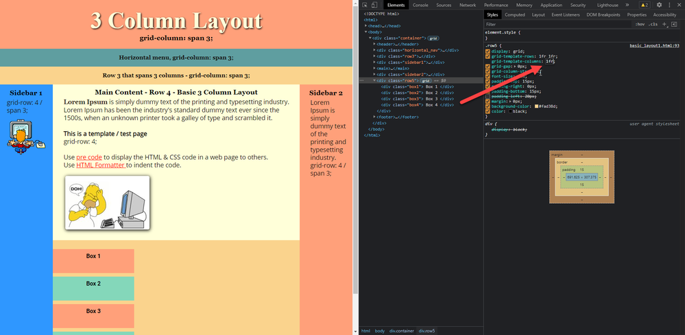
Question 1: How to get the 2nd column to butt up next to the 1st column?
It gets wider apart as the screen size changes. They are inches apart to start with and adjusting the padding does nothing.
http://davidswebsite.com/test/basic_layout1.html
@media (min-width: 768px) {
.row5  {
display: grid;
grid-template-rows: 1fr 1fr ;
grid-template-columns: 1fr 1fr ;
grid-gap: 0px;
grid-column-start: 2;
   }
 }
Copy link to clipboard
Copied
I may have given you a bum steer when I sugged a nested grid. From what I gather later on, you are wanting to create an image gallery. If that is the case, you should be using flexbox as in https://css-tricks.com/adaptive-photo-layout-with-flexbox/
Copy link to clipboard
Copied
Its not possible how you are doing it at the moment.
Think about it, you are splitting row5 into 2 equal widths, and 2 rows then asking box1, box2, box3 and box4 to sit within the grid, taking up 1 grid square each BUT setting a width of 30% for each of the boxes will only consume 30% of the width of each grid square, so there is ALWAYS going to be the 70% space to the right of the boxes!
Your best option would be to wrap your 4 boxes in a seperate <div> and set its width to 60% then apply the grid to that 1fr 1f makes 30% so your boxes will sit side by side then try and control how they react/look as the screen gets narrow using media queries.
Also your footer is NOT within the container div so there is no need to apply any grid related css to it UNLESS you move it within the grid.
Copy link to clipboard
Copied
Hello
I did the following using Flex and Grid. I changed from a 2x2 pattern to in this case 4 across. When I resize the screen it will collapse to 1 column. No width is defined. The content will determine that. If I remove the following the footer will shrink to the width of 2 columns.
footer {
grid-column: span 3;
My test site: http://davidswebsite.com/test/basic_layout1.html
.boxwrapper {
  display: flex;
}

 @media (min-width: 768px) {
.row5  {
display: grid;
grid-column-start: 2;
   }
 }

@media (max-width: 480px) {
.boxwrapper  {
display: grid;
width: 100%;
   }
 }
.
Copy link to clipboard
Copied
I think you must have changed something, last time I looked you had a redundant </div> tag in the code, that seems to have disappeared now and the footer is now back in the container div.
If you want 4 equal width divs side by side then you should add:
.boxwrapper div {
flex: 1;
}
Copy link to clipboard
Copied
Thanks to all.
Get ready! An upgraded Adobe Community experience is coming in January.
Learn more


