- Home
- Dreamweaver
- Discussions
- Re: Its difficult to understand what you are tryin...
- Re: Its difficult to understand what you are tryin...
How to make my logo wrap around itself only?
Copy link to clipboard
Copied
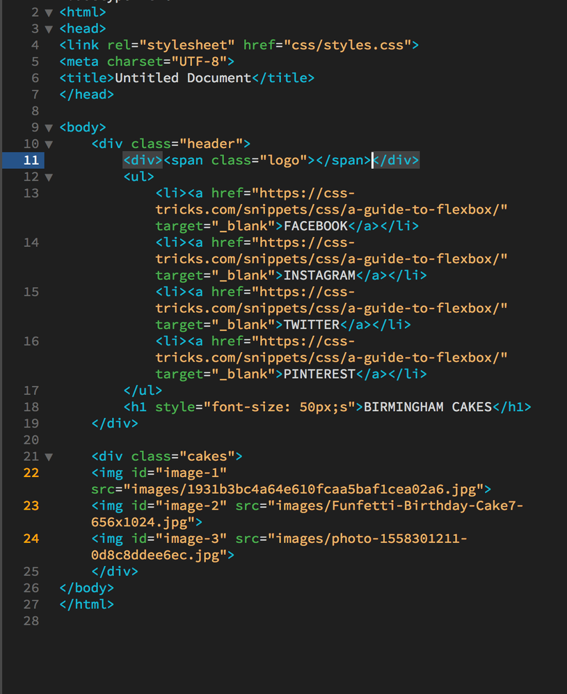
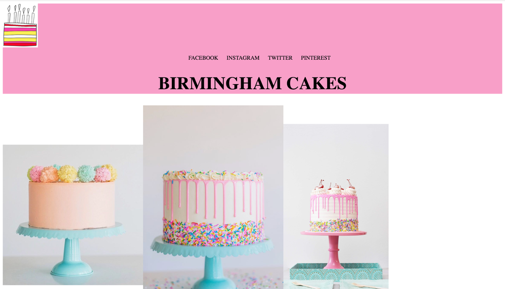
I feel like my navigation and title are pushed to the bottom of my header because the logo is taking up the full width of the page? If that is the problem, how do i make it only take up as much space as it actually is?
Copy link to clipboard
Copied
Its difficult to understand what you are trying to achieve. Assuming the image of the cake is the logo and you want it centered above the navigation and the text 'birmingham cakes' then you just need to center the logo, see your other thread in reference to 'background-images' - link - for the answer.
Copy link to clipboard
Copied
I want the logo on the same line as the navigation, but the logo be to the left of the page and the navigation in the center, does that make sense? At the moment my logo sits on a seperate line it seems.
Copy link to clipboard
Copied
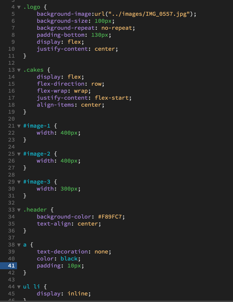
Then wrap your logo div and your navigation <ul> </ul> in a div container and apply display: flex; to it.
Copy link to clipboard
Copied
iv'e done this, but i want to position my items manually? how do i do that? like i want the "important nav" to be in the top left, and i want the logo in the center but 30px from the top etc
Copy link to clipboard
Copied
You're not making much sense. In your other thread the diagram shows the 'contact address' in the top left corner, which is it?
You want the 'important nav' in the top left and to the right of that you want the logo, centered horizontally in the remaining space, 30px from the top of the browser window?
Just saying I want the logo in the center means nothing, center of what, centered where?
Copy link to clipboard
Copied
I'm so sorry, i've been looking at the wrong picture! I was referring to the layout i'd drawn!!!!:P
I HAVE found a way to make this work, but i feel there's an easier way. I've basically put each bit (hyperlinks, logo, title) in their own class and made the position: relative then positioned them using the top, bottom, right, left properties.
Copy link to clipboard
Copied
Iv'e also made all the heading section (coloured in pink) inside a div called "heading-section". This is relative to how i want to position my heading content.
Copy link to clipboard
Copied
I can almost guarantee that so-called "pixel-perfect positioning" is absolutely the wrong approach. Test your layout rigorously in multiple devices, various zoom settings and with aggressively increased text size (Ctrl/Cmd ++++) to ensure that usability remains intact no matter what settings the end user has.
Copy link to clipboard
Copied
Without seeing the code you have produced I can't provide any advice or alternative suggestions BUT I doubt I would be using top, bottom, right, left to position items.
If you have this working but are not happy with your solution then post the code and css in the forum and I'll have a look.


