

- Home
- Dreamweaver
- Discussions
- Re: How to move the navigation menu list to the ri...
- Re: How to move the navigation menu list to the ri...

Copy link to clipboard
Copied
Hi,
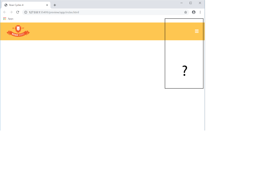
I am making the hamburger menu.
I don't know how to move the list to the right-side border.
Link Roar Cycles 2
I tried LINE 132 .site-nav { }.
Hosun Kang

The Tittle was edited by moderator.


 1 Correct answer

It is working BUT you have changed the original css styling. For instance you have misspelt 'background' - see in red below, so all you are currently seeing is white text on a white background, nothing.
@media screen and (max-width: 1024px) {
.hamburger-icon {
display: block;
}
.site-nav {
position: absolute;
width: 200px;
top: 5.5em;
right: 30px;
display: none;
backgound-color: #000;
padding: 20px;
}
}
 11
Replies
11
11
Replies
11

Copy link to clipboard
Copied
Review CSS Flexbox justify-content.
Copy link to clipboard
Copied
Give the below a go:
<!doctype html>
<html>
<head>
<meta charset="utf-8">
<title>Roar Cycles 2</title>
<link rel="stylesheet" href="https://use.fontawesome.com/releases/v5.8.1/css/all.css" integrity="sha384-50oBUHEmvpQ+1lW4y57PTFmhCaXp0ML5d60M1M7uH2+nqUivzIebhndOJK28anvf" crossorigin="anonymous">
<style>
* {
box-sizing: border-box;
}
body {
margin: 0;
font-family: helvetica, sans-serif;
}
header {
display: flex;
justify-content: space-between;
align-items: center;
background-color: #fec64f;
padding: 10px 30px;
}
.hamburger-icon {
color: #fff;
display: none;
font-size: 20px;
}
.site-nav {
display: block;
}
.site-nav ul {
display: flex;
margin: 0;
padding: 0;
list-style: none;
}
.site-nav a {
color: #fff;
display: block;
padding: 0 10px;
text-decoration: none;
}
.site-nav a i {
padding: 0 10px 0 0;
}
@media screen and (max-width: 768px) {
.hamburger-icon {
display: block;
}
.site-nav {
position: absolute;
width: 200px;
top: 5.5em;
right: 30px;
display: none;
background-color: #000;
padding: 20px;
}
.site-nav ul {
display: flex;
flex-direction: column;
}
.site-nav li {
margin: 0 0 5px 0;
}
}
@media screen and (max-width: 480px) {
.site-nav {
width: 100%;
right: 0;
}
}
</style>
<!-- jQuery library -->
<script src="http://code.jquery.com/jquery-3.3.1.min.js" integrity="sha256-FgpCb/KJQlLNfOu91ta32o/NMZxltwRo8QtmkMRdAu8=" crossorigin="anonymous"></script>
<script>
$(document).ready(function(){
// MOBILE MENU
$('.hamburger-icon').css('cursor' , 'pointer').click(function(){
$('.site-nav').slideToggle();
});
// WINDOW RESIZE FUNCTION TO SET NAV DISPLAY OPTIONS
$(window).resize(function() {
var width = $(document).width();
if (width > 768) {
$('.site-nav').show();
}
else if (width < 768) {
$('.site-nav').hide();
}
});
});
</script>
</head>
<body>
<header>
<div class="logo">
<img class="logo" src="https://dreamy-kalam-5ecd62.netlify.com/images/logo.png" alt="Roar Bikes logo">
</div>
<!-- end logo -->
<div class="hamburger-icon">
<i class="fas fa-bars"></i>
</div>
<!-- end hamburger-icon -->
<nav class="site-nav">
<ul>
<li><a href=""><i class="fas fa-shopping-cart site-nav--icon"></i>SHOP</a></li>
<li><a href=""><i class="fas fa-comment site-nav--icon"></i>OUR STORY</a></li>
<li><a href=""><i class="fas fa-envelope site-nav--icon"></i>CONTACT</a></li>
</ul>
</nav>
<!-- end site-nav -->
</header>
</body>
</html>
Copy link to clipboard
Copied
Hi,
Thank you very much for your instruction.
I am wrapping it up line by line.
My current issue is "toggle doesn't work on the hamburger menu in Tablet View".
I set the break point at 1024.
I made css and js files separately from html.
I added a hover effect in Desktop View (lines 46-48 on css).
Link
Hosun Kang
Copy link to clipboard
Copied
It is working BUT you have changed the original css styling. For instance you have misspelt 'background' - see in red below, so all you are currently seeing is white text on a white background, nothing.
@media screen and (max-width: 1024px) {
.hamburger-icon {
display: block;
}
.site-nav {
position: absolute;
width: 200px;
top: 5.5em;
right: 30px;
display: none;
backgound-color: #000;
padding: 20px;
}
}
Copy link to clipboard
Copied
Hi,
1.
On Mobile View, grey rectangle doesn't eclipse black rectangle in hovering.
How would I do?
2.
What is "right: 0;" in line 137?
3.
Your CSS starts with
* {
box-sizing: border-box;
}
What is it?
Hosun Kang

Copy link to clipboard
Copied
In CSS code, the asterisk (*) is a wildcard selecftor for everything in your HTML code.
Right: 0; is positioning.
Copy link to clipboard
Copied
Hosun wrote
Hi,
1.
On Mobile View, grey rectangle doesn't eclipse black rectangle in hovering.
How would I do?
Add the below to your 1024px media query:
.site-nav a {
display: block;
margin: 0;
}
Hosun wrote
2.
What is "right: 0;" in line 137?
I dont know, was that something I provided or something you added. If you mean it doesn't have 'px' following the '0' then 'px' is not required if you set an elements attribute to '0'.
Hosun wrote
3.Your CSS starts with
* {
box-sizing: border-box;
}
That just sets the 'css box-model' to zero, where padding/border etc get added to the width of an element, instead of being part of the width.
.............and yes you need to include the 's' in your jQuery library link - 'https' - as has been pointed out, otherwise your mobile nav will not work.
Copy link to clipboard
Copied
Copy link to clipboard
Copied
Change this link from ordinary HTTP to secure HTTPS.
<script src="http://code.jquery.com/jquery-3.3.1.min.js" integrity="sha256-FgpCb/KJQlLNfOu91ta32o/NMZxltwRo8QtmkMRdAu8=" crossorigin="anonymous"></script>
Copy link to clipboard
Copied
Hi,
In a different question sometime ago, you gave me the link below.
Is this what you mean?
Hosun Kang
<script src="https://code.jquery.com/jquery-3.4.0.min.js" integrity="sha256-BJeo0qm959uMBGb65z40ejJYGSgR7REI4+CW1fNKwOg=" crossorigin="anonymous">
</script>
Copy link to clipboard
Copied
You may use that minified jQuery library.
Find more inspiration, events, and resources on the new Adobe Community
Explore Now
 AdChoices