• Global community
    • Language:
      • Deutsch
      • English
      • Español
      • Français
      • Português
  • 日本語コミュニティ
    Dedicated community for Japanese speakers
  • 한국 커뮤니티
    Dedicated community for Korean speakers
Exit
0

How to Resize Navigation Menu?

Contributor ,
Nov 03, 2021 Nov 03, 2021

Copy link to clipboard

Copied

I created a drop-down menu. It was perfect until I added one more menu item. Now the last item jumps to a 2nd. row. How can I resize the menu so it fits on one row AND it also has to shrink when viewed on a tablet to fit on one row!


www.winvoices.com

Views

1.1K

Translate

Translate

Report

Report
Community guidelines
Be kind and respectful, give credit to the original source of content, and search for duplicates before posting. Learn more
community guidelines

correct answers 1 Correct answer

Contributor , Nov 08, 2021 Nov 08, 2021

Yes, I devised a workaround by creating a filler space before the first submenus for the first 2 cars.

Votes

Translate

Translate
Community Expert ,
Nov 03, 2021 Nov 03, 2021

Copy link to clipboard

Copied

Actually, on any screen size above 920 px, it starts dropping menu items to that second line with as many as 5 buttons. As the viewport width increases, they all jump back up except the last one.

If you increase the max-width setting you have on your gridContainer a bit, that last link will jump up to the first line when the window is open wide enough by the viewer.

Looks like 1362 px will do it.

Votes

Translate

Translate

Report

Report
Community guidelines
Be kind and respectful, give credit to the original source of content, and search for duplicates before posting. Learn more
community guidelines
Contributor ,
Nov 03, 2021 Nov 03, 2021

Copy link to clipboard

Copied

In my code, I don't see an option for max-width.

Votes

Translate

Translate

Report

Report
Community guidelines
Be kind and respectful, give credit to the original source of content, and search for duplicates before posting. Learn more
community guidelines
Community Expert ,
Nov 03, 2021 Nov 03, 2021

Copy link to clipboard

Copied

It's in your fluid-index.css file, in one of your competing media queries, line 86...

@media only screen and (min-width: 769px) {
.gridContainer {
width: 88%;
max-width: 1232px;
padding-left: 0.9%;
padding-right: 0.9%;
margin: auto;
}

Votes

Translate

Translate

Report

Report
Community guidelines
Be kind and respectful, give credit to the original source of content, and search for duplicates before posting. Learn more
community guidelines
Contributor ,
Nov 03, 2021 Nov 03, 2021

Copy link to clipboard

Copied

I increased the max-width from 1232px to 1362px. and it made no difference. Then I tried 1432px and it worked, but when viewed on a tablet, the last 4 menu items still jump to a 2nd row. Is there a way to shrink the font size when it detects a smaller screen? BTW, thanks so much for all your help!

Votes

Translate

Translate

Report

Report
Community guidelines
Be kind and respectful, give credit to the original source of content, and search for duplicates before posting. Learn more
community guidelines
Community Expert ,
Nov 03, 2021 Nov 03, 2021

Copy link to clipboard

Copied

to add at what Jon said, the problem will often happen, it's a first architecture question... how to distinguish categorie, menu, sub menu... and so on...

the best way is to set a card sorting going bottom to top... but anyway, here you are, and you face this problem...

so you can act on the font size... from 16px to 12px... in the rule .navWrapper li a

.navWrapper li a {
    /* other properties */
    font-size: 12px;
}


Votes

Translate

Translate

Report

Report
Community guidelines
Be kind and respectful, give credit to the original source of content, and search for duplicates before posting. Learn more
community guidelines
Contributor ,
Nov 03, 2021 Nov 03, 2021

Copy link to clipboard

Copied

I changed the font-size from 15px to 12pix. That worked on my desktop, but on my tablet, the last 2 menu items still jumped to a 2nd. row.

Votes

Translate

Translate

Report

Report
Community guidelines
Be kind and respectful, give credit to the original source of content, and search for duplicates before posting. Learn more
community guidelines
Community Expert ,
Nov 03, 2021 Nov 03, 2021

Copy link to clipboard

Copied

a horizontal menu will always have a width limit and, of course, will have to be spread over two, even three, rows, depending on the number of items composing it...
that's why, in order to be usable in an ergonomic way on any type of device, there is the hamburger menu... would say burger king


https://code-boxx.com/simple-responsive-pure-css-hamburger-menu/

Votes

Translate

Translate

Report

Report
Community guidelines
Be kind and respectful, give credit to the original source of content, and search for duplicates before posting. Learn more
community guidelines
Contributor ,
Nov 03, 2021 Nov 03, 2021

Copy link to clipboard

Copied

The problem is when a 2nd row appears, the upper submenus are blocked by the 2nd row.

Votes

Translate

Translate

Report

Report
Community guidelines
Be kind and respectful, give credit to the original source of content, and search for duplicates before posting. Learn more
community guidelines
Community Expert ,
Nov 03, 2021 Nov 03, 2021

Copy link to clipboard

Copied

with an hamburger menu, you wont have trouble with any submenu. did you have a read on the link I send ?

this one is more visual

https://www.mockplus.com/blog/post/hamburger-menu-examples


Votes

Translate

Translate

Report

Report
Community guidelines
Be kind and respectful, give credit to the original source of content, and search for duplicates before posting. Learn more
community guidelines
Community Expert ,
Nov 03, 2021 Nov 03, 2021

Copy link to clipboard

Copied

Your Navigation contains too many elements to fit on one row. 

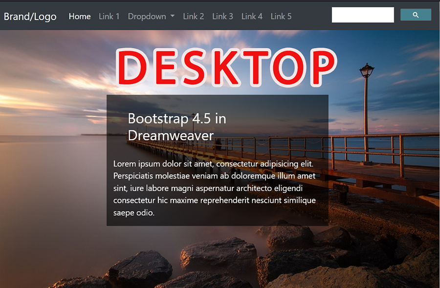
The workaround is to collapse menu on ALL devices or reduce the number & size of links on smaller devices.  See screenshots.


image.png


image.png


Nancy O'Shea— Product User, Community Expert & Moderator
Alt-Web Design & Publishing ~ Web : Print : Graphics : Media

Votes

Translate

Translate

Report

Report
Community guidelines
Be kind and respectful, give credit to the original source of content, and search for duplicates before posting. Learn more
community guidelines
Community Expert ,
Nov 03, 2021 Nov 03, 2021

Copy link to clipboard

Copied

yes you're right, I agree, that was my point... architecture of information, and hamburger menu

Votes

Translate

Translate

Report

Report
Community guidelines
Be kind and respectful, give credit to the original source of content, and search for duplicates before posting. Learn more
community guidelines
Contributor ,
Nov 03, 2021 Nov 03, 2021

Copy link to clipboard

Copied

So I eliminated one menu item and I changed the longest menu item to be double spaced. But now the single spaced menu items don't fit height-wise!

www.winvoices.com

Votes

Translate

Translate

Report

Report
Community guidelines
Be kind and respectful, give credit to the original source of content, and search for duplicates before posting. Learn more
community guidelines
Community Expert ,
Nov 03, 2021 Nov 03, 2021

Copy link to clipboard

Copied

add to your UL definition in .navWrapper ul

.navWrapper ul {

    overflow:hidden;
}

and add padding and margin... to your  A definition in .navWrapper li a rule

.navWrapper li a {

    padding-bottom: 100px;
    margin-bottom: -90px;
}

 that should do the trick

Votes

Translate

Translate

Report

Report
Community guidelines
Be kind and respectful, give credit to the original source of content, and search for duplicates before posting. Learn more
community guidelines
Contributor ,
Nov 03, 2021 Nov 03, 2021

Copy link to clipboard

Copied

That didn't work because all my submenus disappeared!

Votes

Translate

Translate

Report

Report
Community guidelines
Be kind and respectful, give credit to the original source of content, and search for duplicates before posting. Learn more
community guidelines
Community Expert ,
Nov 03, 2021 Nov 03, 2021

Copy link to clipboard

Copied

ah yess the submenu are involved in the main menu, and so the overflow cut them... I see


Votes

Translate

Translate

Report

Report
Community guidelines
Be kind and respectful, give credit to the original source of content, and search for duplicates before posting. Learn more
community guidelines
Community Expert ,
Nov 03, 2021 Nov 03, 2021

Copy link to clipboard

Copied

so for removing the overflow, that mean that the bottom margin, an the padding bottom, must reflect the height of the main menu (UL) but I don't like it

sorry; I have to go tonight, it's 11PM here... I should be back to the office tomorow morning, if no one helped you, I will think about it by then

Votes

Translate

Translate

Report

Report
Community guidelines
Be kind and respectful, give credit to the original source of content, and search for duplicates before posting. Learn more
community guidelines
Community Expert ,
Nov 04, 2021 Nov 04, 2021

Copy link to clipboard

Copied

well as I see that you have no tracks during night, here is a way that you could try...

so different points...


 1 - first you have to change the display mode of your menu item...


.navWrapper li {
	/* float: left; */
	display: table-cell;
}


2 - the problem is now all your submenu react the same so you have to fileter them by creating a new rule


.navwrapper .submenu li {
    display: initial;
}


3 - as your background main menu doesn't fit, you have to remove properties background(s) and border form the A tag


.navWrapper li a {
	/* border-right: 1px solid #000; */

	/* background-image: url("https://www.winvoices.com/menu-06_files/css3menu1/mainbk.png"); */
	/* background-repeat: repeat; */
	/* background-position: 0 200px; */
}


4 - finaly, you can add them to a new specific rules targeting the main menu items only


.navWrapper .navMenu > ul > li {
	border-right: 1px solid #000;
	background-image: url("https://www.winvoices.com/menu-06_files/css3menu1/mainbk.png");
	background-repeat: repeat;
	background-position: 0 200px;
}


5 - and you will have to handle the submenu items background as you like, by affecting the existing submenu rule


.subMenu li {

}


give it a try and let me know

Votes

Translate

Translate

Report

Report
Community guidelines
Be kind and respectful, give credit to the original source of content, and search for duplicates before posting. Learn more
community guidelines
Community Expert ,
Nov 04, 2021 Nov 04, 2021

Copy link to clipboard

Copied

if that works, you will probably have to clean some properties that fits around for no way ...

Votes

Translate

Translate

Report

Report
Community guidelines
Be kind and respectful, give credit to the original source of content, and search for duplicates before posting. Learn more
community guidelines
Contributor ,
Nov 04, 2021 Nov 04, 2021

Copy link to clipboard

Copied

I really appreciate all your help but I know my limitations. This is too complex for me to apply to my site.

Votes

Translate

Translate

Report

Report
Community guidelines
Be kind and respectful, give credit to the original source of content, and search for duplicates before posting. Learn more
community guidelines
Community Expert ,
Nov 05, 2021 Nov 05, 2021

Copy link to clipboard

Copied

in case, just send me your CSS file (navigation.css)

Votes

Translate

Translate

Report

Report
Community guidelines
Be kind and respectful, give credit to the original source of content, and search for duplicates before posting. Learn more
community guidelines
LEGEND ,
Nov 05, 2021 Nov 05, 2021

Copy link to clipboard

Copied

quote

in case, just send me your CSS file (navigation.css)


By @B i r n o u


I think possibly it's a dead project, the OP has reverted to their original layout where the navigation breaks before the hamburger break-point. Once there are too many main navigation items its best to expore other potential ways to solve the issue.

Votes

Translate

Translate

Report

Report
Community guidelines
Be kind and respectful, give credit to the original source of content, and search for duplicates before posting. Learn more
community guidelines
Community Expert ,
Nov 05, 2021 Nov 05, 2021

Copy link to clipboard

Copied

Agreed.  And there's a huge amount of dead space on the page that could be put to better use with a modern layout approach. 


image.png


Nancy O'Shea— Product User, Community Expert & Moderator
Alt-Web Design & Publishing ~ Web : Print : Graphics : Media

Votes

Translate

Translate

Report

Report
Community guidelines
Be kind and respectful, give credit to the original source of content, and search for duplicates before posting. Learn more
community guidelines
Community Expert ,
Nov 06, 2021 Nov 06, 2021

Copy link to clipboard

Copied

@sneedbreedley you're not araound anymore ?

Votes

Translate

Translate

Report

Report
Community guidelines
Be kind and respectful, give credit to the original source of content, and search for duplicates before posting. Learn more
community guidelines
Contributor ,
Nov 08, 2021 Nov 08, 2021

Copy link to clipboard

Copied

LATEST

Yes, I devised a workaround by creating a filler space before the first submenus for the first 2 cars.
Votes

Translate

Translate

Report

Report
Community guidelines
Be kind and respectful, give credit to the original source of content, and search for duplicates before posting. Learn more
community guidelines