Copy link to clipboard
Copied
I have been trying to correct this problem but I can't figure out how.
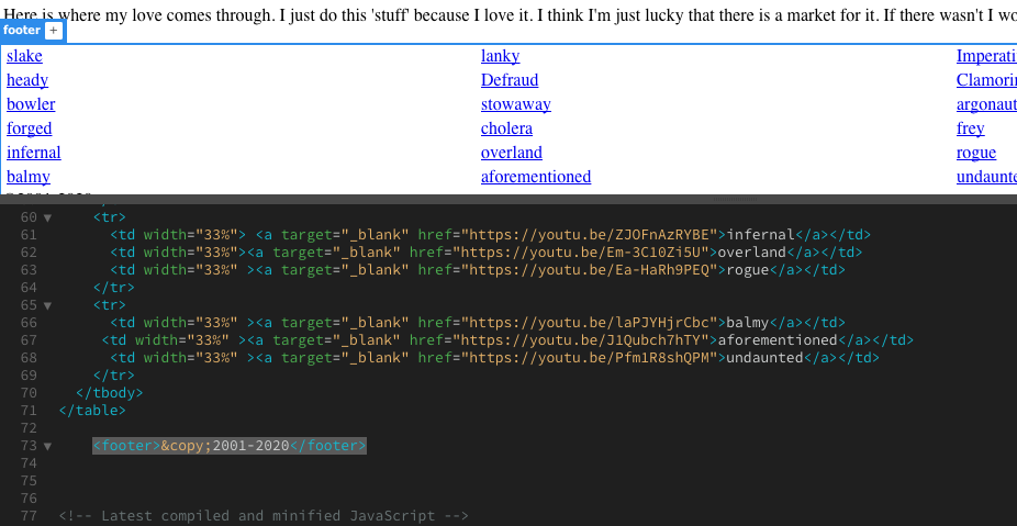
As you can see my footer has somehow engulfed the table contents. I have tried to move it around. I've thrown out the old footer and replaced it but it still wound up engulfing the entire table. I need to separate them. Help!
 1 Correct answer
I just transfered all the info I had on the other 'responsive.css' pages and put it into the one I was having trouble with. It worked! Thank you all for your information.
Copy link to clipboard
Copied
Not sure what you mean. Please explain and give us a link to the site so that we can help you.
Copy link to clipboard
Copied
It sounds like you could have set a height on the table or you could be using position absolute to locate the elements.
Paste your pages code in the forum together with any css or better upload your page and any associated files to a remote server and provide a link to the page.
Copy link to clipboard
Copied
Code snippets don't tell us anything. We need a URL to the online page.
Failing that, validate code and fix reported errors.
HTML -- https://validator.w3.org/
CSS - https://jigsaw.w3.org/css-validator/
Copy link to clipboard
Copied
The site is not online as yet. I am trying to update the entire site. All the pages are just in my desktop Dreamweaver App. The pictures I have included in the original 'Help' shows the portion of the page where the problem is. When I try to just get to the footer it encompassed the the entire table above it. Why does it do that and how do I eliminate it? The table size is set as percentages not as an absolute.
Copy link to clipboard
Copied
Usually what you show in your screen captures is caused by code errors in your html.
We would need to see the entire code to be able to tell you where, exactly, the error is.
Copy link to clipboard
Copied
Here is the screen capture of the code. It is in two shots.
Copy link to clipboard
Copied
HTML code without CSS does not tell the whole story.
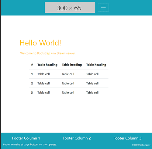
Try copying & pasting the code below into a new, blank document.

<!doctype html>
<html lang="en">
<head>
<meta charset="utf-8">
<title>Alt-Web Demo :: Flexbox filled viewport</title>
<meta http-equiv="X-UA-Compatible" content="IE=edge">
<meta name="viewport" content="width=device-width, initial-scale=1">
<!--Bootstrap 4.4.1 CSS-->
<link href="https://stackpath.bootstrapcdn.com/bootstrap/4.4.1/css/bootstrap.min.css" rel="stylesheet" integrity="sha384-Vkoo8x4CGsO3+Hhxv8T/Q5PaXtkKtu6ug5TOeNV6gBiFeWPGFN9MuhOf23Q9Ifjh" crossorigin="anonymous">
<style>
/**some custom styles**/
body {
min-height: 100vh;
padding-top: 25vh;
}
.flex-grow { flex: 1; }
</style>
</head>

<body class="d-flex flex-column">
<!--BEGIN RESPONSIVE NAVBAR-->
<nav class="navbar navbar-dark navbar-expand-lg bg-info justify-content-center fixed-top"> <a class="navbar-brand" href="#"><img class="img-fluid rounded"  src="https://dummyimage.com/300x65" alt="Your Logo" title="Company Logo or Brand"></a>
<button class="navbar-toggler" type="button" data-toggle="collapse" data-target="#navbarsExampleDefault" aria-controls="navbarsExampleDefault" aria-expanded="false" aria-label="Toggle navigation"> <span class="navbar-toggler-icon"></span> </button>
<div class="collapse navbar-collapse" id="navbarsExampleDefault">
<ul class="navbar-nav ml-auto">
<li class="nav-item active"> <a class="nav-link" href="#">Home <span class="sr-only">(current)</span></a> </li>
<li class="nav-item"><a class="nav-link" href="#">Menu2</a></li>
<li class="nav-item"><a class="nav-link" href="#">Menu3</a></li>
<li class="nav-item"><a class="nav-link" href="#">Menu4</a></li>
</ul>
</div>
</nav>

<!--BEGIN MAIN CONTENT-->
<main class="container flex-grow">
<div class="row text-warning">
<div class="col">
<h1 class="p-1">Hello World!</h1>
<p class="p-2">Welcome to Bootstrap 4 in Dreamweaver. </p>
</div>
</div>
<div class="row">
<div class="col-10 mx-auto">
<table class="table table-responsive">
<thead>
<tr>
<th scope="col">#</th>
<th scope="col">Table heading</th>
<th scope="col">Table heading</th>
<th scope="col">Table heading</th>
</tr>
</thead>
<tbody>
<tr>
<th scope="row">1</th>
<td>Table cell</td>
<td>Table cell</td>
<td>Table cell</td>
</tr>
<tr>
<th scope="row">2</th>
<td>Table cell</td>
<td>Table cell</td>
<td>Table cell</td>
</tr>
<tr>
<th scope="row">3</th>
<td>Table cell</td>
<td>Table cell</td>
<td>Table cell</td>
</tr>
</tbody>
</table>
</div>
</div>
</main>

<!--BEGIN FOOTER-->
<footer class="bg-info text-white mt-4">
<div class="container-fluid py-3">
<div class="row">
<div class="col-md-4 text-center">
<h5>Footer Column 1</h5>
</div>
<div class="col-md-4 text-center">
<h5>Footer Column 2</h5>
</div>
<div class="col-md-4 text-center">
<h5>Footer Column 3</h5>
</div>
</div>
<div class="row">
<div class="col-md-6"> <small>Footer remains at page bottom on short pages.</small></div>
<div class="col-md-3"></div>
<div class="col-md-3 text-right small align-self-end"><small>©2020 XYZ Company</small></div>
</div>
</div>
</footer>
<!--First jQuery, then popper then Bootstrap-->
<script src="https://code.jquery.com/jquery-3.2.1.min.js" integrity="sha256-hwg4gsxgFZhOsEEamdOYGBf13FyQuiTwlAQgxVSNgt4=" crossorigin="anonymous"></script>
<script src="https://cdnjs.cloudflare.com/ajax/libs/popper.js/1.11.0/umd/popper.min.js" integrity="sha384-b/U6ypiBEHpOf/4+1nzFpr53nxSS+GLCkfwBdFNTxtclqqenISfwAzpKaMNFNmj4" crossorigin="anonymous"></script>
<script src="https://stackpath.bootstrapcdn.com/bootstrap/4.4.1/js/bootstrap.bundle.min.js" integrity="sha384-6khuMg9gaYr5AxOqhkVIODVIvm9ynTT5J4V1cfthmT+emCG6yVmEZsRHdxlotUnm" crossorigin="anonymous"></script>
</body>
</html>
Copy link to clipboard
Copied
I just transfered all the info I had on the other 'responsive.css' pages and put it into the one I was having trouble with. It worked! Thank you all for your information.


