

- Home
- Dreamweaver
- Discussions
- Re: List Items not filling Unordered List
- Re: List Items not filling Unordered List
List Items not filling Unordered List

Copy link to clipboard
Copied
Hello,
I'm pretty new to Web Development, and I'm trying to create a simple website. On one of my pages I have multiple list items within an unordered list. I've set the flex-basis to 33.33% and allowed it to wrap in hopes of getting three list items in each row. However, the list items are not filling the entire width of the unordered list; there is a significant gap on the left side. I would be grateful for any suggestions on how to make the list items fill the width of the unordered list.
Below I have attached a picture as well as the relevant HTML and CSS.
Thanks in advance!
HTML:
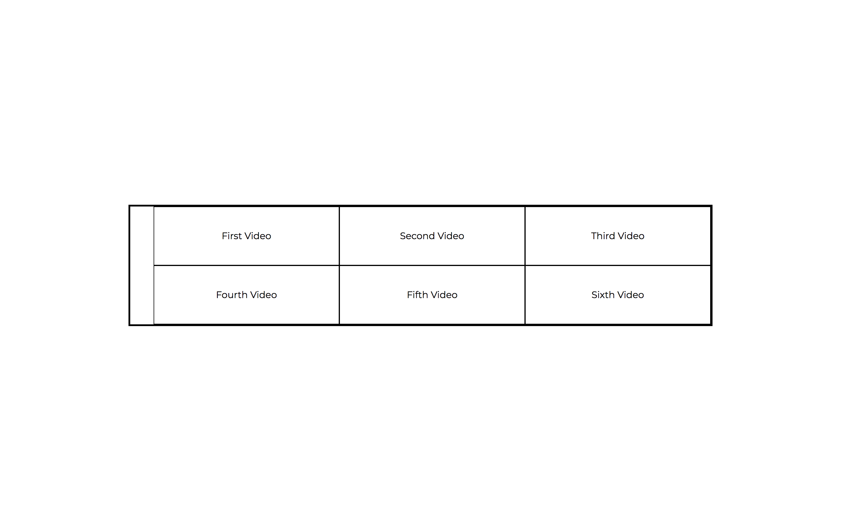
<main class="container">
<ul>
<li>First Video </li>
<li>Second Video</li>
<li>Third Video </li>
<li>Fourth Video </li>
<li>Fifth Video </li>
<li>Sixth Video </li>
</ul>
</main>
CSS:
.container {
width: 100%;
margin: auto;
max-width: 1000px;
text-decoration: none;
font-weight: 100;
text-align: center;
display: flex;
justify-content: center;
}
ul {
list-style-type: none;
display: flex;
font-weight: 400;
margin: 0 auto;
text-align: center;
flex-wrap: wrap;
border: medium solid #000000;
}
li {
min-width: 250px;
padding-top: 40px;
padding-right: 40px;
padding-left: 40px;
padding-bottom: 40px;
text-align: center;
display: flex;
margin: auto 0;
border: thin solid #000000;
flex-basis: 33.33%;
justify-content: center;
flex-wrap: wrap;
position: static;
}


 9
Replies
9
9
Replies
9

Copy link to clipboard
Copied
Before we go any deeper, is this supposed to be a menu?
And what do you envision for mobile and tablet screens?

Copy link to clipboard
Copied
Here's your solution:

Copy link to clipboard
Copied
ALsp wrote
Here's your solution:
You sure that's working Al - dont do anything in my browsers?
Unless I'm a little bit crazy shouldnt there be a li class:
li.flex-root-li
But I dont see one in the html:
<ul class="flex-root-ul closed" aria-label="Navigation Menu">
<li><a href="#">Menu Item</a></li>
<li><a href="#">Menu Item Two</a></li>
<li><a href="#">Menu Item 3</a></li>
<li><a href="#">Menu Item Four</a></li>
<li><a href="#">Menu Item Number 5</a></li>
<li><a href="#">Menu Item 6</a></li>
</ul>
Copy link to clipboard
Copied
You sure that's working Al - dont do anything in my browsers?
I copied the CSS displayed in the black content area from another page in that folder. The actual CSS is in the head is fine and the menu displays fine in Chrome, Firefox, Edge, iPhone, and Android for me.
I corrected the CSS in the content area. Good catch 🙂
Borders is always going to be a problem because of the wrap. Been there.
Copy link to clipboard
Copied
ALsp wrote
You sure that's working Al - dont do anything in my browsers?
I copied the CSS displayed in the black content area from another page in that folder. The actual CSS is in the head is fine and the menu displays fine in Chrome, Firefox, Edge, iPhone, and Android for me.
I corrected the CSS in the content area. Good catch 🙂
Borders is always going to be a problem because of the wrap. Been there.
Shadow is good
Copy link to clipboard
Copied
It sometimes helps, but besides, Ben likes your answer and I'm amazed because neither my code or yours uses Bootstrap. 

Copy link to clipboard
Copied
ALsp wrote
It sometimes helps, but besides, Ben likes your answer and I'm amazed because neither my code or yours uses Bootstrap.
I did't take you to be the envious type 
Copy link to clipboard
Copied
I'm not. Now the OP has 2 excellent examples to learn from... and the planet hasn't been harmed by another useless Bootstrap implementation 🙂
Copy link to clipboard
Copied
Anyway Ive gone nuts and created an option. The css is a bit long-winded as I wanted to give all the boxes a thin border, don't know if there is a better way to apply a thin border like border-collapse works on a table.
<!DOCTYPE html>
<html>
<head>
<meta charset="UTF-8">
<title>Flex Box</title>
<style>
* {
box-sizing: border-box;
}
ul.container {
display: flex;
flex-wrap: wrap;
width: 90%;
margin: auto;
padding: 0;
border: thin solid #000000;
}
li:nth-child(1), li:nth-child(2) {
border-bottom: thin solid #000000;
border-right: thin solid #000000;
}
li:nth-child(3) {
border-bottom: thin solid #000000;
}
li:nth-child(4), li:nth-child(5) {
border-right: thin solid #000000;
}
li {
display: flex;
justify-content: center;
flex-basis: 33.33%;
font-weight: 400;
padding: 40px 0;
margin: 0;
}
@media screen and (max-width: 768px) {
li {
flex-basis: 50%;
}
li:nth-child(2) {
border-right: none;
}
li:nth-child(3) {
border-right: thin solid #000000;
}
li:nth-child(4) {
border-right: none;
border-bottom: thin solid #000000;
}
}
@media screen and (max-width: 480px) {
ul.container {
width: 95%;
}
li:nth-child(1), li:nth-child(3) {
border-right: none;
}
li:nth-child(5) {
border-right: none;
border-bottom: thin solid #000000;
}
li {
flex-basis: 100%;
}
}
</style>
</head>
<body>
<ul class="container">
<li>First Video </li>
<li>Second Video</li>
<li>Third Video </li>
<li>Fourth Video </li>
<li>Fifth Video </li>
<li>Sixth Video </li>
</ul>
</body>
</html>
Find more inspiration, events, and resources on the new Adobe Community
Explore Now
 AdChoices