positioning-3
Copy link to clipboard
Copied
Hi,
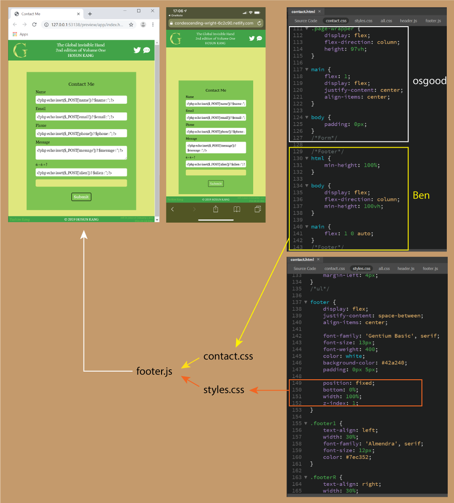
Q1. (osgood)
I added osgood's code.
But it doesn't look like working for the alignment.
Q2. (Ben)
osgood's body {padding: 0px;} made me to follow Ben's fixed footer.
<footer> is under contact.css and styles.css.
I wrote the code in orange box together with body {padding-bottom: 21.33px;} for the original fixed footer.
How would I deal with them? (leave them or block them)
https://trusting-brahmagupta-566a63.netlify.com/
Hosun Kang
Copy link to clipboard
Copied
If you want to horizontally and vertically center content in your 'main' container you will have to add the css below for the 'main' container,
justify-content: center;
align-items: center;
I can't see where in your styles that has been included even though I indicated to do this in my last post.
The issue now is that you are getting conflicting/confusing information given to you. The reason I did not suggest the way Ben showed you, which is a better approach to push a footer to the bottom of the browser window, is because your footer was already 'fixed' and I'm trying to work with the code you currently have. At the moment you are stabbing around in the dark, adding more and more conflicting css - what should be a simple exercise is beconming a complete mess as a result.
Your basic page structure/css should be no more complicated than below:
<!DOCTYPE html>
<html lang="en">
<head>
<meta charset="UTF-8">
<title>Contact Me</title>
<style>
body {
margin: 0;
padding: 0;
}
.page-wrapper {
display: flex;
flex-direction: column;
height: 100vh;
}
header {
background-color: #41a348;
}
main {
display: flex;
justify-content: center;
align-items: center;
flex: 1;
background-color: #dfe67d;
}
.footer {
background-color: #41a348;
}
.form-container {
background-color: #7ec352;
width: 60%;
}
</style>
</head>
<body>
<div class="page-wrapper">
<header>
<h3>Header goes here</h3>
</header>
<main>
<div class="form-container">
<h2>Contact Me</h2>
</div>
<!-- end form-container -->
</main>

<footer class="footer">
<h3>Footer content goes here</h3>
</footer>

</div>
<!-- end page-wrapper -->

</body>
</html>
Copy link to clipboard
Copied
Hi,
Thank you very much for your advice.
That is what I am worried about.
Now, it looks fine on laptop.
The remaining issue is iPhone.
Is there any solution?
https://distracted-lamport-1ff7d2.netlify.com/
Hosun Kang
Copy link to clipboard
Copied
I don't have an iphone to check on.
Does the basic code I provided work on iphone or does that also push the 'contact me' box lower down the page than where it should be?
I guess you could try some css prefixes for flex on the page-wrapper and main containers and see if that resolves the issue:
.page-wrapper {
display: -webkit-box;
display: -ms-flexbox;
display: flex;
-webkit-box-orient: vertical;
-webkit-box-direction: normal;
-ms-flex-direction: column;
flex-direction: column;
height: 100vh;
}

main {
display: -webkit-box;
display: -ms-flexbox;
display: flex;
-webkit-box-pack: center;
-ms-flex-pack: center;
justify-content: center;
-webkit-box-align: center;
-ms-flex-align: center;
align-items: center;
-webkit-box-flex: 1;
-ms-flex: 1;
flex: 1;
background-color: #dfe67d;
}
Copy link to clipboard
Copied
Hi,
Thank you very much for your reply.
With your original code, the green box is not vertically-aligned on iPhone.
When I changed
from
.page-wrapper {height: 97vh;}
to
.page-wrapper {height: 83vh;}, it looks fine on iPhone and not on my laptop.
That is what I see now.
https://dreamy-cray-c1a69f.netlify.com/
Hosun Kang
Copy link to clipboard
Copied
Copy link to clipboard
Copied
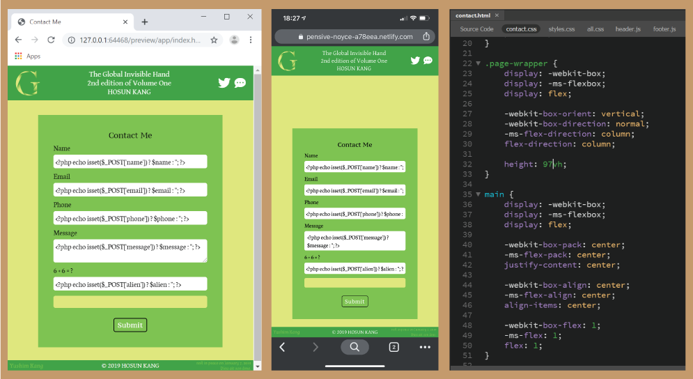
Hi,
I tried your code (prefixes).
It looks fine on laptop, but not OK on iPhone.
I just think of doing over without include files (header.js and footer.js).
https://pensive-noyce-a78eea.netlify.com/
Hosun Kang
Copy link to clipboard
Copied
I don't think it has anyting to do with the include files. It appears the browser you are using on your iPhone for some reason is not observing some of the flex attributes.
You can remove the <header></header> and <footer></footer> from the current page and test but I think it will still show the same results, the form will not be vertically centered in the window.
Copy link to clipboard
Copied
Copy link to clipboard
Copied
I think the problem is you're still using footer 'fixed' and NOT the suggested layout provided by Ben and myself which uses flex, so it doesnt help reslove matters - all the combinations of css, both in your files and the css supplied to you as a solution then get mixed up. What you really have to do to be absolute positive that the flex solution doesnt work in iPhone is test the basic code Ben or I provided. DO NOT link any of your code or css to the file as there may be something in them which conflicts with the solution supplied. Once it has been established the code Ben or I supplied doesnt work then solutions or alternatve suggestions can be sought. If the code supplied does work and then when you link your css/code it doesnt then its something in your files which is conflicting.


