

Question
positioning-3
Hi,
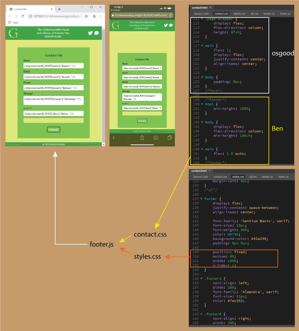
Q1. (osgood)
I added osgood's code.
But it doesn't look like working for the alignment.
Q2. (Ben)
osgood's body {padding: 0px;} made me to follow Ben's fixed footer.
<footer> is under contact.css and styles.css.
I wrote the code in orange box together with body {padding-bottom: 21.33px;} for the original fixed footer.
How would I deal with them? (leave them or block them)
https://trusting-brahmagupta-566a63.netlify.com/
Hosun Kang
 AdChoices