Responsive menu change - from image buttons to text buttons - is it possible?
Copy link to clipboard
Copied
Hello!
I am about to start building a responsive website in Dreamweaver for a client.
The in Photoshop designed desktop version of the website contains a custom designed menu with visual icons as buttons. Is it possible to have the menu switch between an image-based button menu for desktop and a text-based dropdown menu for tablet/smartphone, as it resizes per device?
Copy link to clipboard
Copied
Sure, you can do something elaborate with javascript by replacing the images for text at mobile device sizes OR a more simplistic approach would be to create 2 identical menus, one of which has images, the other text then display the appropriate menu for the appropriate device using css and media queries.
Having 2 menus, one for desktop and one for mobile devices will result in more management. Youre much better off just using a text based menu across all devices in my opinion.
Copy link to clipboard
Copied
A resounding yes! But please ditch the Photoshop menus entirely. Image-based navigation is NOT web-friendly on any device.
CSS styled text links are the way to go for ALL devices. It's better for search engines, language translators and humans with vision impairments. On high resolution devices, real text is much cleaner and easier to see than pixelated images.
Bootstrap will help you get started with responsive menus that work on all devices.
Go to File > New > Starter Templates > Bootstrap Templates. Pick one and hit CREATE button.
And if desired, you can add Bootstrap icons to the mix. See below.
Hope that helps.
Copy link to clipboard
Copied
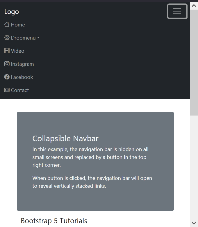
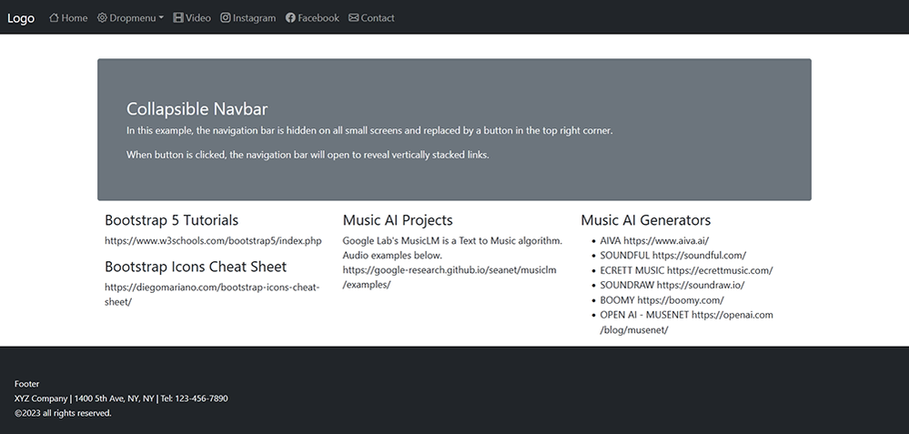
Below is a working example with Bootstrap 5 & Bootstrap Icons.
On larger devices, the navigation becomes horizontally aligned.
The code:
<!doctype html>
<html lang="en">
<head>
<title>Bootstrap 5.1.3 Example</title>
<meta charset="utf-8">
<meta name="viewport" content="width=device-width, initial-scale=1">

<!--Minified Bootstrap 5 CSS-->
<link href="https://cdn.jsdelivr.net/npm/bootstrap@5.1.3/dist/css/bootstrap.min.css" rel="stylesheet">

<!--Bootstrap Icons-->
<link rel="stylesheet" href="https://cdn.jsdelivr.net/npm/bootstrap-icons@1.10.2/font/bootstrap-icons.css">
</head>

<body>
<!--navbar-->
<nav class="navbar navbar-expand-md navbar-dark bg-dark">
<div class="container-fluid">
<a class="navbar-brand" href="#">Logo</a>
<button class="navbar-toggler" type="button" data-bs-toggle="collapse" data-bs-target="#collapsibleNavbar">
<span class="navbar-toggler-icon"></span>
</button>
<div class="collapse navbar-collapse" id="collapsibleNavbar">
<ul class="navbar-nav">
<li class="nav-item">
<a class="nav-link" href="#"><i class="bi bi-house"></i> Home</a>
</li>
<!--Begin Dropmenu-->
<li class="nav-item dropdown">
<a class="nav-link dropdown-toggle" href="#" role="button" data-bs-toggle="dropdown"><i class="bi bi-gear"></i> Dropmenu</a>
<ul class="dropdown-menu">
<li><a class="dropdown-item" href="#">Link</a></li>
<li><a class="dropdown-item" href="#">Another link</a></li>
<li><a class="dropdown-item" href="#">A third link</a></li>
</ul>
</li> <!--end dropmenu-->
<li class="nav-item">
<a class="nav-link" href="#"><i class="bi bi-film"></i> Video</a></li>
<li class="nav-item"><a class="nav-link" href="#"><i class="bi bi-instagram"></i> Instagram</a></li>
<li class="nav-item">
<a class="nav-link" href="#"><i class="bi bi-facebook"></i> Facebook</a></li>
<li class="nav-item"><a class="nav-link" href="#"><i class="bi bi-envelope"></i> Contact</a></li>
</ul>
</div>
</div>
</nav><!--end navbar-->
<!--Begin Content-->
<div class="container mt-3">
<div class="row">
<div class="mt-4 p-5 bg-secondary text-light rounded">
<h3 class="mt-3">Collapsible Navbar</h3>
<p>In this example, the navigation bar is hidden on all small screens and replaced by a button in the top right corner.
</p>
<p>When  button is clicked, the  navigation bar will open to reveal vertically stacked links.</p>
</div>
</div>
<div class="row">
<div class="col-lg-4">
<h4 class="mt-3">Bootstrap 5 Tutorials</h4>
<p>https://www.w3schools.com/bootstrap5/index.php</p>

<h4 class="mt-3">Bootstrap Icons Cheat Sheet</h4>
<p>https://diegomariano.com/bootstrap-icons-cheat-sheet/</p>
</div>

<div class="col-lg-4">
<h4 class="mt-3">Music AI Projects</h4>
<p>Google Lab's MusicLM is a Text to Music algorithm. Audio examples below.<br>
https://google-research.github.io/seanet/musiclm/examples/</p>
</div>

<div class="col-lg-4">
<h4 class="mt-3">Music AI Generators</h4>
<ul>
<li>AIVA https://www.aiva.ai/</li>
<li>SOUNDFUL https://soundful.com/</li>
<li>ECRETT MUSIC https://ecrettmusic.com/</li>
<li>SOUNDRAW https://soundraw.io/</li>
<li>BOOMY https://boomy.com/</li>
<li>OPEN AI - MUSENET https://openai.com/blog/musenet/
</li>
</ul>
</div>
</div>
</div>
<div class="container-fluid">
<footer class="row bg-dark text-light">
<div class="mt-4 p-4">
<small>Footer<br>XYZ Company  |  1400 5th Ave, NY, NY | Tel: 123-456-7890<br>
©2023 all rights reserved.</small>
</div>
</footer>
</div>

<!--latest minified Bootstrap JS bundle-->
<script src="https://cdn.jsdelivr.net/npm/bootstrap@5.1.3/dist/js/bootstrap.bundle.min.js">
</script>
</body>
</html>
Copy link to clipboard
Copied
Wow. I'll need a moment to look into it, looks good. Thank you, Nancy!


