- Home
- Dreamweaver
- Discussions
- Re: Why Does Chrome Display My Layout Wrongly?
- Re: Why Does Chrome Display My Layout Wrongly?
Copy link to clipboard
Copied
Hii everybody, does anybody know why my website layout displays wrongly in Chrome but correctly on Firefox? It’s a pretty simple layout. The Chrome display narrows the columns at the sides and widens the cells in the middle so there are spaces between the pictures. This does NOT happen in Firefox or Safari.
The layout is basically 8 columns equalling 980px width in total. 65,25,200,200,200,200,25,65. As you can see (website link below) Chrome narrows the 65px columns at the edges and widens the 200px columns in the middle for reasons I can’t work out.
http://www.maximum-robot.co.uk/
Thanks for any help.
Gareth
 1 Correct answer
Then do yourself and your band a favor and hire an experienced web developer to help you.
Responsive web design is not optional and nothing new. It has been around since 2012. And it's NOT about building separate pages for specific devices. It's about building layouts that fit a wide range of device widths from small mobile to big screen TVs, usually with frameworks like Bootstrap.
Copy link to clipboard
Copied
Try adding reset.css to your page: https://meyerweb.com/eric/tools/css/reset/
Having said that, tables are for tabular data, not for layouts.
Copy link to clipboard
Copied
I'm afraid "browser variation" is the least of your worries.
The average shelf-life of a site these days is 3-5 years. Clearly your current site has far exceeded that limit and it shows. This site needs to be rebuilt to modern web standards.
Among other things, table-based layouts are NOT responsive. On hi-res displays, 980px looks like a postage stamp floating in the Atlantic ocean. And 980px doesn't fit small devices. So you're alienating users on both spectrums and all parts in between. Bad enough to be sure but Google is penalizing you for not having a "mobile-friendly" site. See report below.
https://search.google.com/test/mobile-friendly?id=rKKJUizzrTovJ2dtGrvYRQ
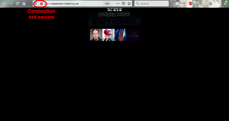
Misstep #2 is not having HTTPS connections. There's no excuse for not having a secure server anymore. GoDaddy offers SSL/TLS certs. Or you can get FREE low level certs from Let's Encrypt or Cloudflare and install them yourself. Secure connections are a "must have."
https://www.whynopadlock.com/results/beaab99a-fdfb-4d96-bdd4-d2b5709478b7
Start your responsive site with one of the built-in Bootstrap Starter Templates in DW CC. File > New > Starter Templates > Bootstrap Templates. Choose a layout and hit the Create button.
Read chapters, do code exercises and take quizzes at the end.
- https://www.w3schools.com/html/
- https://www.w3schools.com/css/
- https://www.w3schools.com/js/
- https://www.w3schools.com/bootstrap4/
Copy link to clipboard
Copied
Thanks Ben & Nancy, I didn't see this until now because the reply notifiction went into my spam for some reason. I have (sort of) solved the issue by breaking the text with a paragraph. For some reason Chrome caused the text to push the cell longer. This fix wouldn't work if there was more text but as it's only two lines I can get away with it! As for the other issues I would prefer not to spend any time on these matters. Though I appreciate that it would look better on many devices if I did. Redesigning it for the latest technology would be a never ending task as devices and browsers are forever changing. I think we need to focus on the music! Thanks again for your help.
Copy link to clipboard
Copied
Then do yourself and your band a favor and hire an experienced web developer to help you.
Responsive web design is not optional and nothing new. It has been around since 2012. And it's NOT about building separate pages for specific devices. It's about building layouts that fit a wide range of device widths from small mobile to big screen TVs, usually with frameworks like Bootstrap.
Copy link to clipboard
Copied
Hi,
The statement on the forever changing is not true in the context your putting it.
As time will go on your site will actually work less and less without change from that near 20 year old code structure.
Yes CSS and HTML tech is evolving but extending, not changing.
Flexbox exists, gets fixes but because CSS grid exists and is new does not mean flexbox goes away.
The biggest issue with web development was how Microsoft did its own thing with its rendering engine over webkit and firefox's Gecko they now use chormium as a base. And these are very stable.
It is design, UX methadology etc which is always evolving and why Nancy said 3-5 year lifespan for a site. Marketing based sites can often be small, single page promo sollutions which only last 6 months but a large site needs to keep with the times.
A basic site like you linked can be replicated using bootstrap and be a bit more up to date and browser compatible in just a few hours if it is flat code (No CMS/custom server side code)
Copy link to clipboard
Copied
Thanks, I'm really not into all this tech stuff. Some people are, fair play to them. I won't be going on that journey any time soon. Life is too short! Thanks for the advice and infomation on this thread. It's always been great a help whenever I've had to use this forum. Let's hope it's a while before I need it again. Thanks again.
Get ready! An upgraded Adobe Community experience is coming in January.
Learn more


