- Home
- FrameMaker
- Discussions
- Re: Template and Manual Page Recreation
- Re: Template and Manual Page Recreation
Template and Manual Page Recreation

Copy link to clipboard
Copied
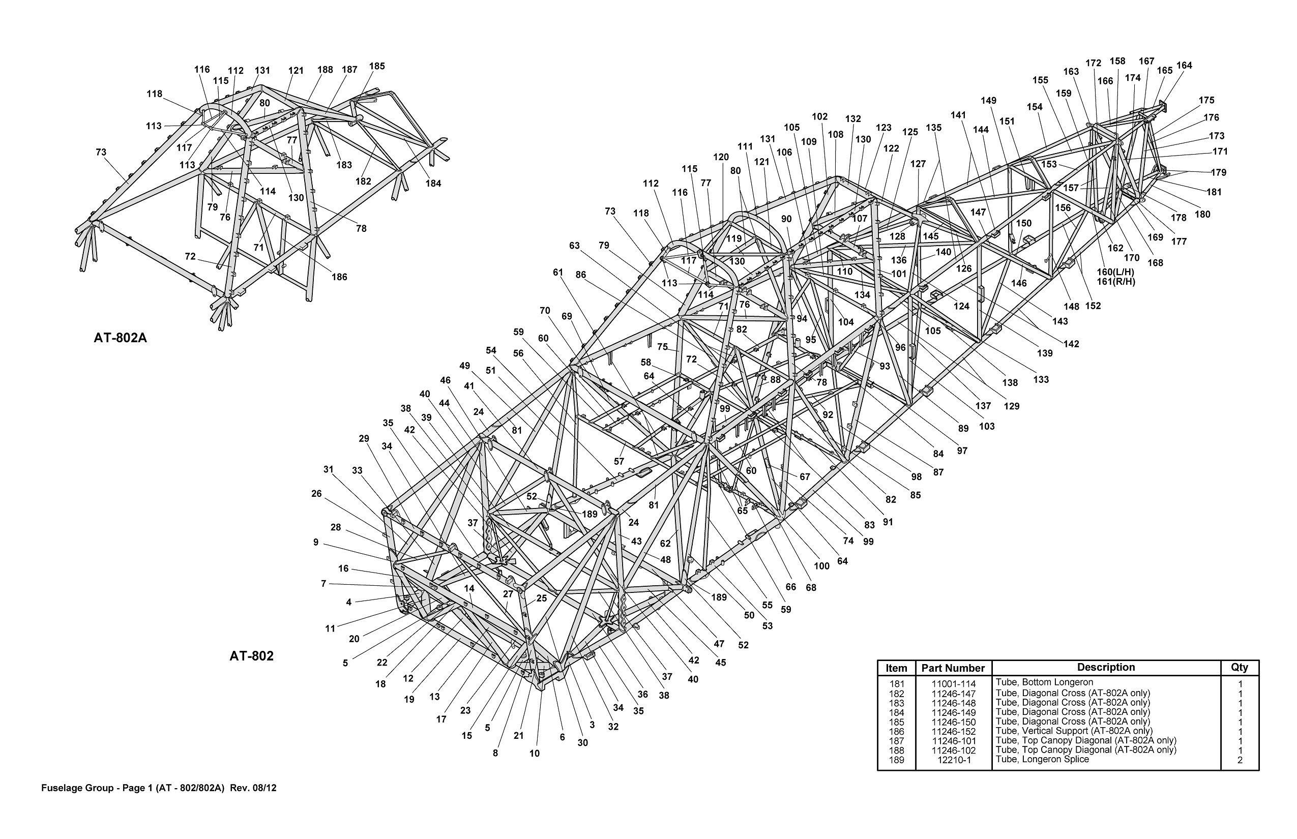
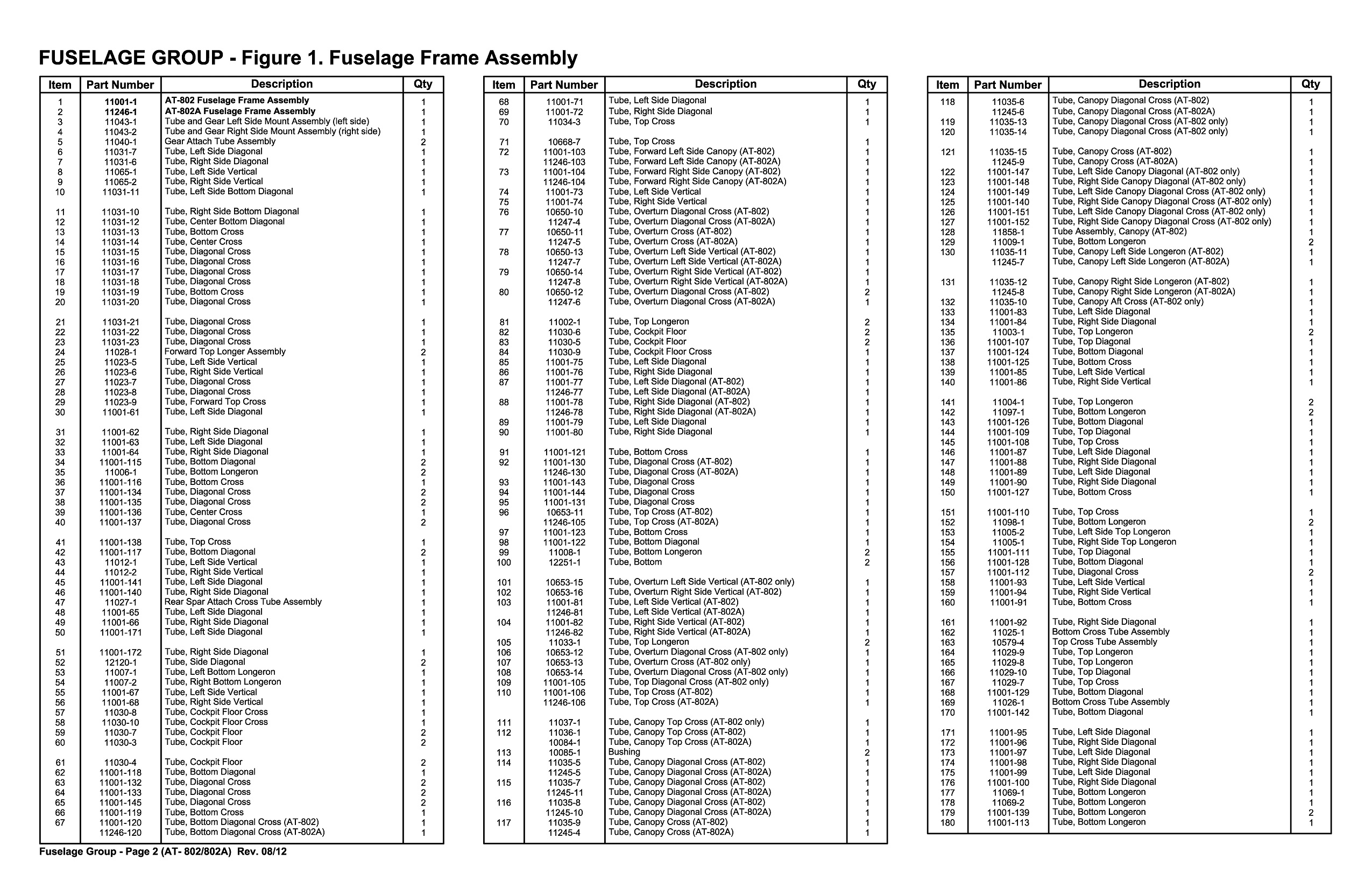
I am needing to recreate a template and Manual page to show to my supervisor so he will get on board with buying FrameMaker for my work. Basically, I need help.


Copy link to clipboard
Copied
Go pull down the 30 trial copy of FM 12 and play around with it.

Copy link to clipboard
Copied
Sorry I guess I should have clarified that I am using the trial version and can't seem to figure out a few things with the table layout. Such as getting the table to justify to the bottom of the page instead of the top. The table is continuous through all 3 columns.
Copy link to clipboard
Copied
Unfortunately, FM tables can't be forced to fit to the bottom of a page. Most things (except for anchored frames) in FM are continuous within the flow through the connected text frames of a document. The main override option is to have something start at the top of a frame or column (but not bottom).
If the example that you posted was done in FM, what are the problems that you're having?

Copy link to clipboard
Copied
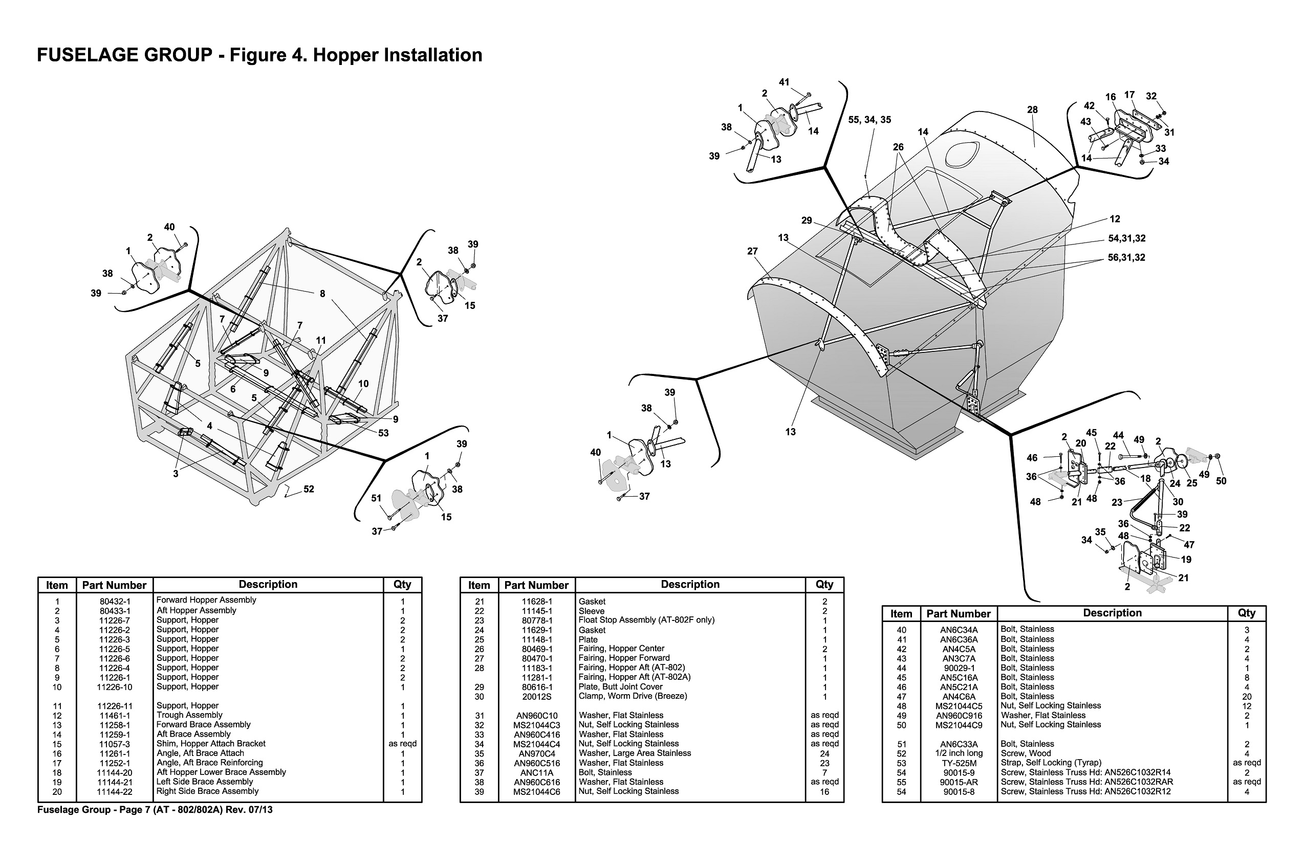
It wasn't created using Frame. Here is another example showing why I would need them to justify to the bottom. I guess a continued table cannot be placed into an anchored frame?

Copy link to clipboard
Copied
If I were you, I'd set up this type of page using two text anchors -- the
first at the top of the page for the anchored frame to hold the graphic.
The second is in the text flow and would anchor the table.
Note that in the example .jpg, you actually have either one table snaking
through three text columns or three small tables... hard to tell from the
screen snap.
That is possible to do with Frame, but the procedure would be convoluted.
You'd create an anchored frame, then put a text frame inside it, probably
setting it to three columns. Then insert a narrow table into that, it would
snake through the column layout, but there may be white space on the bottom
of each column.
So you'd end up with a series of nested containers, with the lowest level
holding the text. The problem is that it would be a disconnected text flow,
and wouldn't adapt as the book's pagination changes with more material
being added on pages ahead of it
Art Campbell
art.campbell@gmail.com
"... In my opinion, there's nothing in this world beats a '52 Vincent and
a redheaded girl." -- Richard Thompson
No disclaimers apply.
DoD 358
I support www.TheGrotonLine.com, hyperlocal news for Groton MA.
Copy link to clipboard
Copied
For these types of page layouts, you can place the graphics at the top of the page and set the text frame for the bottom part/half to hold the table in a multi-column layout.
Parts diagrams, especially on oversized pages, can be created using disconnected pages and you don't have to use anchored frames to hold the graphics. You can postion at the top of the page, set run-around properties on for the graphics and then the tables will pushed to the bottom.

Copy link to clipboard
Copied
I guess the good thing about our catalogs are that they are modular so the figures are either 1 page or 2 page and do not overlap to other pages. Thanks for your input. I'm also wondering, since these are tabloid size and the catalog flips on the long edge in a binder, how does frame handle adjacent pages that don't flip right to left?
Copy link to clipboard
Copied
In FM you can only have one physical page size per file. You use the book file to string the files together and set and control the page numbers and internal numbering for pargraphs, figures, tables, etc.
Copy link to clipboard
Copied
> I guess a continued table cannot be placed into an anchored frame?
They can. You'd put all 3 text frames in the same Anchored Frame, give them a unique Flow Tag, then connect them (Format > Customize Layout > Connect Text Frames). AFs, as you know, can be set to Bottom of Column.
If you use autoconnect, you'd probably need to have a unique table set Flow Tag for each page pair, to prevent tables from flowing onto pages where they don't belong.
Other suggestions seem easier.

