- Home
- Illustrator
- Discussions
- Adjusting bounding box size of text?
- Adjusting bounding box size of text?
Copy link to clipboard
Copied
Hey all. This is probably an ignorant question.
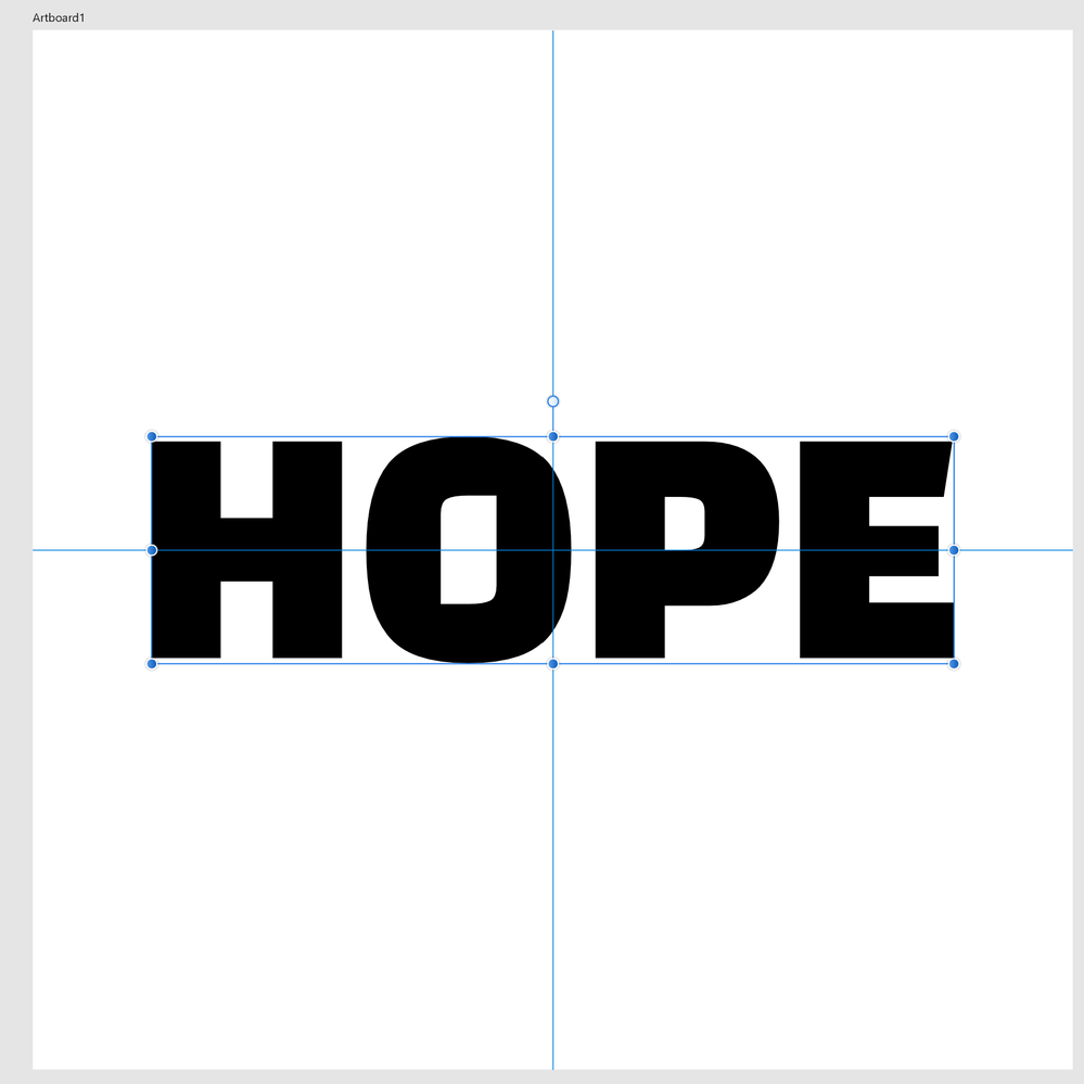
In Illustrator, many fonts I choose are displayed with extra white space around them. The bounding box does not match the characters. Is there a setting I can/should change to make the bounding boxes match the characters? I'm uploading two images. One is of Illustrator and the other is Affinity Designer. Both are displaying the same font, Change One.
I'd be really grateful for any input / thoughts.
Thanks!
 1 Correct answer
ReadyPlayer,
Illy (job description Adobe Illustrator) generally thinks in terms of typography rather than sign making, and including sometimes unwanted things like leading; but she can give you the sign making style.
You can:
1) Tick Edit>Preferences>General>Use Preview/Artwork Bounds;
2) Select the Type with the (normal) Selection Tool and Effect>Path>Outline Object;
That will reduce the Bounding Box to the actual bounds of the letters, and keep the Type editable, so you can place the live
Explore related tutorials & articles
Copy link to clipboard
Copied
ReadyPlayer,
Illy (job description Adobe Illustrator) generally thinks in terms of typography rather than sign making, and including sometimes unwanted things like leading; but she can give you the sign making style.
You can:
1) Tick Edit>Preferences>General>Use Preview/Artwork Bounds;
2) Select the Type with the (normal) Selection Tool and Effect>Path>Outline Object;
That will reduce the Bounding Box to the actual bounds of the letters, and keep the Type editable, so you can place the live Type as you wish based upon its appearance.
But if you need it as non outlined text in PDF you will have to remove the effect:
3) With the live Type selected, in the Appearance palette click the Reduce to Basic Appearance button.
That will bring it back to normal plain Type.
Obviously, you will need to untick Use Preview/Artwork Bounds for other purposes, but you can just tick that again when you need to edit (some of) the Type if needed to keep it in place; that may not be necessary because the changes will (mostly, and only if no letters exceed the hitherto vertical bounds) be in the horizontal direction.
Copy link to clipboard
Copied
Thank you! That is what I needed.
Copy link to clipboard
Copied
For my part you are welcome, Ready Player.
Copy link to clipboard
Copied
In addition to Jacob's (Hi, Jacob!) contribution, for alignment purposes, recent versions of Illustrator have Snap to Glyph functionality. You can find relevant information here.
Peter
Copy link to clipboard
Copied
Actually, in Illustrator, and most programs that work with digital typefaces, this is expected behaviour.
What you are seeing in your Illustrator file is a bounding box that is honouring the actual specifications built into the fonts, including the areas where descending characters would fall, like a lower-case "g", as well as ascending characters, like an accented letter. Typefaces, even in the digital age, are designed by a type foundry in the same manner as if they were, to use an analogy, old-school metal or wood blocks. Each designer will determine the proper spacing of these "blocks" if they are placed side by side (a kerning of "0") so the letters may have space "built-in" on the left and right on some characters and some not for proper optical spacing and this will vary between typefaces from different designers, etc
(in my example, you can see the as-designed dimensions of a capital H and a W in Adelle Bold).
Some programs can define a bouding box on the fly based on snugging up to the actual letter shapes, and I suspect that is what's happening in your Affinity (Artistic Text). If you convert your text to outlines in Illustrator, the bounding box will change accordingly.
Copy link to clipboard
Copied
If you convert your text to outlines in Illustrator, the bounding box will change accordingly.
And in so doing, the text is made un-editable. This isn't a good option.
Copy link to clipboard
Copied
Hi Peter (still no show?).
And hi Brad.
Copy link to clipboard
Copied
Hi, Jacob!!
Copy link to clipboard
Copied
Correct.
Get ready! An upgraded Adobe Community experience is coming in January.
Learn more


