ReadyPlayer,
Illy (job description Adobe Illustrator) generally thinks in terms of typography rather than sign making, and including sometimes unwanted things like leading; but she can give you the sign making style.
You can:
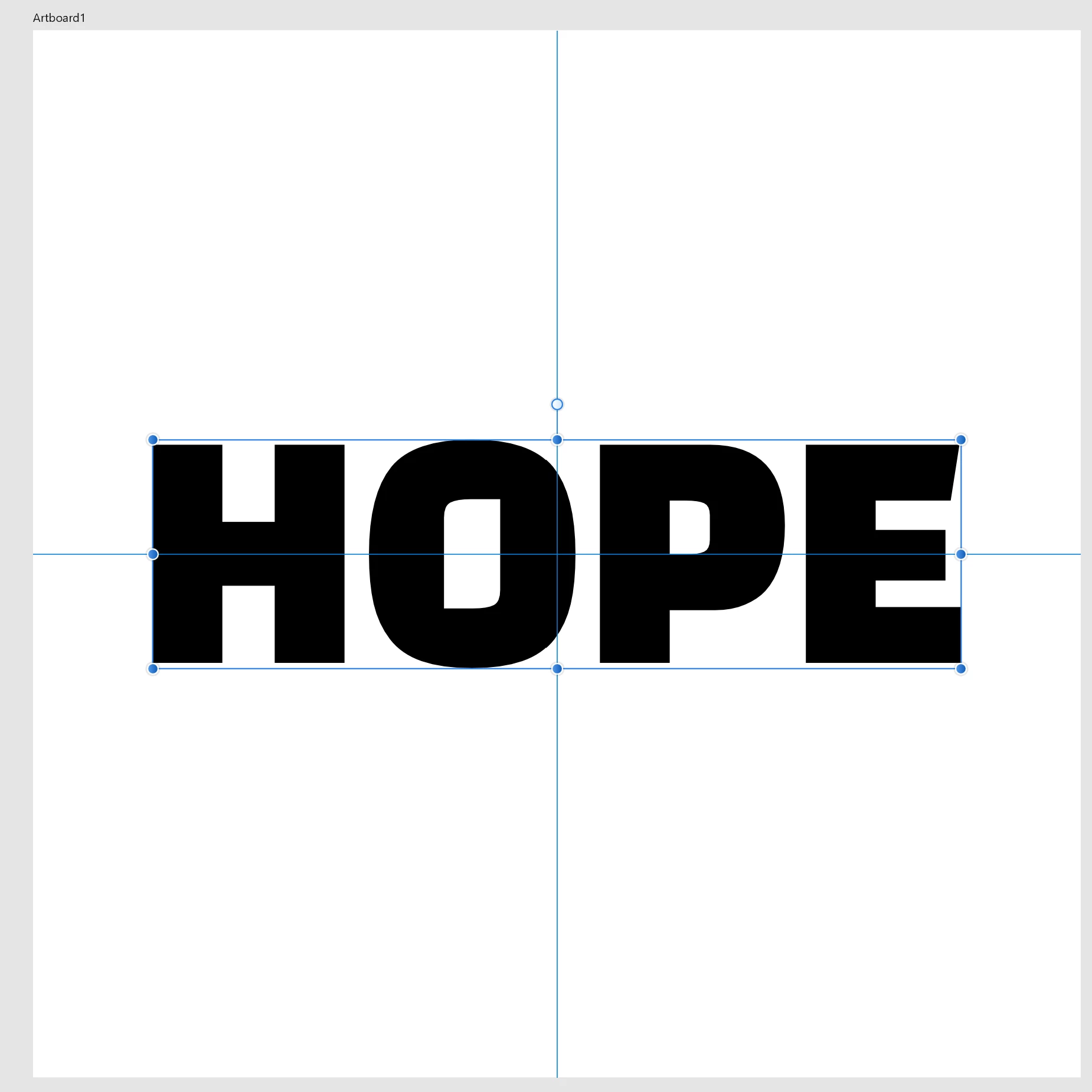
1) Tick Edit>Preferences>General>Use Preview/Artwork Bounds;
2) Select the Type with the (normal) Selection Tool and Effect>Path>Outline Object;
That will reduce the Bounding Box to the actual bounds of the letters, and keep the Type editable, so you can place the live Type as you wish based upon its appearance.
But if you need it as non outlined text in PDF you will have to remove the effect:
3) With the live Type selected, in the Appearance palette click the Reduce to Basic Appearance button.
That will bring it back to normal plain Type.
Obviously, you will need to untick Use Preview/Artwork Bounds for other purposes, but you can just tick that again when you need to edit (some of) the Type if needed to keep it in place; that may not be necessary because the changes will (mostly, and only if no letters exceed the hitherto vertical bounds) be in the horizontal direction.