Ahhh, Avenir. (sigh)
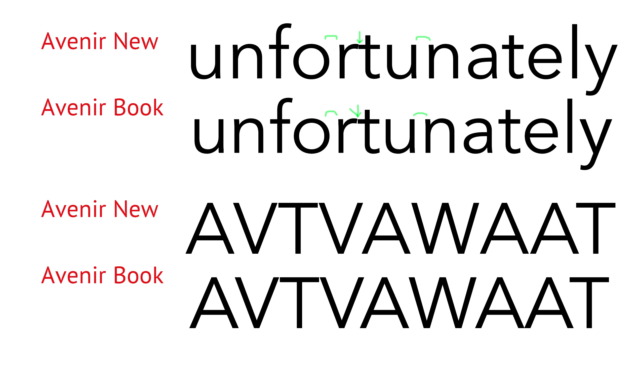
This used be one of my favourite fonts, but it has had a history of issues, the worst of which is its notoriously odd kerning pairs and side bearings, made even worse in the "New" version. Just because it's from a high-end foundry like Linotype, it still comes down to the typeface designer's desires.
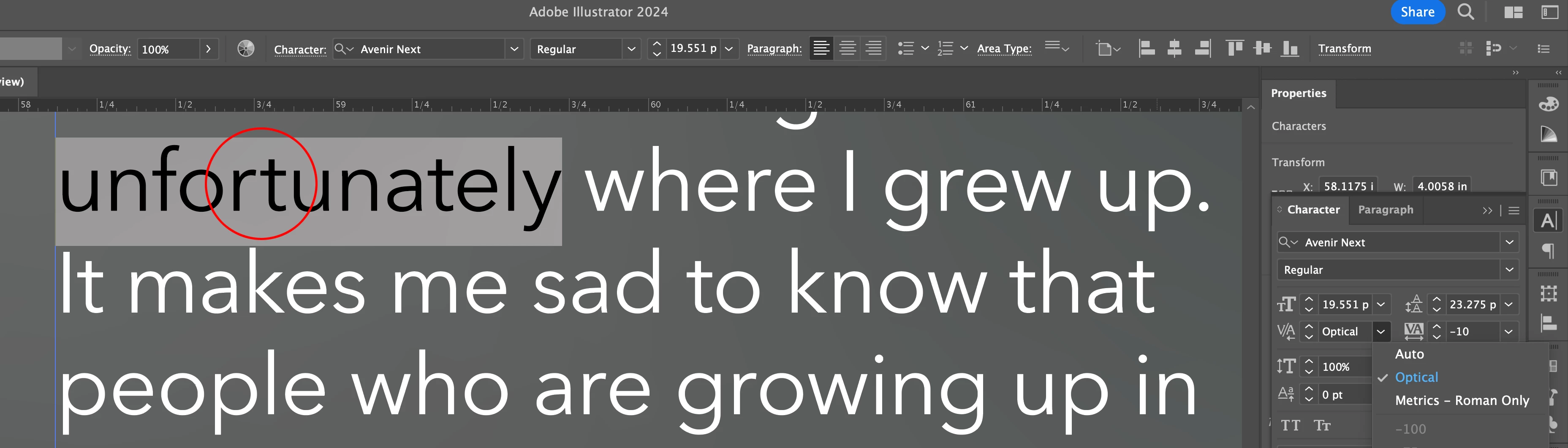
The Auto setting will use the Font Metrics information designed if it exists, if not, it goes Optical.
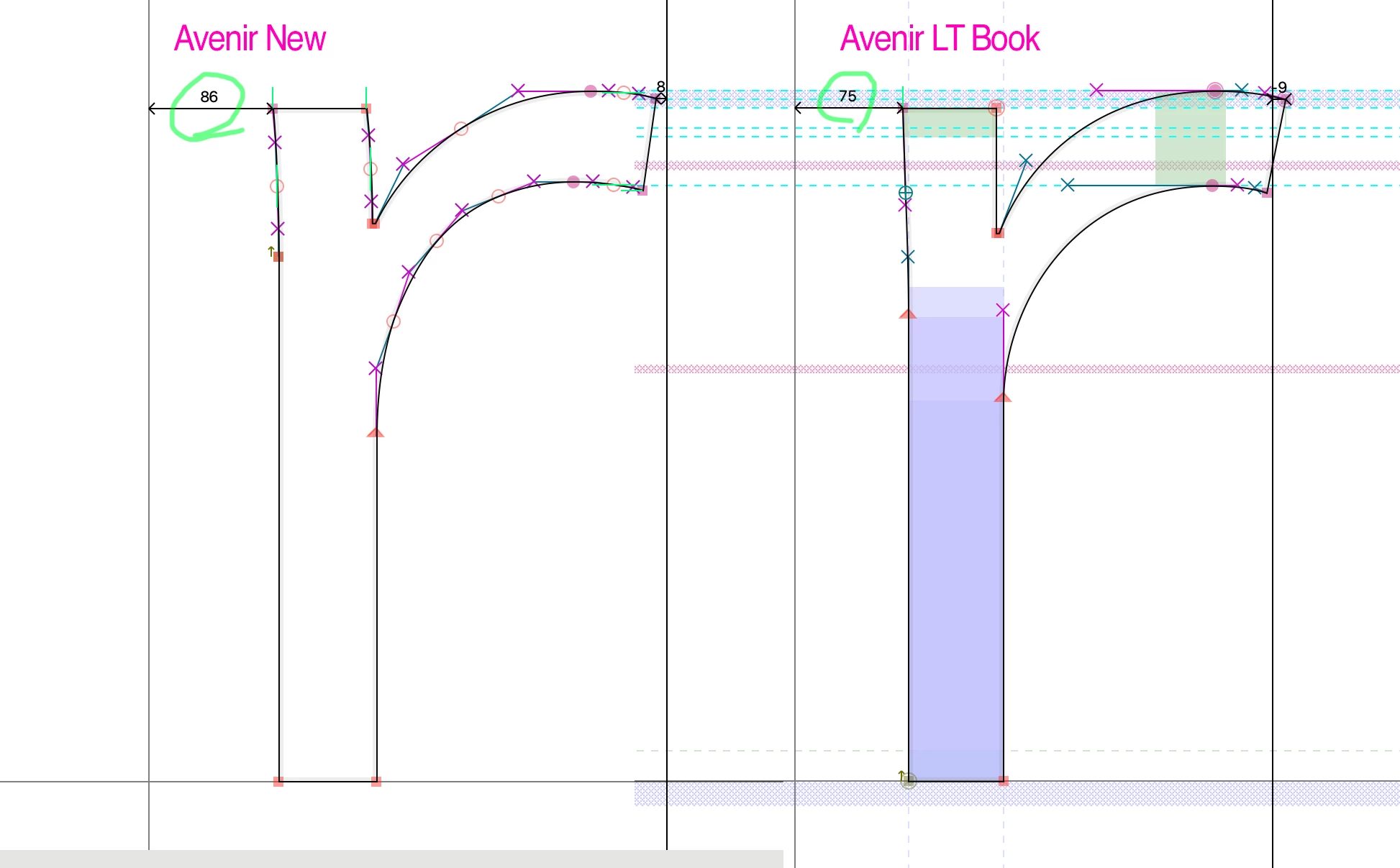
I would not want the default to be Optical, as that has other ramifications, e.g. not matching output from other programs, etc. Besides, most Font Metrics are actually better than Optical anyway and are the way the designer intended, for better or worse. Optical is just an algorithm. (The third option, of course is no kerning pairs at all (i.e. selecting "0"), but as you can see from the actual metrics for a lower case "r" even THAT would almost touch the next letter (Avenir New) or even still overlap (oldschool Avenir Book). Avenir New for some reason INCREASED the left sidebearing on the "r" so now it's even more off to the right from a previous letter.
There's nothing to prevent you from making a template file where Optical is YOUR default.
fwiw: I abandoned Avenir and switched to Proxima, by the way, over the years and haven't looked back!