Blue Color in Illustrator
Copy link to clipboard
Copied
Does anybody know how I can get the blue in the photo below in illustrator? Can't seem to get the right blue

Explore related tutorials & articles
Copy link to clipboard
Copied
You will have to work in RGB mode in order to get it.
But then you still won't be able to print it. It could even get a problem when using spot colors in print.
Copy link to clipboard
Copied
So, it won't work then in CMYK?
I assumed it wouldn't work because it's for a heat sublimation print. I think the program the client used to create this also may have made the graphics more detailed than they really are.
Copy link to clipboard
Copied
Place the image in Illustrator in RGB mode, as Monika mentioned above. Then use your eyedropper tool to sample the blue color on the image to create a color swatch.
Copy link to clipboard
Copied
the printer we use uses cmyk ink to print.
Copy link to clipboard
Copied
Get in contact with the printer and discuss with them what's possible with their equipment.
Copy link to clipboard
Copied
Correct, this color wont' work for heat sublimation. This blue is displays on your screen using red, green, blue light waves, not pigment.
Is your printer setup with an icc profile?
This is an interesting article about the art and science of using sublimation printers.
The Art and Science of Color Management for Sublimation - Sawgrass
Copy link to clipboard
Copied
Some blues are impossible to reproduce in CMYK. I pasted your image into an Illustrator RGB file and into a CMYK file with this result - CMYK on the left RGB on the right:

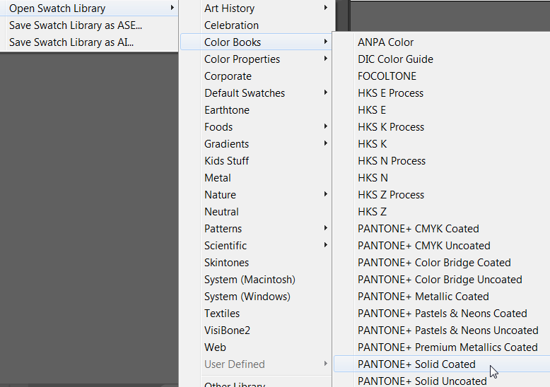
The only way to get close to that blue is to use a Spot color, not CMYK. In the Swatches panel menu, choose Open Swatch Library > Color Books > Pantone Solid (Coated or Uncoated, depending on whether you are using coated or uncoated paper stock).

Even with a spot color you may not be able to match the blue precisely without the printer doing a custom ink mix, but you'll get closer than using CMYK.
Copy link to clipboard
Copied
The only way to get close to that blue is to use a Spot color, not CMYK...
How is defining a spot swatch from a library going to "get closer to" the subject blue?
First, setting up a spot swatch does not in any way enable your RGB glowing monitor to display colors it cannot display in a RGB mix. All the monitor ever displays is RGB. It never actually displays a spot color from a Color Book Swatch Library; it merely displays an RGB approximation of it. Defining a Spot Swatch is not going to magically cause the monitor to be able display more RGB combinations. Moreover, Ryana already has exactly "that blue" displaying on the monitor. As stated, the subject desired blue is the RGB color in the original post screenshot.
Second, Using a spot color swatch is not going to help someone achieve that color in a dye-sublimation printing process unless a corresponding physical spot ink is available for the target printer. Dye based inks are often somewhat more brilliant than CMYK offset inks, just as watercolors are often more brilliant than oil paints. But that doesn't mean a sublimation dye even exists that corresponds to a spot ink selected from Pantone's color book for offset printing inks (or any other manufacturer's color book library).
If the solution here was to merely define a Spot Swatch, Ryana could simply sample the desired blue with the Eyedropper Tool, define a color Swatch, and then specify that Swatch to be treated as a spot color. Spot Swatches don't have to be selected from a "Color Book" Swatch Library. If you know what spot ink you are specifying, its on screen display doesn't even matter. By definition, all that affects the printed color of a spot color is the ink that is actually loaded into the printing device. So how does selecting a spot color from any of the provided Color Books get Ryana any closer to a solution without even knowing if a matching dyes or ink is even available for the sublimation printing device?
The only way selecting a Spot Swatch from one of Illustrator's spot Color Books would be of any help is if one of those Color Books represented inks available for the target sublimation printer. And just as with offset printing, that doesn't ensure an accurate printed match to what is merely a published recommendation for simulating a physical ink on screen. (Many Pantone inks simply cannot be closely simulated on the monitor.)
Brilliant blues is one of the weakest areas in offset process printing because of the nature of cyan ink. Inkjet process dyes (sublimation printers are often inkjets) can be brighter than offset printing inks. But sublimation printing is still a reflective printing medium. You're not going to get a glowing fluorescent neon blue in any printing process without actually laying down a glowing fluorescent neon blue ink.
This thread is simply about the fundamental common misconceptions that:
- "Any color" can be replicated by an RGB monitor.
- Process reproduction (be it RGB or CMYK) can render "any color."
The simple fact is, neither is true.
JET
Copy link to clipboard
Copied
What is the name and model of your heat transfer machine?
