
Book Cover Background Colors Muddy in KDP Print (via Ai created PDF)
So obviously, I'm a newbie at Illustrator and really need some expert advice.
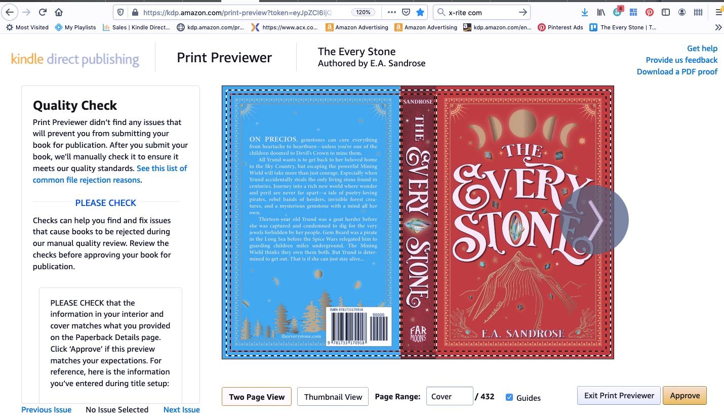
By hook and by crook, I got far enough to make my own book cover in Ai. But I'm having trouble with my background colors shifting to an amber/muddy hue when file goes to KDP Printer. Here's what it looks like in Illustrator with the screenshot of the PDF of same file in Acrobat Reader. Notice it's getting a tinge of orange as soon as it's saved as a PDF (which is the format KDP requires).
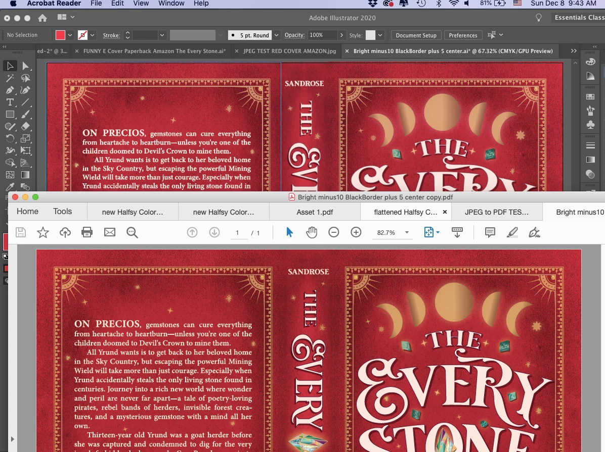
Then, when I upload to Amazon's KDP Print, the KDP previewer shows the colors getting noticeably muddy and dull.
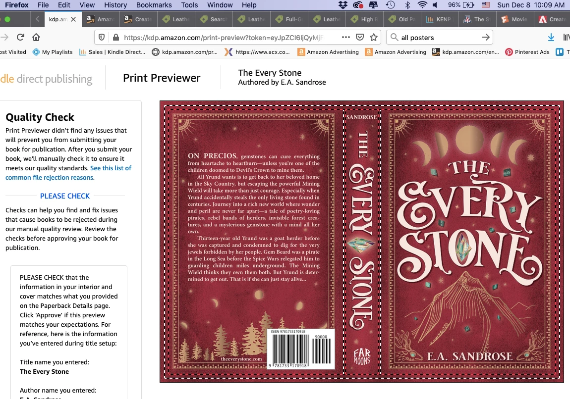
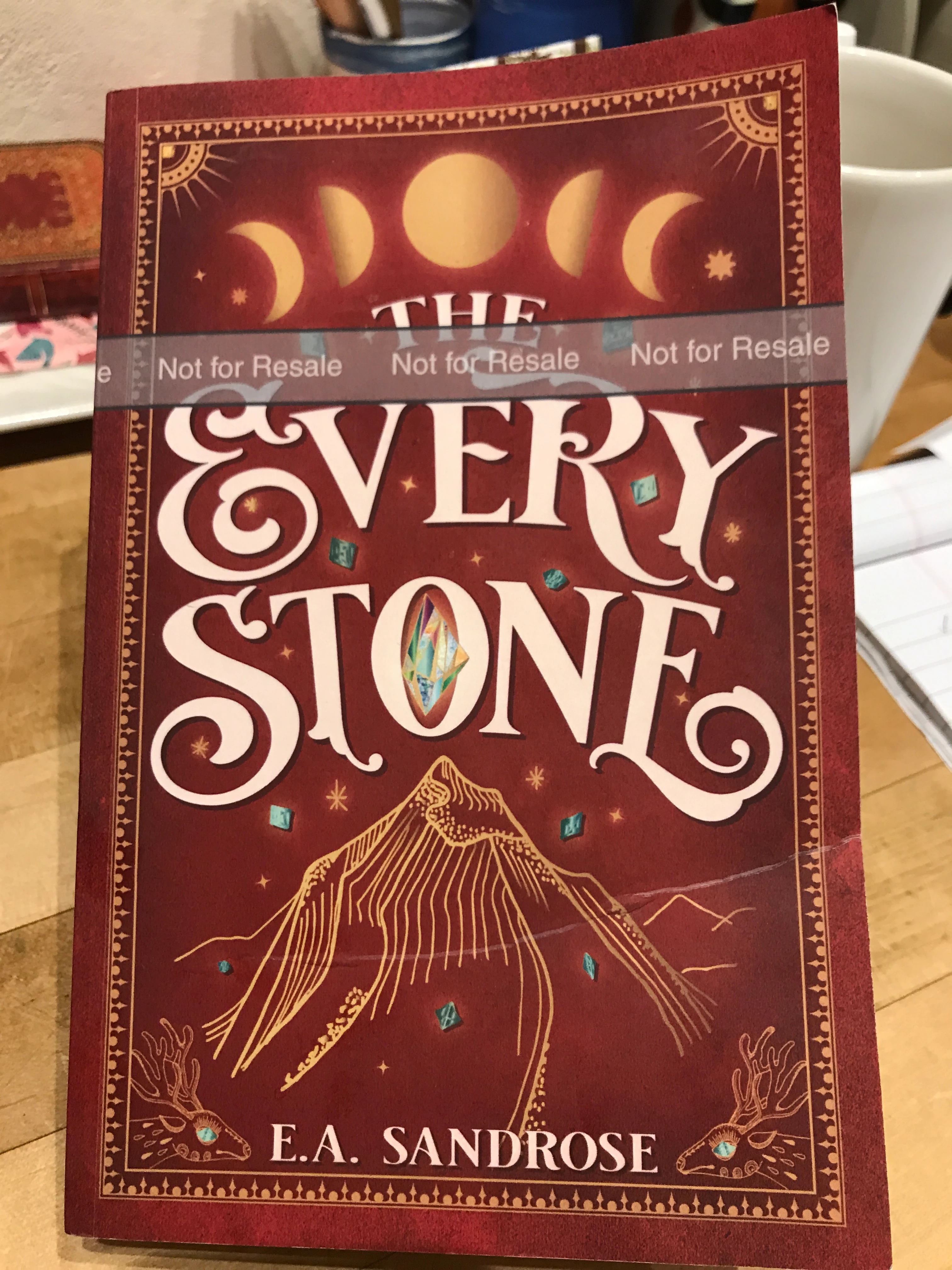
Note—this previewer is a fairly accurate predictor of how the printed version will look. See the pic of proof copy below, which got even more brown in tone.
My setup:
- I'm working on a MacBookAir running Mojave 10.14.6. Using the updated Illustrated 2020.
What KDP requires to submit my cover to print: - a CMYK or RGB single PDF of the cover less than 40MB with flattened transparencies
What I've tried so far:
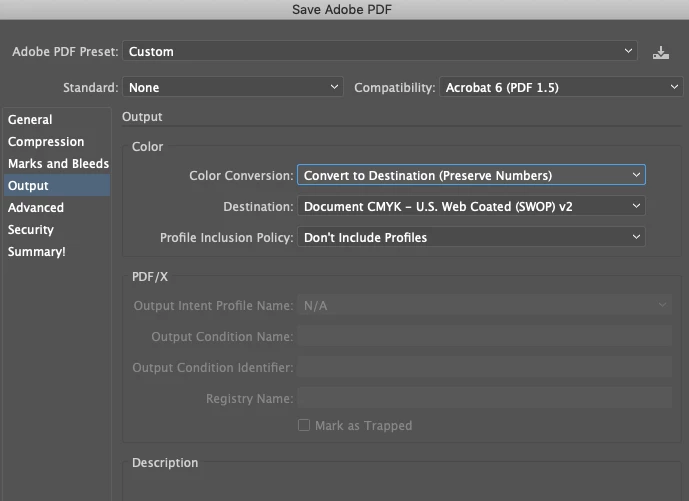
- I've tried setting Color Mode to both RGB and CMYK before creating the PDF. Both look fine up until I upload to KDP Print when they turn muted and muddy.
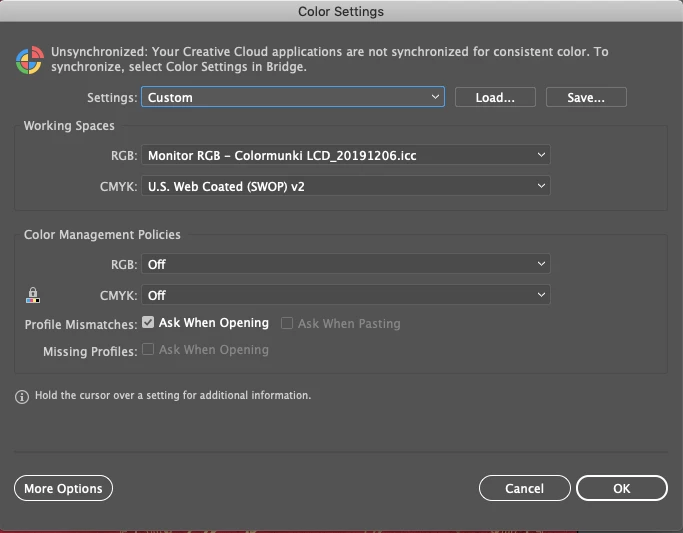
- I've tried changing the Color Settings without fixing the problem. Perhaps I'm missing the right combination? Currently set to:
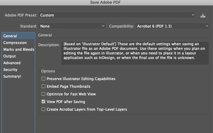
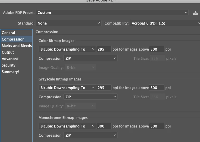
- Changing the PDF settings when I create the Save Copy as PDF hasn't yet fixed it either. Again, maybe I'm missing the right combo. Here were the settings I used:
- I calibrated the monitor with Color Munki but changing the display around hasn't really helped me figure anything out. Everything always looks fine in Illustrator.
- Changing the Color Balance of the background layers does not reduce the muddy tone or the haziness in KDP Previewer thus far. Perhaps, I'm not picking right values? If I reduce the black 25% I just get a lighter orange preview:
- Just out of curiousity, I tried swapping out the background layers from the old antique book cover jpegs to rectangles the same size in primary CMYK blue or red from Ai default swatches. They also get muted in the KDP previewer.
Other things I've tried:
- Overprint Preview doesn't replicate the KDP previewer exactly but gets closer to predicting the tone change, yet I can't figure out how to adjust the original cover in Ai to ever have it look good in Overprint Preview. Even if I remove all black from the background it still looks muted both in the Overprint Preview and the KDP Previewer. But obviously other people have red covers.
- Changing KDP print selection from matte to glossy does not affect the brown tinge/muddiness.
- Had a three hour chat with Adobe Illustrator Tech Support who tried everything I did with no difference, though he was very insistent it was better. I ran out of patience, thanked him and disconnected only to find my whole file had been corrupted when he had control over my screen. The whole 665MB file had to be thrown out as small pieces of the entire cover got erased in wiggly strips. Thank goodness I had hidden a backup. Needless to say, tech support not on my happy list right now.
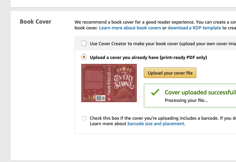
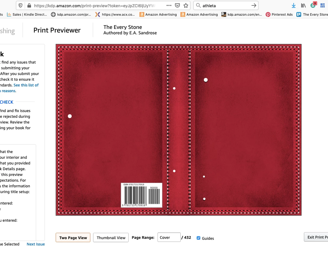
- I have called KDP three times, an always pleasant exchange though it's not really tech support as much as customer service. They suggested I adjust color balance (which I did but file still looked muddy even when yellow reduced), switch to RGB (no difference), and, last, try saving as a JPG and uploading via KDP’s cover generator instead. MIRACULOUSLY this worked! If I sent the red background as a JPG, when KDP themselves converted it to a PDF the colors stayed red and true and looked in their previewer exactly how I wanted. Hooray, sort of. See the screenshot below.
- Of course, the problem is that I can’t actually create the cover in their generator—it’s just an engine to make a basic cover with their fonts and a few images and now way to override the settings to import my own whole cover. So interesting but not fixed. I still need to a generate a PDF of the whole cover.
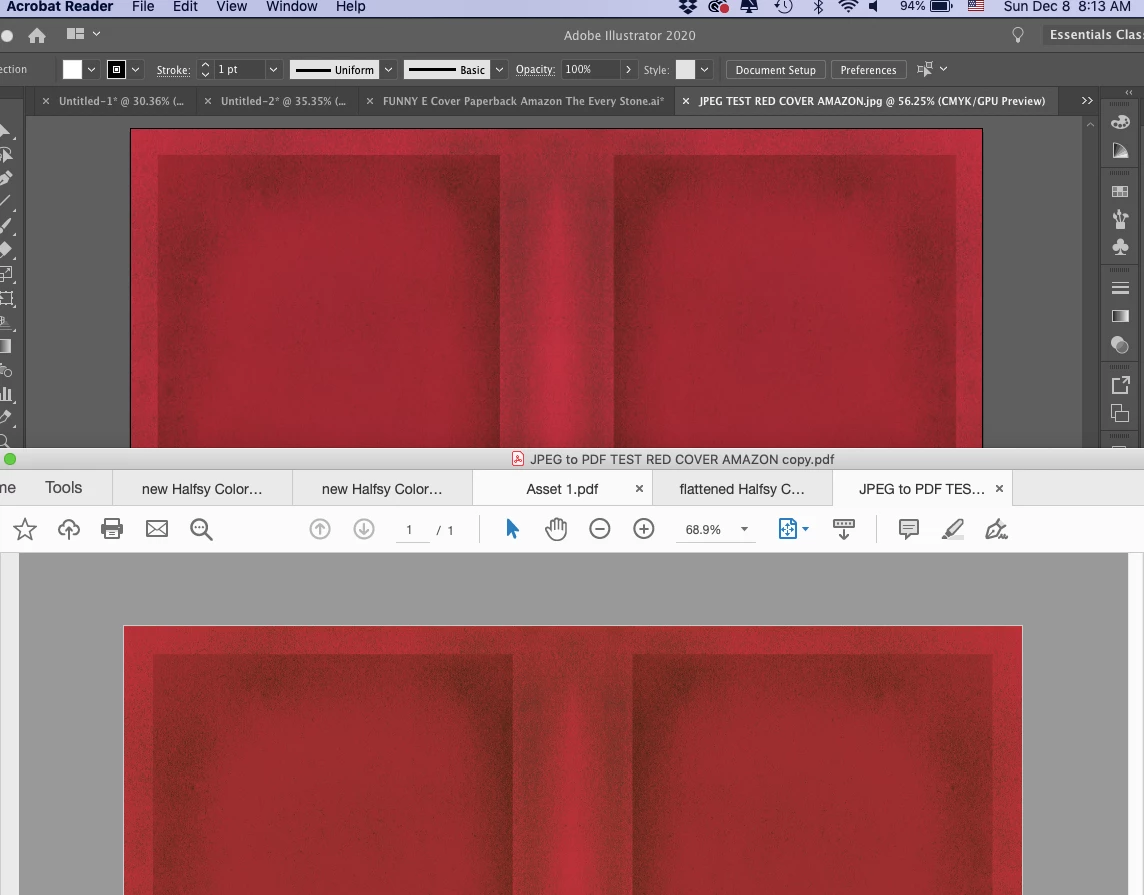
- Digression: If I generate a PDF from the JPG in Preview, the file size is way too small to ever have any good resolution and gets random white borders attached. Same if I save as a PDF through print, though in both cases the color stays true.
- Also interesting--if I open the JPG of the red background looking just how I want back into Ai and save a copy as a PDF, it goes back to the muddy orange quality. See pic:
- One last thing quirky thing that might or might not be useful to know. If I take a screenshot of the first KDP cover preview (the muddy one) then import that image back into Illustrator, the screenshot goes from muddy to the correct color and tone. What in the world does that mean? I’m figuring that’s a useful clue if I just knew what to make of it.
So now what do I do?
Is it the PDF file generated by Ai that’s the problem?
Is there a way to preview it in Illustrator looking exactly how it will once printed?
What color settings should I be using?
What PDF save settings should I be using?
Obviously after three days of not solving this on my own or with tech support, I’m pretty frustrated. I know real graphic designers would have resolved this in a flash, but due to a first cover fail with an artist ($1000 but not right fit for genre and not liked by readers) I’ve used up my budget and am stuck with myself now. And I want the cover to have that perfect antique red/burgundy tone not the brownish scab color the proof copy came out. Help and many thanks!