

- Home
- Illustrator
- Discussions
- Changing space between labels in a graph?
- Changing space between labels in a graph?

Copy link to clipboard
Copied
Hi,
Is there any way to change the space between labels in a graph? Or change the width between each tick mark? I know how to change the width of the columns themselves and I see something there called cluster width, but when I fool around with those, they don't widen the actual width between labels/tick marks. The answer's probably simple, but I'm still learning the graph tool.


 1 Correct answer
Thanks. Unfortunately, increasing the width does nothing but make the numbers bigger. I gave up and created it manually.
Explore related tutorials & articles
 17
Replies
17
17
Replies
17

Copy link to clipboard
Copied
Can you please show an example?
Copy link to clipboard
Copied
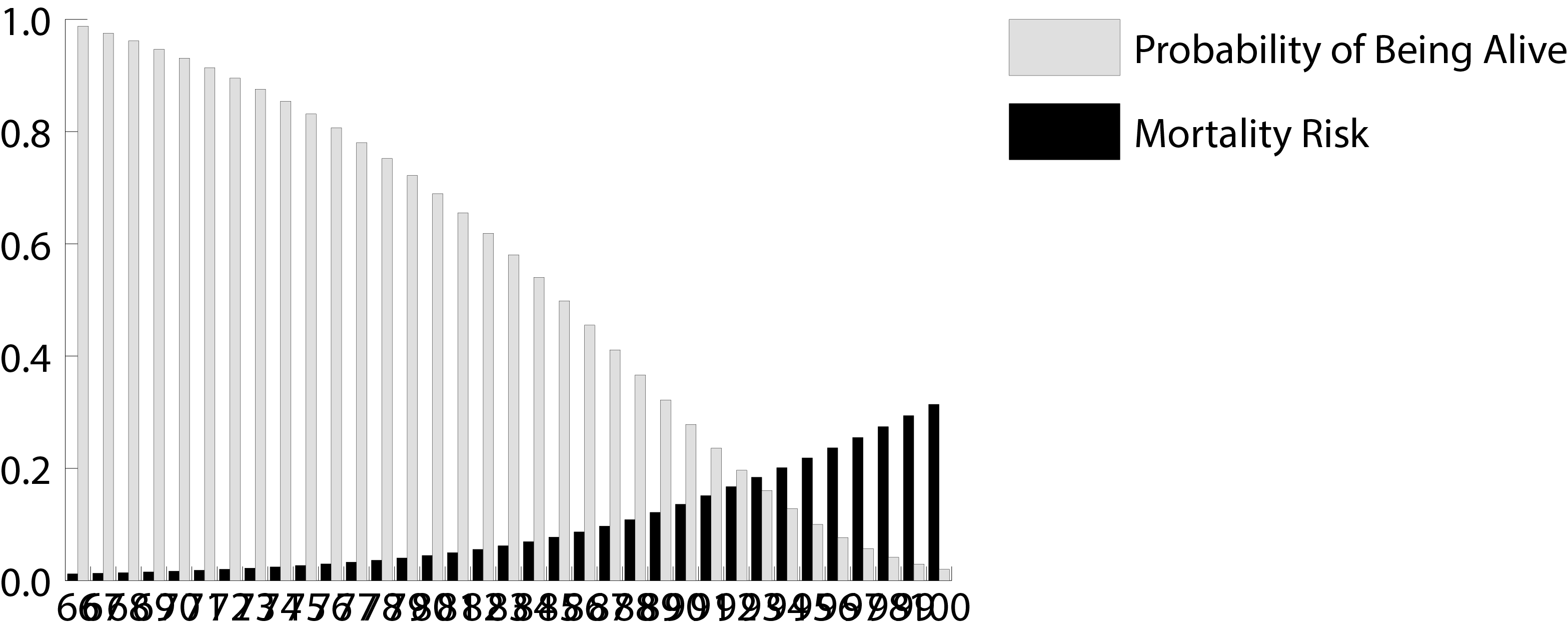
Here's the graph I'm working on. I need the columns far enough apart that the numbers aren't overlapping. I've tried decreasing the font size, but the only way to get the labels looking decent is to make them so small they'd either be unreadable or the graph would have to be resized to the size of the whole page to make them readable.
Copy link to clipboard
Copied
But resizing the graph is your only option.
There's no space left on that x-axis.
Copy link to clipboard
Copied
Exactly. But when I try scaling the graph, that only makes a bigger graph with bigger overlapping numbers. When I try recreating it as a larger graph, the same thing happens. I need to increase the space between labels/tick marks. Is there a way to do that?
Copy link to clipboard
Copied
Adjust these two:
Copy link to clipboard
Copied
The column and cluster width? I've tried that. It just changes the thickness of the columns and moves them closer together. And it doesn't do anything to the labels.
Copy link to clipboard
Copied
Can you please show some examples of what you have tried so far?
If there's not enough space on your axis, you won't see any good results.
Copy link to clipboard
Copied
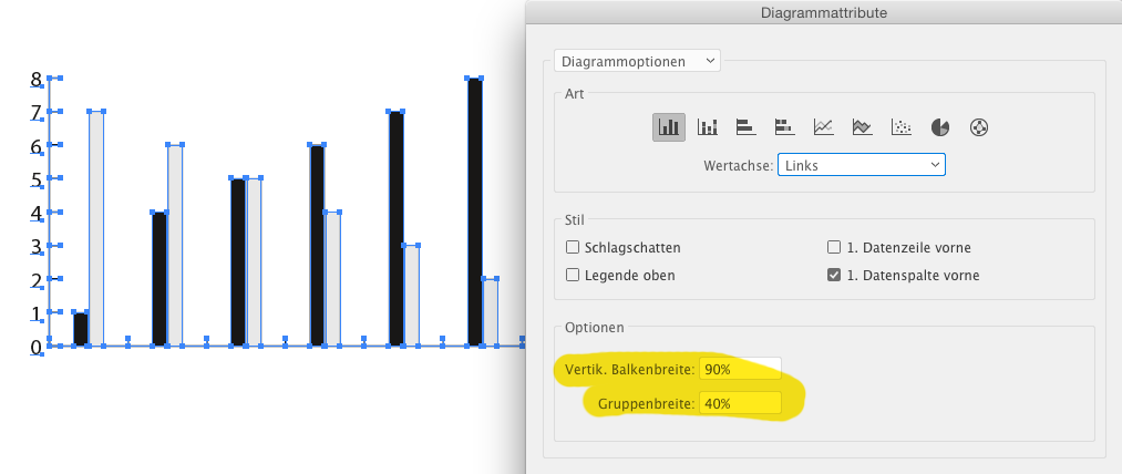
 This is with a column width of 90 and a cluster width of 40.
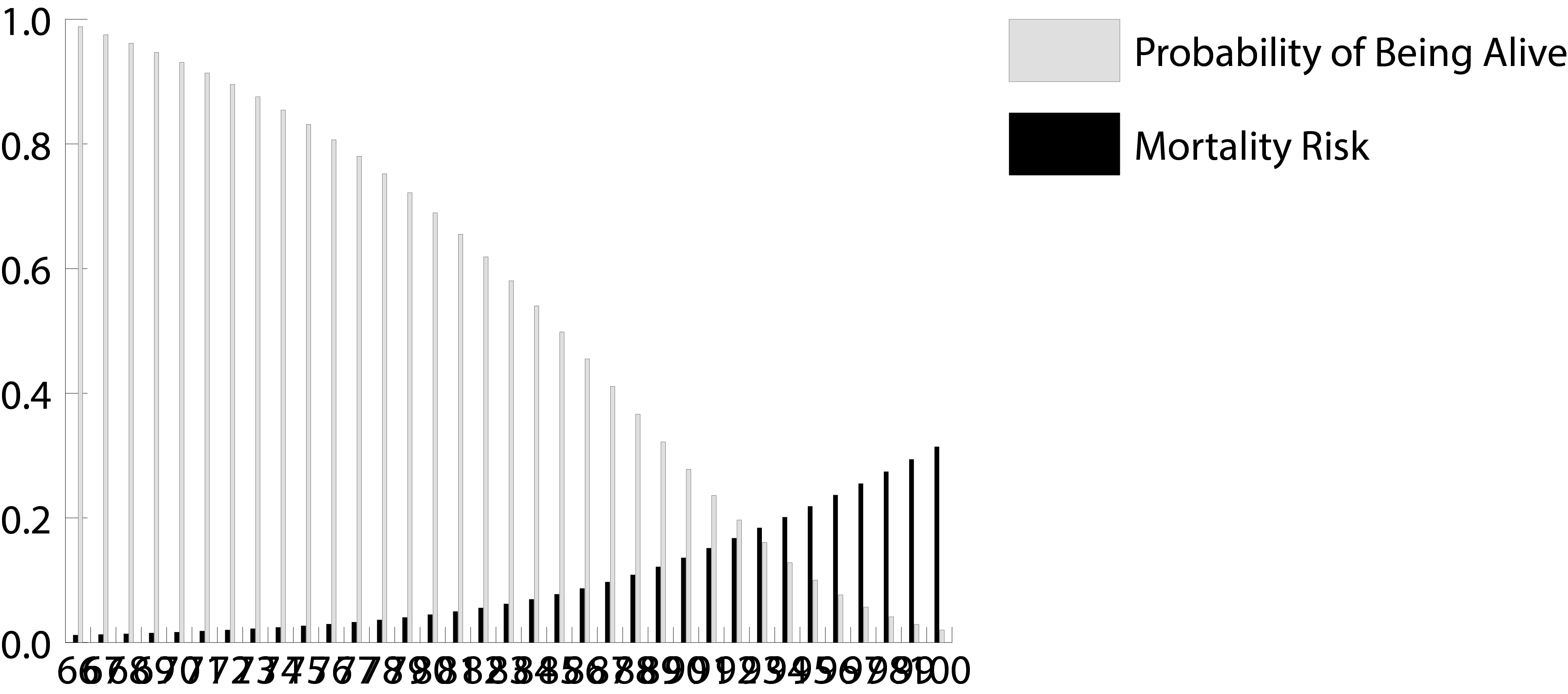
 This is with a column width of 120 and a cluster width of 100.
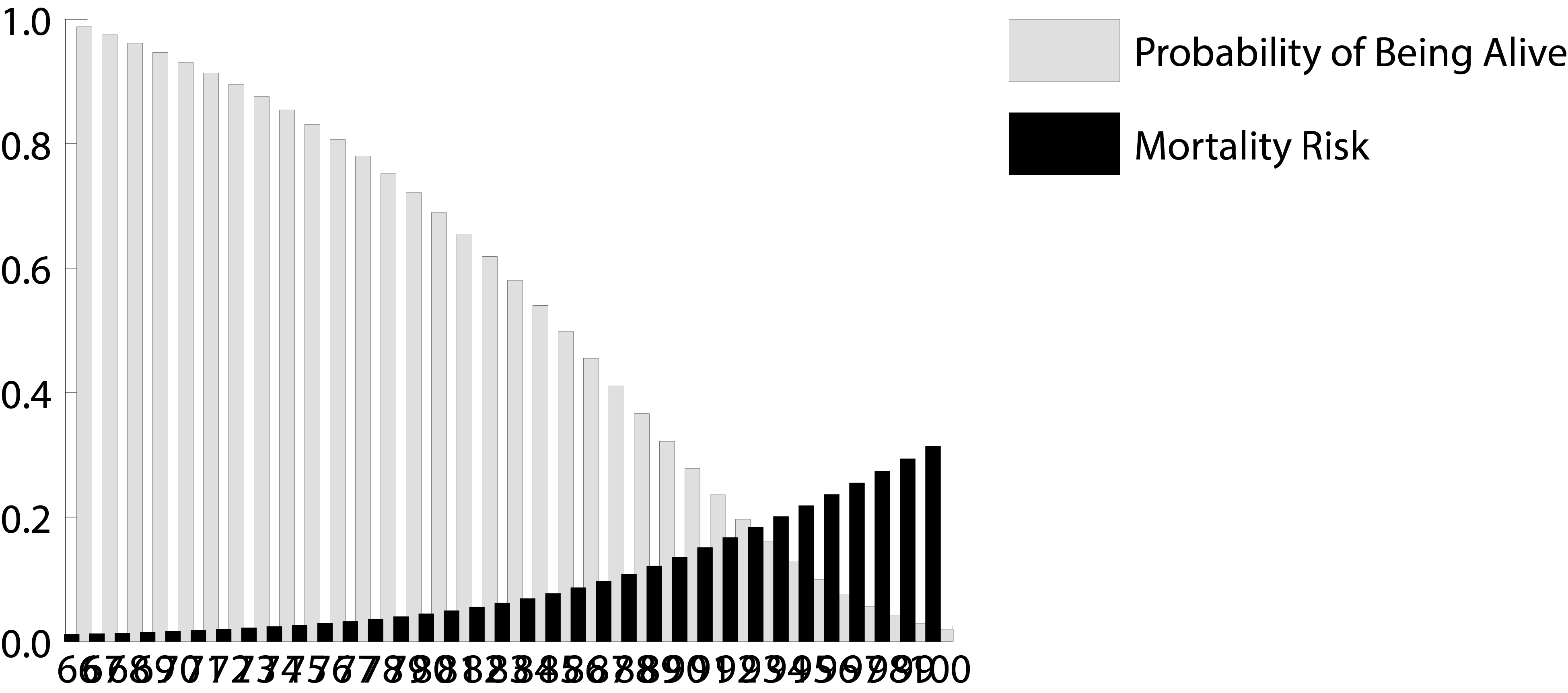
 This is with the graph scaled to 200%.

Copy link to clipboard
Copied
It looks like you have two sets of numbers running horizontally, one over lapping the other. Remove one set and with the remaining set adjust the horizontal scale to around 66 - 70% ad see if reducing the size by a point or two is doable.
Copy link to clipboard
Copied
I just tried recreating your graph by increasing the amount of space between the vertical spans. I failed to get the text to fit using a 66% horizontal scale and reducing the font size a few points. The only way to make it work is to increase the entire width of the graph and tripling the amount of space between vertical spans.
Copy link to clipboard
Copied
It's not letting me add more images, but I also tried redoing the graph with it bigger from the beginning (instead of transforming it). It looks the same as when scaled. I also tried changing the font size, but the only way to make them not overlap is to make the font size too small to read.

Copy link to clipboard
Copied
To do what you want you might try just labeling every 5th or 10th bar. People can figure it out on their own if they want specific numbers.
Copy link to clipboard
Copied
I would love to, but I can't. I'm just creating it based off of what the author says.
Copy link to clipboard
Copied
Then you'll have to rotate the text 90 degrees. It can only be as wide as the two bars for each data set.
Copy link to clipboard
Copied
Thanks. Unfortunately, increasing the width does nothing but make the numbers bigger. I gave up and created it manually.

Copy link to clipboard
Copied
Hi!
I think I found the solution to this issue! (I know I'm a year late, but other people may benefit).
To edit the position and/or orientation of the text elements you need to select all the text elements with the "Direct selection tool" (white arrow) and the go to "Effects">"Distort and Transform">"Transform" once there you can play with the controls to organize your text elements.
Cheers!

Copy link to clipboard
Copied
Well this helped me now in 2021! Thank you!

Get ready! An upgraded Adobe Community experience is coming in January.
Learn more
 AdChoices