• Global community
    • Language:
      • Deutsch
      • English
      • Español
      • Français
      • Português
  • 日本語コミュニティ
    Dedicated community for Japanese speakers
  • 한국 커뮤니티
    Dedicated community for Korean speakers
Exit
0

Creating a transparent shape like the Mohawk logo

Explorer ,
Feb 06, 2017 Feb 06, 2017

Copy link to clipboard

Copied

Does anyone know how to create this Mohawk logo effect?  I'm an Illustrator newbie and I thought it looked pretty straightforward but not so much. I can't seem to figure out how they got the cone shapes under or on top of the circles (orange, blue and purple) to stay less transparent.  Love to learn,

Views

627

Translate

Translate

Report

Report
Community guidelines
Be kind and respectful, give credit to the original source of content, and search for duplicates before posting. Learn more
community guidelines

correct answers 1 Correct answer

Community Expert , Feb 06, 2017 Feb 06, 2017

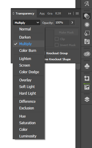
multiply is one of the transparency blending modes:
multiply.png

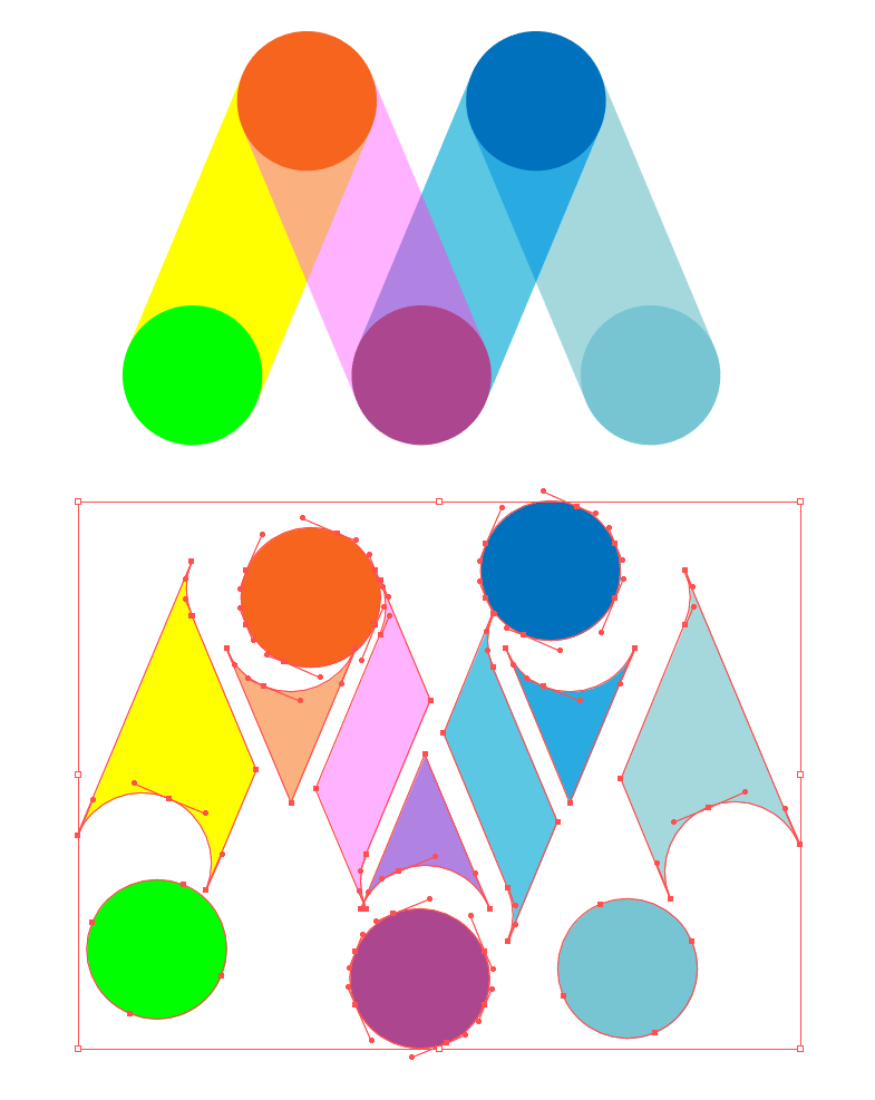
but really you want to be building separate shapes, or otherwise colour these areas individually, for a logo. it's the most foolproof way:
logo.png

Votes

Translate

Translate
Adobe
Community Expert ,
Feb 06, 2017 Feb 06, 2017

Copy link to clipboard

Copied

Most probably all of those shapes are not transparent at all, but filled with colors to mimick transparency.

Votes

Translate

Translate

Report

Report
Community guidelines
Be kind and respectful, give credit to the original source of content, and search for duplicates before posting. Learn more
community guidelines
Explorer ,
Feb 06, 2017 Feb 06, 2017

Copy link to clipboard

Copied

That's what I was wondering, Monika! The closest I came to recreating it was when I created the 'cone' shapes separately with 100% opacity and layered them over the transparent parts.

Votes

Translate

Translate

Report

Report
Community guidelines
Be kind and respectful, give credit to the original source of content, and search for duplicates before posting. Learn more
community guidelines
Community Expert ,
Feb 06, 2017 Feb 06, 2017

Copy link to clipboard

Copied

applying Multiply gives broadly similar results, but i think what i would do personally is create them all as separate shapes, including the overlaps, (either using shape builder or live paint or pathfinder to help out) and then colour each segment individually to your liking.

Votes

Translate

Translate

Report

Report
Community guidelines
Be kind and respectful, give credit to the original source of content, and search for duplicates before posting. Learn more
community guidelines
Explorer ,
Feb 06, 2017 Feb 06, 2017

Copy link to clipboard

Copied

Thanks, Doug.  Can you explain what you mean by applying Multiply?

Votes

Translate

Translate

Report

Report
Community guidelines
Be kind and respectful, give credit to the original source of content, and search for duplicates before posting. Learn more
community guidelines
Community Expert ,
Feb 06, 2017 Feb 06, 2017

Copy link to clipboard

Copied

Votes

Translate

Translate

Report

Report
Community guidelines
Be kind and respectful, give credit to the original source of content, and search for duplicates before posting. Learn more
community guidelines
Community Expert ,
Feb 06, 2017 Feb 06, 2017

Copy link to clipboard

Copied

LATEST

multiply is one of the transparency blending modes:

multiply.png

but really you want to be building separate shapes, or otherwise colour these areas individually, for a logo. it's the most foolproof way:

logo.png

Votes

Translate

Translate

Report

Report
Community guidelines
Be kind and respectful, give credit to the original source of content, and search for duplicates before posting. Learn more
community guidelines