Copy link to clipboard
Copied
Hello! I'm no expert in font creation, but I work with 2 custom fonts designed to create special characters for printing.
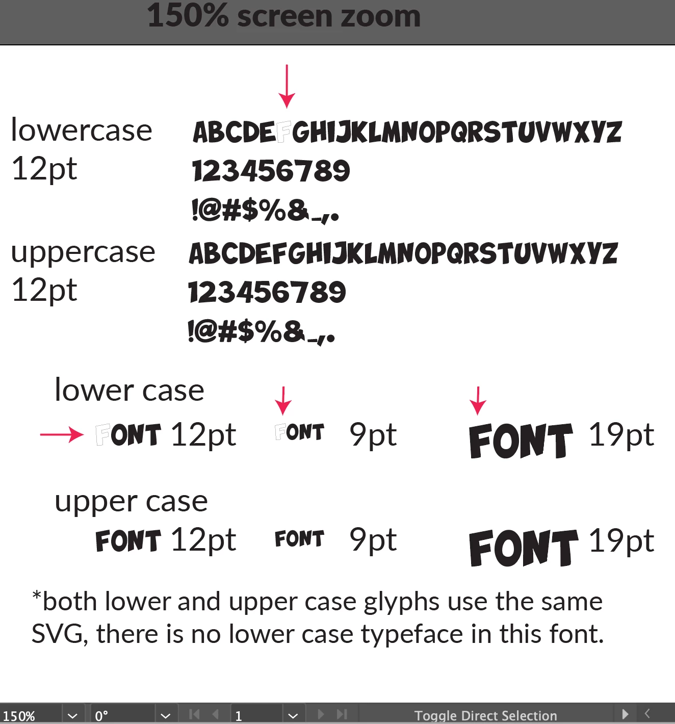
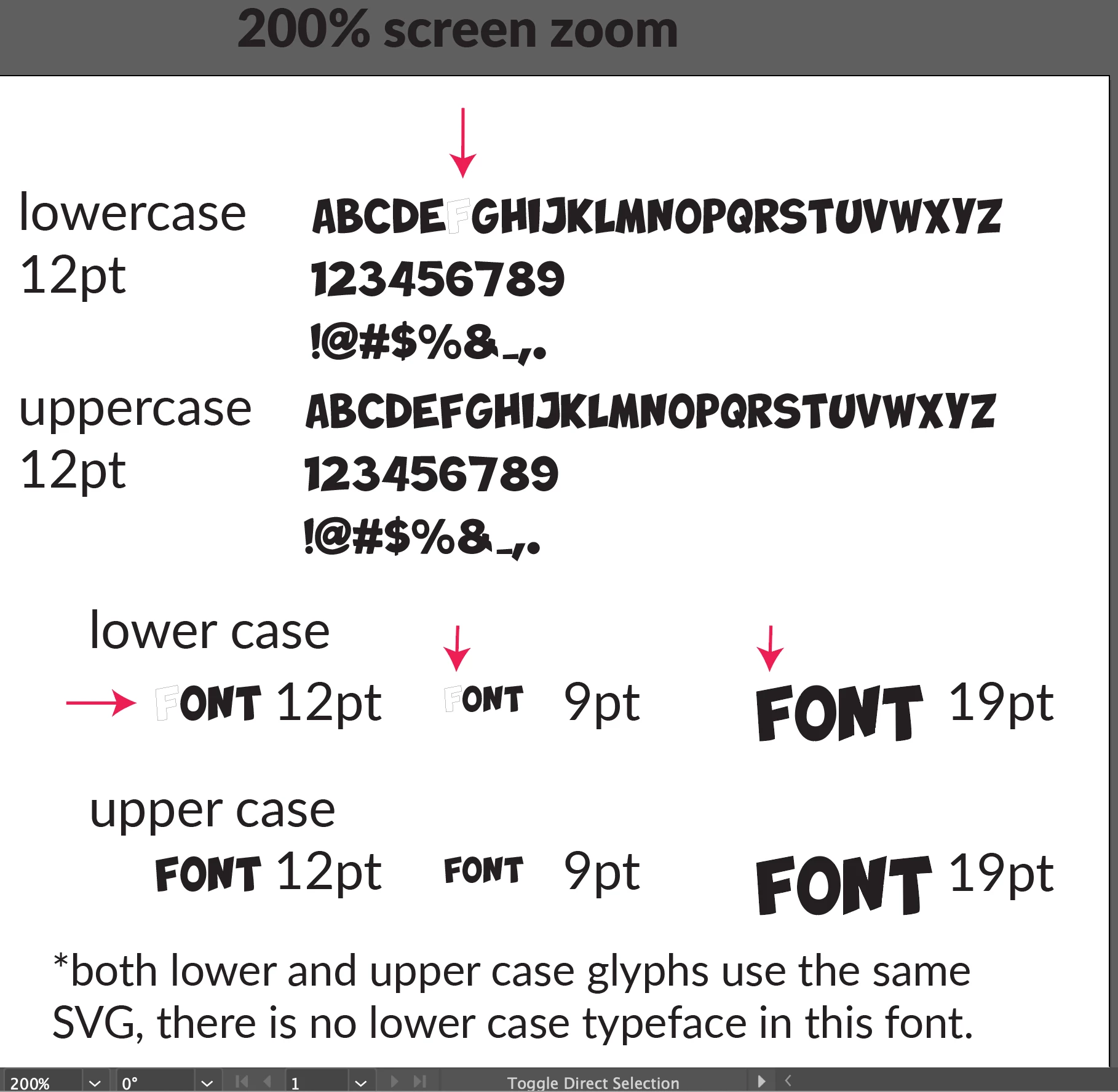
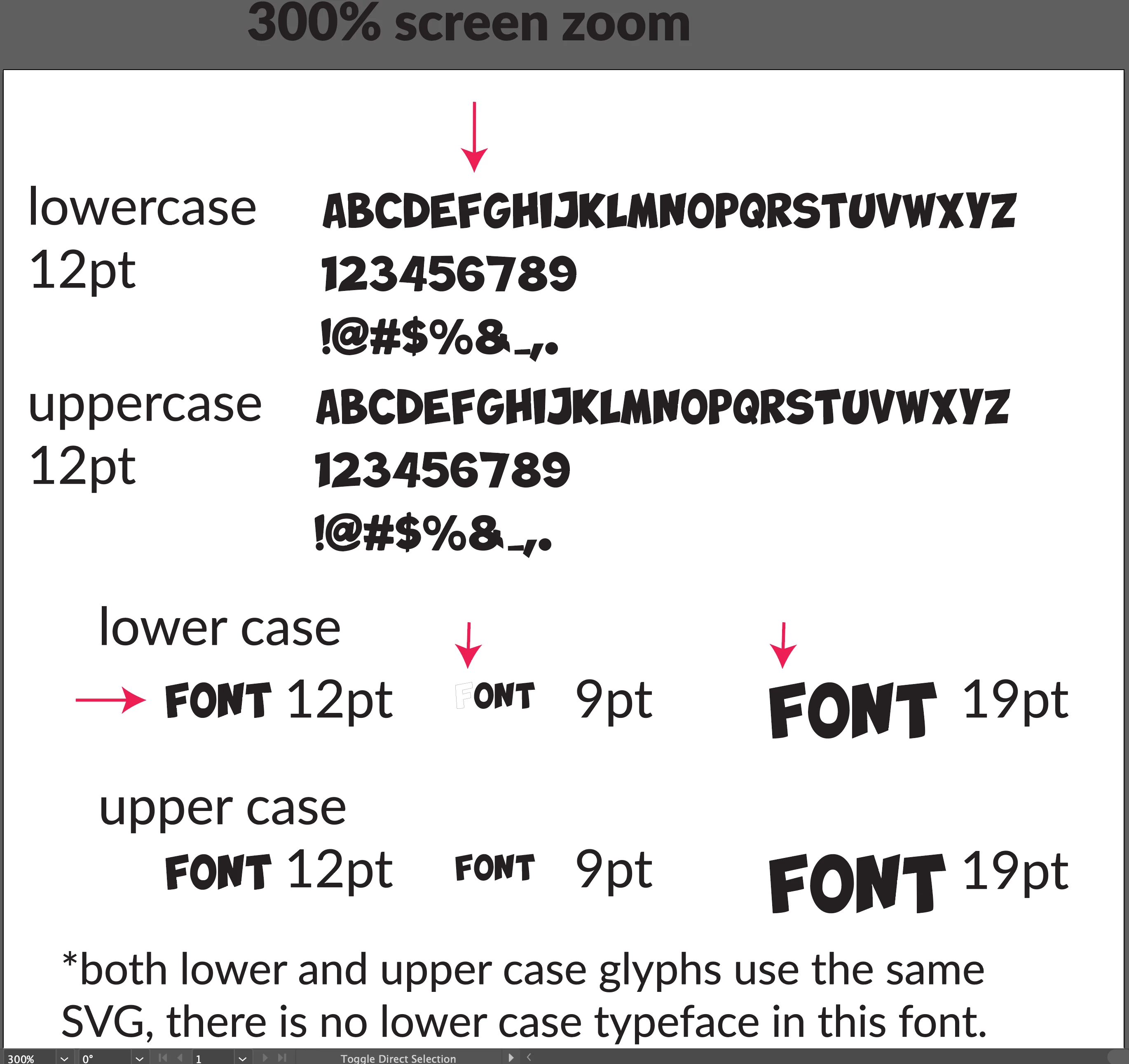
There is a single glyph in a custom font that appears white with a thin black stroke when viewing zoomed out, or when working with a larger font pt setting.
The glyph in question is the lowercase "F."
In this custom font, there are no lowercase typefaces. All lowercase glyphs use the exact same SVG source files as the uppercase glyphs.
See screenshots for details!
Thanks for any help, let me know if you've encountered something like this before
Copy link to clipboard
Copied
Since this is a custom font it seems like you should be asking the creators of the font this question. It sounds like there is something in the code that they used to create the font that makes accurate screen view an issue for that character. Fortunately for you, though, the actual end use of the font seems to be OK. That seems like the most important thing.
Copy link to clipboard
Copied
Thank you Bill, apologies that I was not clear. I am the creator of this font, and I am not a font creator lol. I have limited working knowledge of the process. The SVG was created through illustrator, then uploaded to an opensource web creator called glyphrstudio.com. The SVG is the same file used to create the capital F glyph which appears to be correct.
Perhaps I'll start by recreating the F from scratch and seeing what happens. I'll also investigate the code, maybe I can do so through a code comparing tool. Any other troubleshooting suggestions are appreciated, thank you for taking the time Bill
Copy link to clipboard
Copied
The path of the glyph might not be closed or maybe the wrong path direction, wrong fill rule applied and whatnot. But like Bill wrote, this needs to be done in the font editor.
Copy link to clipboard
Copied
Thank you Monika, I apologize for being unclear.
I'm the creator of this font. I have limited working knowledge of font creation, and I used an open source browser font creator called glyphrstudio.
The svg images were built in illustrator.
Does it seem odd that the SVG appears correctly in the capital F, but not the lowercase F?
I will check to see if the glyph is not closed, but it sounds like you're suggesting it could be a number of issues.
By path direction, is this referring to something called "winding?"
If you can think of any other possible issues it could be, that's at least helpful for me to investigate.
Thanks again for the time
Copy link to clipboard
Copied
Path direction might be called winding, yes.
Also: the winding rule might matter. Even if it's not a compound path.