Known Participant
June 16, 2024
Answered
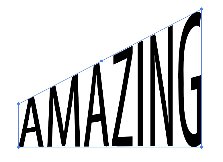
Distort text
- June 16, 2024
- 4 replies
- 1246 views

You could use an envelop distort with a top object. To avoid curved results see this discussion about gradient meshes:
Already have an account? Login
Enter your E-mail address. We'll send you an e-mail with instructions to reset your password.