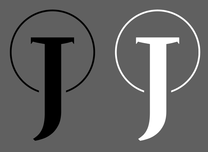
feedback on monogram logo
Copy link to clipboard
Copied
i dont know where to find this forum so im just throwing it up anywhere. i am a self taught beginner in graphic designing and i am trying to create a brand for myself. i am simply looking on improving the visuals - not really the meaning behind it.
my idea of this whole thing: J represents my name (Josh) and the simplicity of the brand represents my style of work (minimalism). a circle is 1 line. no variation. no angles. no turns. minimal.

Explore related tutorials & articles
Copy link to clipboard
Copied
Looks okay, but those faint fake serifs/ spikes will of course be troublesome once the Logo gets scaled to smaller sizes.
Mylenium
Copy link to clipboard
Copied
Hi
What disturbs my eyes, is the circle end point are not perfectly in the same distance to the letter.
Pierre
Copy link to clipboard
Copied
Why should a logo represent the business nature ?
The example you give isn't a monogram.
Copy link to clipboard
Copied
Ray Yorkshire - Did you read what I wrote. See below. The black/white version and grayscale versions are not show on that page.
"Note: I do have a black and white version of my logo and grey scale and even a two color version that can be changed."
The logo does not have to be related to the business. Did you see read the story that I told about the Make-Up Artist that uses a banana as her logo?
"I know a make-up artist here in Germany that uses a banana as her logo. Which is memorable as not many make-up artists would do something of that nature.... but even if people do not like it they will remember her from the banana!"
The idea behind having a logo that relates to what you do, makes it easy at first glance for people to go oh he or she is a illustrator, he or she is a photographer, he or she is a fashion designer, a film-maker, etc. But as mentioned you can go totally in different direction. One could do a logo of unicorn and say that because their work is magical. The most important thing is to make the logo represent who you are personally.
There is an amazing book series entitled Los Logos..... it worth looking at in a bookstore.... I think they are on edition 8 now.
Copy link to clipboard
Copied
Iris
It looks like it is based on a font and then extruded and slanted
Kenneth,
Yes I did read your post fully, and had a quick look at the link you gave too.
But my comment was threaded under, and in response to irislanef18294126) and the Minecraft link-
that not being a monogram :
'A monogram is a motif made by overlapping or combining two or more letters or other graphemes to form one symbol. Monograms are often made by combining ...'' wiki
The book Los logos looks interesting, though the cover example is an utter mess..
Good videos on logo trends etc at lynda.com by the enthusiastic presenter
Bill Gardner — Online Courses, Classes, Training, Tutorials on Lynda
Copy link to clipboard
Copied
First you are off to the right start and working in ILLUSTRATOR and not Photoshop! Whew, that already makes me happy!
I curate the Wacom Gallery on Behance and have hosted over 18 Behance Portfolio Reviews.
I think your logo needs to reflect more your personality or what you do. This seems too classic.... like you are selling cars or something. I think as a creative you can have more fun with your logo.
Here is how I designed my logo...
Kenneth Shinabery - Düssel York City Logo
As you will see, I really wanted a logo that showed off all my skills as well as that I am American living in Europe.
I may rework my logo even more into a something else as I am ready for a brand update (which I love since I work in PR and Marketing as well)!
Note: I do have a black and white version of my logo and grey scale and even a two color version that can be changed.
They say if you create 10 ideas or in this case designs.... then one of the ten will be brilliant and amazing!
If you are a digital artist and using tablet then maybe combine the J with a stylus or digital pen. If you are a photographer, then work the J into a design of a camera. If there is something unique about you or your personality then go for it.... if you are creative there is no boundary. I know a make-up artist here in Germany that uses a banana as her logo. Which is memorable as not many make-up artists would do something of that nature.... but even if people do not like it they will remember her from the banana!
Have fun... do not be afraid to push boundaries!
Just remember your logo should be scale-able... thus test it at the size of a 1/4 inch by 1/4 inch.... if you can still read it then you created something that can work in all sizes!
Copy link to clipboard
Copied
Oh totally forgot... Adobe Generation Professional and the Adobe Education Exchange did a course last year called DIGITAL ME... I was the instructor for the EU course. You can go back and go through the course even though it has ended and learn some tricks!!!! It was fun and there was so much info... and it is FREE!
Digital Me: Digital Portfolios, Assessment & Employability | Adobe Education Exchange
You also watch all the classes with live demos from the APAC region, EMEA region and Americas.... as each had different instructors, so there is a lot of content to learn from here!!!
Just login with your Adobe ID! Enjoy!
Copy link to clipboard
Copied
Kenneth, you say:
"Just remember your logo should be scale-able... thus test it at the size of a 1/4 inch by 1/4 inch.... if you can still read it then you created something that can work in all sizes!"
You are right, but your Düssel York City logo represents the contrary of that rule. It won't work in many situations. For example, take a look at your avatar here in the forum: That's just a muddy "Something". Not recognisable. Illegible.
No offence intended. Just a notice.
Copy link to clipboard
Copied
Interesting topic
Reminded me of another Lynda video, this one by John McWade (screenshots below for those without a subscription)
''Graphic Design: Logo Design Tips and Tricks''
A few trouble spots
John addresses small scale problems.
In other words perhaps it's ideal, to have a logo work at all sizes but maybe too restrictive to make it rigid rule, and there are workarounds.
Here he making real tiny favicons, but same principals to all small scale..
Problem: the favicon looks different to the original monogram
Bold the lines, in this case to twice the width, then open up the white spaces by moving the stem of the L to the right and the leg of the L up. Moving those parts opens up the white, which is as important as the colored part, so don't miss that. The original logo is the big one on the left and the new logo is the small one on the right. And what you can see is they now look alike.
We need a small square favicon and this whole logo won't fit. The solution here is to use a descriptive piece of the logo. In this case, the distinctive feature is the dot of the I, so all we do is lift out a square piece. Remember the white parts as important as the colored part and the white curve gets really narrow on the right edge. So now we want to widen that curve, place it in the menu bar, and it makes a super identifiable favicon and the two images look alike.
Copy link to clipboard
Copied
Additionally here is a link to an article about the book series Los Logos.
https://www.creativebloq.com/reviews/los-logos-8
I think you can find the older volumes fairly cheap on Amazon or eBay!
Also this is great research material if you want to get into logo design.
Copy link to clipboard
Copied
Joshua.
A few good tips given for your monogram.
But here is more of a technical place for using the adobe software.
If you need more opinions, you may like to try some more specialist forums
GraphicDesignForum has a crit pit section,
which is very good, and worth reading the threads even if you don't submit your own work for review.
For example a recent one on a monogram for a winery.
Friendly, but honest criticism will be given.![]()
https://www.graphicdesignforum.org/c/the-crit-pit
or a similarly named, but not connected, British based forum:
Copy link to clipboard
Copied
Hi
Ok it’s minimalist, but, depending of your clientele base, it is kinda related to religion. Josh > Joshua > Jesus.
The « crown » over the letter seem a representation of a « holy » crown.
How this logo represent your style of work or yourself ? I know that you dont want to talk about meanings, but … It's kinda obvious.
Btw, I see this as a symbol not a monogram.
Pierre


