


Copy link to clipboard
Copied
hello , i just have started flat logo and i and am confused about what a flag logo is and how to make it can you guys ellaborate this in steps and can you guys also share a good video about flat logo in which i get the basics about flat logo.


 1 Correct answer

If i am supposed to make a watch logo for a company , then how should i start. I hope you understand what i am saying.
Is the assignment for a course in using Illustrator or a course in effective design?
Your posting the question as stated in a software-specific forum like this suggests you are falling victim to the very common misconception that just having and knowing how to use graphics software makes you a designer or illustrator. It doesn't.
Graphics software is just an art medium. Predominate
...Explore related tutorials & articles
 9
Replies
9
9
Replies
9

Copy link to clipboard
Copied
Maybe start with some basic rules of logo design, such as these:
https://www.webdesignerdepot.com/2009/06/12-essential-rules-to-follow-when-designing-a-logo/
(you should find plenty more when just searching the web).
Don't know where you got that "flat logo" from, but I assume it means designing something that works without any gradients, effects and such. Just (black) shapes. A good logo should work like that.
Copy link to clipboard
Copied
 Basically Monika Gause this is example of flat watch logo given to me by my instructor and i have to make a new flat watch logo and i am confused in that the watch logo in the middle how i can make this rest everything is fine for me thanks in advance.
Copy link to clipboard
Copied
There are dozens of videos on how to draw a watch, such as How To Draw A Simple Clock In Adobe Illustrator - YouTube
There are a couple of different approaches for this, but for now: this is the most straightforward.
It is very difficult to read your posts when there are no breaks whatsoever in them. As this is an international forum: please make breaks and paragraphs whew appropriate. Thank you.
Copy link to clipboard
Copied
thanks Monika Gause very much for your time

Copy link to clipboard
Copied
Flat logo just means to design a logo without gradients or effects like soft dropshadow or glows, just as Monica suggested. The watch is an example of a flat logo. That doesn’t mean you should design a watch for your assignment. I recommend starting by designing with black and white only. Don’t even use gray. This could be surprisingly hard, but it gets you to really focus on the shapes and how they work together.
Copy link to clipboard
Copied
If i am supposed to make a watch logo for a company , then how should i start. I hope you understand what i am saying.

Copy link to clipboard
Copied
Usama,
You should start by considering which very simple and clear appearance best presents what the company is and does and wants to be seen as, based on whichever considerations have been made already.
The initial attempts at actually expressing this may be as crude and rough as you wish (loose sketches on a napkin or whatever), or as smooth (as in vector objects) as you wish, a main thing being to keep it fluent and open.
And all the way you should go about it in a flexible cooperation with the relevant folk at the company, making sure you have enough freedom.

Copy link to clipboard
Copied
Theresa is correct.
A flat graphic is kind of minimalistic to some extent. Think NO GRADIENTS, NO EFFECTS, NO SHADING, NO HIGHLIGHTS, NO GLOWS, etc.
Lots of examples in this list....
3200+ Flat Vector Icons ~ Icons ~ Creative Market
More examples...
https://cssauthor.com/flat-vector-icons/
More examples...
https://colorlib.com/wp/flat-logo-design-inspiration/
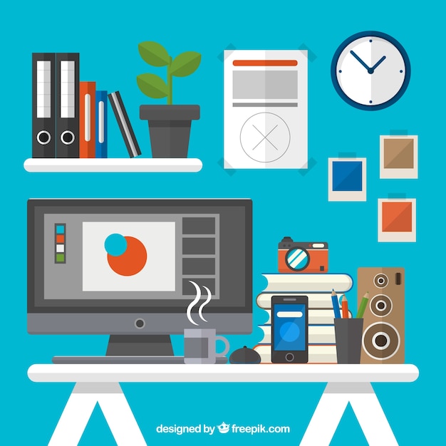
https://image.freepik.com/free-vector/flat-graphic-designer-workplace_23-2147529234.jpg
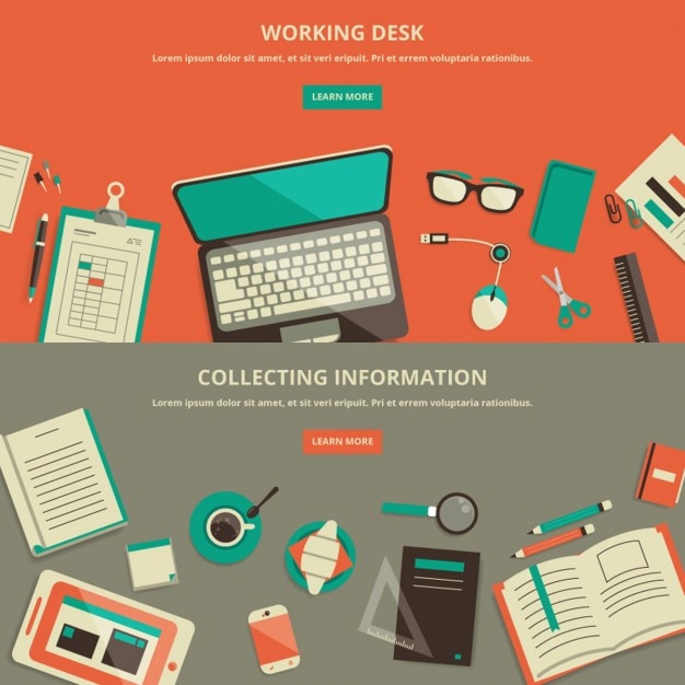
https://image.freepik.com/free-vector/flat-design-work-space-banner_1051-516.jpg
Hope these will inspire you!
Copy link to clipboard
Copied
If i am supposed to make a watch logo for a company , then how should i start. I hope you understand what i am saying.
Is the assignment for a course in using Illustrator or a course in effective design?
Your posting the question as stated in a software-specific forum like this suggests you are falling victim to the very common misconception that just having and knowing how to use graphics software makes you a designer or illustrator. It doesn't.
Graphics software is just an art medium. Predominate mediums change over time. Before the digital software, it was all about the mechanically powered airbrush (the "steampunk" of art media). Before the airbrush, it was all about manually-powered pen and ink, gauche, acrylics, etc. Eventually, something will replace graphics software as the defacto medium, and who knows what that will be.
Principles of effective design are independent of whatever happens to be the current medium. That's especially true of effective logo design, which strives to boil the message down to its bare essence while still being unique.
So if your question is about effective logo design as opposed to merely using a program like Illustrator to render a logo, my advice is:
To start designing the logo, forget the medium:
- Collect as much information as you can about the entity you intend to signify as a logo.
- Pick up a note pad and pencil.
- Jot down words that are essential to the message of the entity.
- Only after you have exhausted ideas, start sketching.
From the start, absolutely disallow gratuitous effects. If any part of the mark's "uniqueness" or "interest" is derived from mere canned effects, it is neither unique, nor interesting. Resorting to effects is the dead giveaway of amateurish design.
Ask yourself: Will this design work if rendered in black. If it won't, then it won't work for a cast emblem. Or for engraving on a writing pen. Or for a kazillion other things a company expects to be able to do with its logo.
Those are the reasons, both conceptual and practical, why it is best practice to design first only in terms of solid black. It keeps you from using effects (even color) as a crutch for weak design. It makes the actual design stand on its own.
All the while, strive to:
- Simplify, simplify, simplify. The goal is elegance. Can you convey more, with less?
- Avoid cliché. Not just "like the plague." It is the plague.
- Avoid the obvious. (Hint: The most effective logo for a watch company is probably not just an icon of a watch.)
- Be utterly ruthless with yourself:
- Pretend you're not you. Pretend you are someone else who doesn't know you or care one whit about you. You are just someone looking at a graphic amid the bombardment of millions of graphics. Ask yourself these questions:
- Does it convey the essence of the message?
- Is it unique?
- Is it memorable?
- If any of the answers are "no," it's not even interesting and you're not even close. Trash that idea. It's junk.
Only after you've got a few solidly strong sketches, start rendering them in software. All the while, ask yourself:
- Are there any unnecessary elements? (A logo is a signature, not a self-biography.)
- Is any element of the primary mark superfluous? (Anything not necessary to the visual message dilutes it.)
- Consider every line, every curve, every path node as potential for improvement, simplification, or removal.
JET

Find more inspiration, events, and resources on the new Adobe Community
Explore Now
 AdChoices